Big Temples and Small Temples

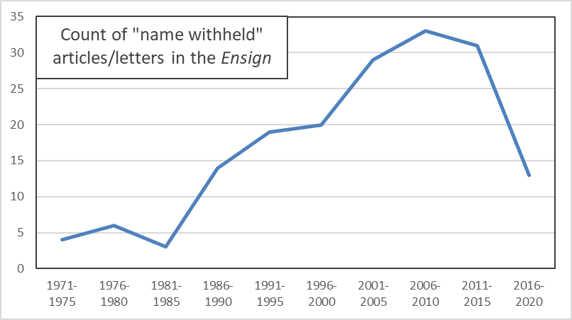
Right before the turn of the millennium, President Hinckley rolled out a new temple-building campaign that reimagined what a temple could be. The Church began building temples that were far smaller than their predecessors, but were also much closer to where members lived.

It has been a couple of decades since then, and President Nelson has his own slew of newly-announced temples. I don’t think he’s made an explicit point like President Hinckley did, of saying they’ll be smaller. I think the sizes are clearly varying by location.

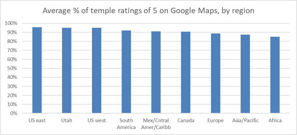
I got to wondering how much of the temple capacity of the Church is still in Utah, or still in the US. My impression is that even with many of the small Hinckley-era temples being built in the US, there are still often quite large temples built here, even in the Mormon corridor. Look at Payson, Utah (dedicated in 2015), for example, or Gilbert, Arizona (dedicated in 2014).

To answer my question, I looked on the Church website at how many endowment sessions there were in each open temple, and how many seats were available in those sessions, for two dates in February: the 14th and the 25th. I checked the number of available seats at least a month before the session dates so that few would be likely to be scheduled. I chose these date to have one weekday and one Saturday, and to not be right next to each other, so a temple that might be closed for cleaning on one day, for example, might open back up on the other. Also, I chose to look at endowment sessions because they’re by far the most time-intensive of vicarious ordinances, so they’re the biggest potential bottleneck.

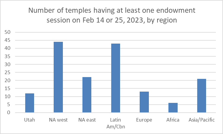
There are 161 temples with at least one endowment session on February 14th or 25th. (I did notice that a few temples that weren’t listed as having sessions available when I started gathering data did when I checked back in the last few days, so it’s possible that a few more will open between now and then so I may be undercounting a little.) Here’s a breakdown by region.

Read More

Ratings of Mormon Books on GoodReads

I wrote a post a couple of years ago where I looked at how Mormon-related movies were rated on IMDB. I thought it would be fun to do a similar look at how Mormon-related books are rated on GoodReads.

I got ratings for 568 books, mostly Mormon-related, but with a few others for comparison. The Mormon-related ones were scriptures, Church-published materials like manuals, and books by GAs, Mormon studies people, and popular Mormon authors (e.g., Jack Weyland, Anita Stansfield). The non-Mormon ones were a few Bibles, the Left Behind series, the top 10 fiction and non-fiction books on the GoodReads lists (I’m not sure exactly of the criteria for these), and 20 fiction and 20 non-fiction books I was hoping would be more representative of average books, so I chose them off of GoodReads user-created lists that had nothing to do with the book content (one was strange titles and the other was interesting covers). I required a book to have at least 50 ratings to be included, although I made exceptions for three extra bad ones I was interested in: the ERA-era book Woman, written by a bunch of GAs, the priesthood/temple-ban-justifying Mormonism and the Negro, and the mansplained classic Woman and the Priesthood. Note that I’ve gathered this data in bits and pieces over the last month or so, so some of the numbers might be a little out of date.

I assigned the books to categories depending on how Correlation-friendly they were. Unfortunately, I’ve only read a small fraction of the books, so I didn’t have firsthand knowledge in most cases. However, most books make pretty clear what type they are. For example, Mormon studies books are typically published by university presses. More correlated books are typically published by Deseret Book or Shadow Mountain. Anyway, this table shows, for all the Mormon books, the number of books in the sample and their average rating on the 1-to-5 scale used by GoodReads.

In my post on movies, I speculated that there would be higher ratings for movies produced by the Church, or that were scripture-adjacent, and that did turn out to be the case. It looks like there’s a similar pattern here, as scriptures rate the highest, and generally categories rank lower in average rating as they move further from being correlated. Here’s a brief explanation of what falls into each category:

  • Scriptures — LDS scriptures in different forms (e.g., Book of Mormon separate vs. Triple Combination) plus some non-LDS editions of the Bible.
  • Correlated — Church manuals and books that have essentially become manuals (e.g., Jesus the Christ).
  • GA biography — Biographies of GAs.
  • Near correlated — Nearly all books by GAs, as well as books by people like John Bytheway who are striving to be correlated, and novels by writers with similar goals (Gerald Lund, Chris Heimerdinger).
  • Correlation friendly — Books that aren’t quite trying to be correlated, but are still very Church-friendly, like many of the Givens’s books, Hugh Nibley, and some of Patrick Mason’s.
  • Mormon memoir — Memoir of someone who’s still Mormon (e.g., Leonard Arrington’s Adventures of a Church Historian).
  • Mormon studies — Any look at a Mormon topic from a scholarly perspective, so for example Maxine Hanks’s Women and Authority, or John Turner’s biography of Brigham Young, or Kathleen Flake’s book about the seating of Reed Smoot in the US Senate.
  • Ex-Mormon memoir — Memoir of someone who left Mormonism, regardless of hostility level, so everything from Martha Beck’s Leaving the Saints to Katie Langston’s Sealed.
  • Not correlation friendly — This includes books with ideas that GAs would generally frown on, even if the writers aren’t hostile to the Church, so for example anything by Carol Lynn Pearson that’s too kind to gay people or too open to Heavenly Mother or rejecting polygamy.
  • Anti — The only book I got in this category is Ed Decker’s classic The God Makers.

Read More

New Children of Record and Church Activity

In this post, I just want to make a small point about the Church’s report of new children of record in the annual statistical report. Here’s a graph showing annual end-of-year counts since 2010.

The count was flat for several years, but then started falling consistently from year to year starting in 2015. And then of course it fell off a cliff in 2020, going from 94,000 all the way to 65,000, a drop of over 30%. (For the rest of this post, I’m going to abbreviate thousands as “K,” so 94K is 94,000.)

It seems clear that the 2020 decline was caused by COVID. But there are (at least) two possible mechanisms that could be driving the effect of COVID on new children of record. One is that COVID affected birth rates. I had the idea in the back of my head that economic downturns are often associated with declining birth rates, and a quick Google turns up at least one paper that suggests that that’s true. However, given the nine month length of human gestation and the fact that COVID was officially declared a pandemic on March 11, 2020, it seems pretty unlikely that couples were changing their childbearing plans and having the effects show up before the end of the year.

The other possible mechanism by which COVID could affect children of record is through church activity. The children of record count is effectively a count of children born to or adopted by LDS families where at least one parent is active enough to get them recorded on Church records. With COVID pushing church meetings to be online, or suspended entirely, it’s not surprising that families were less diligent about recording their births and adoptions with their local units than they would have been in ordinary times. So I think the big drop from 2019 to 2020 makes sense.

What is striking, though, is that the 2020 to 2021 recovery is smaller than I would expect. New children of record rebounded from 65K to 89K, which seems like a healthy gain. But if my guess that people were just lax in recording new births and adoptions is right, there should have been a big backlog from 2020 that got recorded as people largely returned to attending church in person in 2021. Really, the 2021 count should have exceeded 2019 if this was the case.

Read More

Proselytizing vs. Service Missionary Counts in the Church Statistical Report

It may not be read in general conference anymore, but needless to say, I was interested to take a look at the Church’s 2021 statistical report. One interesting thing I noticed has to do with the counts of proselytizing versus service missionaries. Here’s a graph showing the end-of-year counts of missionaries since 2010. You can see in the count of proselytizing missionaries the jump with the age change in 2012, the slow decline afterward, and then the dramatic drop with COVID and then some recovery. The count of service missionaries has had fewer dramatic movements, increasing through 2018, then declining for a couple of years, and then increasing sharply in 2021.

As I mentioned in my conference review post, several speakers reminded young men that they need to be serving missions, and that young women can go as well. For example, here’s President Nelson in the opening talk of the conference:

Today I reaffirm strongly that the Lord has asked every worthy, able young man to prepare for and serve a mission. For Latter-day Saint young men, missionary service is a priesthood responsibility. . . . For you young and able sisters, a mission is also a powerful, but optional, opportunity. . . . Your decision to serve a mission, whether a proselyting or a service mission, will bless you and many others. [italics in original]

As an aside, I find the patronizing tone directed toward young women grating, but I feel like at least it represents a step forward from President Hinckley’s 1997 talk where he pretty openly discouraged women from serving. Anecdotally, for some women I know who were missionaries at the time, the talk led many elders to sneer to them, “Why don’t you just go home?”

Looking back to the graph, President Nelson and the other GAs are clearly concerned with the upper line, the count of proselytizing missionaries. It fell from about 67,000 at the end of 2019 to about 52,000 at the end of 2020. Of course this can be attributed to the pandemic. But then through 2021, even as vaccines became more widely available, it rebounded only a little, to about 55,000. I suspect they’re concerned that all the disruption in missionary work because of COVID has made missionary service seem more optional.

Read More

Name Withheld

A few years ago while reading the Ensign, I got to wondering about the reasons an article writer’s name is withheld. For an individual article, it’s typically pretty easy to guess, but I was wondering about larger trends. Even just cataloging the list of reasons seemed possibly interesting, because it’s a list of things that are considered shameful, but not too shameful. For example, a relatively large number of name withheld articles talk about divorce, but none that I’ve ever read talk about, say, bestiality. The articles provide a kind of list of troubling issues that are on writers’ (and editors’ and perhaps GAs’) minds. Also, while I was at it, I thought it would be fun to look at any trends across time and gender differences and a couple of other things.

I initially planned to look at all magazines on the Church website since 1971, but looking at the Ensign alone turned out to be fairly time-consuming, so I didn’t go any further. Maybe I’ll go back and look at the others another time. I found 172 articles and letters to the editor, using the search “‘name withheld’ site:churchofjesuschrist.org/study/ensign”. (To be precise, a few weren’t labeled exactly “name withheld.” I manually checked all the letters to the editor from the 1970s, after I found their authorship was occasionally noted as “A regular reader” or something similar.)

For each of the 172 documents, I noted the following:

  • Publication year
  • Gender of the writer (I was able to figure this out for 121 of the 172, or 70%)
  • Is the name withheld because of something about the writer or something about another person?
  • Is the person the actor (e.g., used porn) or the victim (e.g., was abused) in the situation?
  • One or more reasons for the name to be withheld. (The max for any one document was four. Most documents had one. Three documents had zero, as I couldn’t figure out any reason at all.) I grouped these into 17 different categories, which I’ll list below with results.
  • The story end type. I classified these into three different categories: perfect (where people end up married in the temple or going on missions), good (where things end up better than they started), and learned (where things don’t get better, but the writer learns to better accept them). I also assigned some documents a not applicable here when there was no story arc. This was the case for a fair number of the letters to the editor, where writers with name withheld often say no more than “I suffer from the same problem as the person in such-and-such an article.”
  • How much the need to forgive the wrongdoer is discussed. I rated this as high, low (little discussion, or just reference to need to overcome bitterness and anger), or none.

I also tried noting down some other things, like the approximate age of the writer (typically difficult to figure out) or the location (rarely mentioned), but I wasn’t able to get enough useful data for them.

This graph shows the total number of documents in five-year periods across the history of the Ensign. Note that there’s no adjustment for possible differences in length of the magazine at different points in time.

Even with my extra combing through the 1970s issues, the prevalence of “name withheld” documents really didn’t take off until the latter half of the 1980s. It’s also interesting that it has dropped so dramatically in the latter part of the 2010s. I wonder if this is a change Russell M. Nelson has made, because even the 13 in the 2016-2020 period can be broken down into six in 2016 and seven total in the four following years.

Read More

Hymn Tempo in 1973 and 1985 Hymnals

This is what then-apostle Spencer W. Kimball had to say in a report of a 1955 mission tour (my source for the quote is Ardis Parshall):

Music: It is generally sung too fast.

If you’re like most Mormons I know, your complaints typically run in the opposite direction: Music is played and sung too slowly in church. This has certainly been my experience. I recall in the ward my wife and I lived in when we were first married a couple of decades ago, the hymns were so slow in sacrament meeting that I took to timing them and comparing to the suggested tempo in the hymnal and whispering complaints to my wife about how big the differences were. And that was before smartphones, so I had to do the math in my head! Along the same lines, you might notice that in my Conference review posts, I typically note particularly fast musical numbers for praise.

I was thinking about this issue while I’ve gathered some data from the hymnal in preparation for the release of the Church’s new hymnal. Like in my last post, I’m looking at the 1985 hymnal and the previous hymnal (the copy I have is from 1973, but it was largely unchanged from 1948). It occurred to me that, because many hymns appear virtually unchanged in both hymnals, I could line them up next to each other and see if the compilers of the 1985 hymnal generally suggested faster or slower tempos than the compilers of the previous hymnal did. This would be an indicator of whether they thought music was being played and sung too fast or too slowly.

For example, “The Spirit of God” appears in the 1973 hymnal with a tempo of 100 beats per minute (bpm), and in the 1985 hymnal with a tempo of 96-112 bpm. It is in 4/4 time in both hymnals, and the tune is the same. As you probably know, the 1985 hymnal always suggests a tempo range. The 1973 hymnal just suggests a single tempo, although I’m guessing it was with the expectation that there would be variation around it in practice.

I was able to find 250 matched pairs of hymns to compare across the two hymnals. I matched them on both title (taking into account that sometimes the titles changed for the same hymn) and composer, to be sure that I wasn’t comparing hymns set to different tunes. I used the 1985 hymnal as the starting point, and looked for a matching hymn for each in the 1973 hymnal. A few hymns appear more than once in the 1985 hymnal and therefore also more than once in the set of 250. For example, “Come, Come Ye Saints” is #30 in the 1985 hymnal, and also #326, for men’s voices.

This graph summarizes where the 1973 tempos fall in comparison to the 1985 tempos for the 250 matched pairs of hymns.

The most frequent result is that the 1973 tempo falls within the 1985 interval (the middle bar). But when it doesn’t, it’s much more common that the 1973 tempo is slower than the 1985 interval than that it’s faster. When the 1973 tempo is at the end of the interval, it’s over four times as likely (26% vs. 6%) to be at the slow end as at the fast end. When it’s entirely outside the interval, it’s over ten times as likely (22% vs. 2%) to be outside at the slow end as outside at the fast end. Another way of summarizing the same data, although it’s not shown in the graph, is that the average fraction of the 1985 tempo range that is faster than the 1973 tempo is 72%. Overall, it seems clear that the compilers of the 1985 hymnal were generally trying to speed the hymns up.

Read More

Mood of Hymns for Men vs. Hymns for Women

I’m getting ready for the Church to release the new hymnal, although I realize it will be a while still before it comes out. In preparation, I’ve been looking at some comparisons of the current 1985 hymnal with the one that preceded it. From Wikipedia, it looks like the previous hymnal was released in 1948, revised in 1950, and added to just a little in 1960. The copy I own has a copyright date of 1973, but it looks like it’s just the 1960 version (although I can tell that its preface from 1973 because it is signed by the First Presidency of Harold B. Lee, N. Eldon Tanner, and Marion G. Romney).

One difference between the two hymnals that I’ve noticed is in the hymns to be sung by men versus those to be sung by women. More particularly, the difference is in the moods used to describe how the hymns are to be sung. By “moods,” I mean the one- or two-word adverb descriptions written at the top of the hymn. For example, the current hymnbook says that hymn #1, “The Morning Breaks” is to be sung triumphantly. In the 1973 hymnal, the moods for men’s hymns aren’t too different from the moods for women’s hymns. In the 1985 hymnal, the moods for men’s versus women’s hymns are more markedly different. Because there are a lot of different mood words assigned to the hymns, I lumped them into three groups for convenience in display. Mood words like boldly I called “high energy.” Mood words like reverently I called “holy.” And mood words like peacefully I called “low energy.” Here’s a graph comparing the hymns for men and for women in the two hymnals.

The total number of hymns specifically for men or for women was much larger in the 1973 hymnal (47 for men; 41 for women) than in the 1985 hymnal (19 for men; 10 for women). As you can see, in the graph, I’m showing percentages instead of counts to make the comparisons easier to look at. (Note that six of the 41 women’s hymns in the 1973 are excluded from the comparison because they either have no mood description, or they have a tempo word in place of a mood description.)

In the 1973 hymnal, there’s some tendency for men to be assigned more high energy moods and women more holy and low energy moods. In the 1985 hymnal, this difference gets much larger, as over two thirds of men’s hymns have high energy moods, and only 10% of women’s hymns do. This isn’t at all a surprising difference to run into. I am disappointed, though, to see that the hymn selectors’ ideas of traditional gender roles, with active men and passive, worshipful women, is translated into the hymns they select and the moods they apply to them. I hope that the new hymnal doesn’t feature such a difference, but I’m guessing that it probably will.

Read More

How often do BYU student speakers at commencement suggest they’re straight?

Like many other people, I was dismayed to read Elder Holland’s recent speech at BYU where he advocated the use of metaphorical muskets to fire at people who he sees as not sufficiently faithful to the Church’s anti-LGBT stance. He seemed very concerned about a slippery slope that starts with a student expressing the idea (approved by powers that be in the administration!) that they were gay and also loved by God that might lead to . . . it’s unclear exactly what. Maybe a student would say they’re single and also loved by God, or trans and also loved by God. I can’t really get Elder Holland’s concern here, since the people approving the speeches work for the Q15, so if he doesn’t like that they approved it, he should maybe call an internal meeting over it rather than wringing his hands about it in public. Anyway, at the same time that he’s deeply concerned with this slippery slope, Elder Holland seems totally unconcerned with another slippery slope that he starts by bringing up the metaphor of using muskets to shoot at people who aren’t straight-friendly enough. This slippery slope starts with discussion of metaphorical musket fire and moves to discussion of real musket fire (helpfully already supplied by DezNat folks and their friends) and ends with physical violence against LGBT people. I think this should be a much bigger concern, but clearly Elder Holland doesn’t agree. I don’t even want to know how much he sympathizes with DezNat. I was clearly wrong when I placed him as “lean progressive” on my Q15 spectrum just a couple of months ago.

Photo by Daniel Sandvik on Unsplash

Read More

General Conference Talks by Speaker Position Since 1960

How many women will speak in General Conference now that the Church has announced that it’s discontinuing Saturday night gender-specific sessions? This was the major question I asked in my post last week on this change. I worry that we’ll go back to just having two women speak per Conference, the norm for the last several years when you ignore gender-specific sessions. Some commenters on the post were more optimistic that there would be more, though.

I was wondering about which other group of speakers (i.e., holders of what position–Seventies, Q12, or whatever) might have their speaking opportunities reduced to make space for more women speaking. I thought it could be helpful to look back at recent history, to see how many speaking slots the different positions have been allocated. I went back to 1960, because that turned out to be a good compromise between getting a good amount of data and me running out of energy.

Of course the total number of talks per Conference isn’t constant. This graph shows the average number of talks per Conference each year. I’m showing the average each year instead of showing the talk counts Conference by Conference because there’s often a lot of up-and-down noise between April and October (for reasons like the statistical and auditing reports only occurring in April) that makes the trend across time harder to look at. Averaging each year smooths those little ups and downs out, although you can see there’s still plenty of year-to-year variation.

Read More

Quotes of Current Church President in Conference, April 2011 vs. April 2021

Since President Nelson assumed office, I’ve read a number of discussions of how he seems to get quoted a lot in General Conference, even in comparison with previous Church Presidents. For example, it’s mentions of his name rather than quotes, but TheFingerLakesBandit posted a graph (presumably based on Corpus of LDS General Conference Talks data) on the Mormon Subreddit a few months ago that showed that President Nelson’s name has a much bigger spike than any other newly-called Church President since World War II or so. And this certainly matches my own experience: I feel like he’s quoted a ton.

When I was working on my Conference review post last month, I decided to note all the sources quoted so I could do a little comparison. I chose to compare this last Conference against April 2011. I chose it as a comparison point not because it was a decade ago, but because at that point, Thomas S. Monson had been Church President for about as long as Russell M. Nelson has been now (it was the seventh Conference as President for each of them).

For each quote in each talk, I noted the following:

  • The speaker’s name and position
  • The source of the quote
  • The length of the quote in words

Of course there are many different sources quoted in Conference. The majority are from scriptures, but there are also lots of other Mormon and even occasionally non-Mormon sources. To make the data easier to look at, I sorted the quotes into the following categories by type of source:

  • Deity (scriptures that are in the words of Jesus)
  • Ancient prophet (most non-deity scriptures)
  • Latter-day prophet (including some D&C verses in Joseph Smith’s voice instead of Jesus’s)
  • Latter-day GA
  • Current prophet
  • Current GA
  • Other Mormon
  • Other non-Mormon (including occasional bits of scripture like Pharisees interrogating Jesus)

I excluded three types of quotes entirely:

  • Sometimes a speaker quotes a source and then uses a phrase from that source repeatedly throughout their talk. For example, in her 2011 talk, Mary N. Cook quoted the song “Kindness Begins with Me.” Then, throughout the talk, she repeated the phrase “remember this: kindness begins with me” several more times (and once just “kindness begins with me”). I counted the first quote, but excluded the others.
  • Sometimes a speaker quotes someone in the context of telling a story rather than because they’ve said a wise thing. When a quote was just used for the story, I excluded it, because I wanted to count only cases where someone is quoted for their wisdom. For example, in this 2011 talk, Quentin L. Cook told the story you might remember about a teen girl’s purse that was left at a dance, and how the people who found it inferred what kind of person she was based on its contents. In telling the story, he quoted from the stake YW President talking about the contents of the purse. I didn’t include this quote.
  • Following the same principle as the previous point, if a speaker quoted something they thought listeners might be saying or thinking, I didn’t count that. For example, also in a 2011 talk, Dieter F. Uchtdorf supposed that people might be texting each other about his talk and saying “He’s been speaking for 10 minutes and still no aviation analogy!” As this wasn’t included in the talk because it shares a bit of wisdom, I excluded it.

The biggest difference between the two Conferences is that April 2011 had an extra session (General Young Women) because it was before women’s meetings were moved to Conference weekend and alternated with General Priesthood meeting. The number of talks was similar, though (37 in 2011, 35 in 2021), because the 2021 talks were generally shorter (an average of 1560 words versus 1820 in 2011). A similar fraction of the total words in talks were quotes, 15% in 2011 and 16% in 2021. Because of this, I did all the analyses below by looking at quotes of a particular source as a fraction of total quotes, rather than as a a fraction of total words. Also, to take into account different length of quotes, I used words in quotes as the unit of analysis (for example, counting a 20-word quote for twice as much as a 10-word quote) rather than individual quotes.

This first graph shows the percentage of quoted words coming from each of the eight source types, comparing April 2011 against April 2021. For example, the leftmost blue bar says that about 33% of words in quotes in April 2011 Conference were quotes of deity.

Read More

What age would each Q15 member need to reach to become Church President?

Note: In the original version of this post, I had Elders Gong and Soares out of order at the bottom of the graph. Thanks to Jim, who commented on the previous post to point out the problem, I’ve now fixed it.

While I was working on my last post about each Q15 member’s probability of becoming Church President, I realized that I could look at the question a different way. Rather than calculating probability, I could work out how long each member would have to live in order to outlive everyone senior to him. For those much younger than those senior to them, this will be a relatively young age; for those close in age or perhaps even older than those senior to them, this will be a greater age. I know probability answers the question of who’s likely to make the top spot more directly, but I like the vividness of the how long would he have to live question.

Using the same method I used in the last post (see the Method section below for details), I calculated the life expectancy for each current Q15 member from the SOA mortality table I’ve been using. Then it was straightforward to also find, for each member, the longest remaining life expectancy of any other member senior to him, and from that, the age he would have to reach to become Church President.

I thought it would also be fun to look at needed life expectancy to become Church President for past Q15 members. This is even easier to calculate, as everyone’s lifespan is already known, so there are no life expectancy calculations required. For each member, I just noted the latest death date of anyone senior to him, and subtracted the member’s birthday to get the age he needed to reach to become Church President.

The graph below shows life expectancy needed to reach the presidency for all Q15 members back to Heber J. Grant. It’s a little busy, so let me walk you through what’s in it.

  • Fatter bars with lighter shading show needed life expectancy to become Church President.
  • Skinnier bars with darker shading show actual lifespan (or current age for living members).
  • Outlined white bars tacked on the skinny bars for living members show remaining life expectancy.
  • Gray and black bars give actual, known values.
  • Blue bars are based on at least some life expectancy estimation.
  • Note that the graph cuts off the ages 0 to 20 to focus better on the ages where there are differences.


Read More

Church President Probabilities, Adjusted for Q15 Parents’ Lifespan

Note: As Jim pointed out in the comments, I mixed up the ordering of the two most junior Q15 members, Elders Gong and Soares. I clearly need to work on my quality control. 🙂 In any case, as it was straightforward to do, I’ve corrected the yearly probabilities graph below. Because it would require more work, I haven’t fixed the remainder of the post with all the parent lifespan-adjusted probabilities. They’re still mostly correct; just ignore the lines for Elders Gong and Soares.

I’ve blogged a number of times about probabilities of Q15 members becoming Church President (see the bottom of this post for links). I’ve always used a pretty similar method to get probabilities: use a single mortality table for all members, simulate their predicted lifespans a bunch of times by drawing random numbers and comparing them to the mortality table, and then check what the implication is in each simulation for who gets to be Church President and for how long.

A suggestion that commenters have sometimes made is that I could adjust the expected lifespans of each Q15 member based on how long his parents lived, as surely longevity is at least partly heritable. In this post, I’ll show results from my attempt to make just such an adjustment. I’ve got to warn you, though: this is based on kind of seat-of-the-pants reasoning, and I’ll understand if you don’t buy the assumptions I made. See the Method section below if you want the details.

First, though, here’s an up-to-date version of the yearly probability of being President graph that I’ve also shown in a few previous posts. This doesn’t include the adjustments based on parent lifespan that I’ll talk about below. I just take the yearly mortality probabilities for each Q15 member, given their age, from the Society of Actuaries’ RP-2014 table (specifically, white collar males, employee up until age 80, and healthy annuitant after that), and for each member, his probability of being Church President in a year is his probability of surviving to that year times the probability that all the men senior to him have died by that year.


As has been the case since I first looked at this question over a decade ago, it’s President Oaks, Elder Holland, and Elder Bednar who look like the best bets to become Church President. Elders Uchtdorf, Andersen, Stevenson, and Soares might have a shot. The remainder are less likely.

However, keep in mind that the biggest weakness of this analysis is that a mortality table describes the lifespan of large groups of people, and works less well for small groups or individuals. If you’re placing bets on who in the Q15 might become Church President, sure, Elder Bednar is probably a better bet than Elder Cook. But in a tiny sample like 15 men, all kinds of things could happen. Elder Bednar might contract an incurable illness tomorrow. Elder Cook might live to be 110.

President Nelson is a great illustration of how big errors can get. In my first post on the topic, back in 2009, my custom mortality table gave him only a 23% chance of becoming Church President, and an estimated 2.4 years in the position if he did make it. He’s obviously made it to the top spot now, and he’s been in for over three years and seems to be going strong. Of course a 23% chance isn’t really that close to zero, but for sure if I had placed bets in 2009, I wouldn’t have predicted Elder Nelson would ever become President Nelson. So the method can make mistakes, big ones. But of course that doesn’t stop me from using it. I can hardly contain myself, as it’s just so darned entertaining to speculate and guess, and to cloak my guesses in at least a veneer of reasonableness.

Read More

Temple Ratings on Google Maps, Part 1

I read a mention somewhere recently of the fact that you can rate and review LDS temples on Google Maps just like you’d rate or review a restaurant or bookstore. I thought it might be interesting to take a look at this rating data, just to see what’s there. For each of the 168 temples that has been dedicated, I noted the following:

  • Number of ratings of each possible number of stars (1-5) — note that all that’s shown by Google Maps is a little chart, but if you poke into the HTML, you can find the actual counts of ratings
  • Top words from the reviews and how often they were used — Google Maps helpfully compiles these
  • Year the temple was dedicated — from Church website
  • Location of the temple, which I aggregated into the following regions: Utah, West US (excluding Utah, divided at Mississippi River), East US, Canada & Alaska, Mexico & Central America & Caribbean, South America, Europe, Africa, Asia/Pacific (including Hawaii)

I also browsed through some of the reviews, and copied snippets that I found funny or interesting. I’ll share those in an upcoming post.

Average ratings

To start, the most interesting question to me is which temple is rated highest. Unfortunately, although I can give you an answer, there’s just hardly any variability to speak of. On the 5-star scale, temples’ ratings range from Tokyo Japan at the low end with 4.48 up to Detroit Michigan at the high end with 4.97. Really, across temples, it’s just a bunch of ratings of five stars, with only the occasional four or lower. And in retrospect, this probably isn’t all that surprising, as it’s overwhelmingly going to be Mormons rating the temples, and they’re overwhelmingly going to give five stars. There are definitely non- or ex- or anti-Mormons rating temples, and sometimes giving lower ratings to show their displeasure, but compared to ratings by Mormons who love to see the temple, they are few and far between.

So instead of looking at average rating for each temple, I went back and looked just at the percentage of ratings that were five stars. Looked at this way, the data has a little more variability. The lowest value is 75.3% for Suva Fiji, and the highest is 98.2% for Palmyra New York. It doesn’t look like there are any real differences by dedication year, but there might be by region. Here’s a graph. I’ve ordered the regions by highest to lowest average.

It’s interesting that the US regions have the highest averages, followed by the other Americas regions, followed by the rest of the world. I did two statistical tests (t-tests, two tailed) to compare the groups of regions, one comparing US versus other Americas and the other comparing other Americas versus the rest of the world. Both were statistically significant (p < .001). This means it’s unlikely that we would see differences this big between the groups if the underlying populations actually had the same average percentage of five-star ratings.

Read More

Fighting in the Comments at the Church Newsroom

Before I read all the contentious comments on the Church Newsroom group post that congratulated Biden and Harris for winning the US Presidential election, I was only vaguely aware of the Church Newsroom Facebook presence. Sure, as a Mormon with lots of Mormon Facebook friends, I’ve seen people link to it now and again, but I don’t know that I had ever clicked through to it more than once or twice. And I certainly had no idea that it was the site of such epic comment wars. If you had asked me, I would have guessed that all the comments would be blandly supportive, kind of like letters to the editor in the Ensign. Now that I’ve noticed it, though, it seems like the comment wars keep coming back. A bunch of fighting broke out again on January 15th when the Q15 (finally) condemned the attempted coup by Trump supporters the previous Wednesday. Comments were quickly closed, as they also had been eventually on the Biden/Harris post. But then just a few days later, a bunch of GAs had the gall to get vaccinated against COVID, and the fighting broke out all over again. (You can see my satire of some of the positions commenters took in my most recent post.)

Seeing all these fights in such a short period of time made me wonder a few things about the Church Newsroom group. Has it always been this full of conflict? Was there ever a time when it was full of nothing but people praising the Church’s news releases? If so, what changed? Was it the rise of Trump that got people in a more argumentative mood? Was it the COVID pandemic? Or maybe was it a change in the Newsroom staff’s moderation strategy, where they were once more hands-on and then moved to being more hands-off?

To make an attempt at answering these questions, I read back through all the old Church Newsroom Facebook group posts I could find. Unfortunately, I discovered that they only go back to August of 2019. Prior to that, it looks like the Newsroom’s Facebook presence was a page rather than a group, and it was at the URL www.facebook.com/MormonNewsroom (redirects from www.facebook.com/LDSNewsroom, the redirect still works even though the page is gone). You can still see it mentioned, for example, in this 2011 Newsroom article on the Church’s social media presence. I’ve looked at some snapshots of the old page using the WayBack Machine, and it’s clear that there were comments on the posts, but the snapshots aren’t anything like frequent or complete enough for me to reconstruct anything.

So without being able to go back before 2016, my question about Trump being a trigger for the fighting was off the table, but at least I could still look at the beginning of COVID. From August 2019 to January 2021, I found 453 Newsroom posts. (It’s possible that I missed a few; I fought with Facebook’s determined desire to show me what it thought I’d find most interesting rather than just listing posts chronologically.) I didn’t want to take the time to read all the comments on all the posts, so for each post, I just noted the following:

  • Date
  • Topic of the post
  • Total number of comments
  • Number of top-level comments (i.e., that are not replies to a comment)
  • Number of subthreads (strings of comments following a top-level comment) that featured fighting
  • When there was fighting, brief notes about what it was about

Read More

I read 2200 comments on the Church Newsroom post so you don’t have to.

Two weeks ago, the US Electoral College voted Joe Biden in as the next US President. The same day, the Church released a boilerplate statement congratulating Biden and Kamala Harris on their win, thanking Trump and Pence for their service, and asking members to pray for all of them. The statement was then linked in the Church’s public Newsroom group on Facebook. Commenters there proceeded to hold a heated debate that ran to 2200 comments before the Church’s public affairs people (I’m assuming) shut it down.

They didn’t delete the comments that were already up, though, so I thought it would be a fun project to read through them and look for patterns like most commonly raised issues. To be complete, I should note that some of the comments clearly had been deleted, as there were only 1882 remaining when I read them (starting about a week ago). However, given how many pretty unhinged comments still remain up, I doubt that it was the Church PA people deleting them. Rather, it seems more likely that people who had made comments went back and deleted them.

Here’s the data I noted for each of the comments:

  • Name of the person making it. I noted this so I could see if it was a few people making a ton of comments, or a lot of people making a few.
  • Lean of the comment (Biden – strong, Biden – weak, neutral, Trump – weak, or Trump – strong). Of course this is subjective but it’s pretty clear most of the time.
  • Issues raised, which I sorted into a few dozen categories.
  • Number of words.
  • Comment being replied to, so I could see which comments drew the most replies.
  • Number of reactions: Like, Love, Care, Haha, Wow, Sad, Angry

For the 103 people who made five or more comments, I also noted the following:

  • Overall lean of their comments. This was straightforward, as people pretty much always showed a consistent lean from one comment to another.
  • Total number of comments.
  • Gender. Most people declare their gender in their profile.
  • Age category (younger, middle aged, older). As most people don’t give their age on Facebook, I guessed based on graduation and marriage dates and apparent ages of children or grandchildren. I was thinking of the age groups as being approximately < 40 for younger, 40 – 64 for middle aged, and 65+ for older. Of the 103 people, I assigned age categories to 92 of them.

Comment Lean

As the graph below shows, Trump-leaning comments outnumbered Biden-leaning ones by nearly a 2:1 ratio. There were also nearly as many neutral comments as Biden-leaning ones.

Read More

Q15 Members Giving Thanks

On the Friday before (US) Thanksgiving, President Nelson suggested that people share messages of gratitude on social media in the next week, using the hashtag #GiveThanks. I saw a friend of a friend on Facebook point out that the other members of the Q15 weren’t all equally diligent in responding to his call. As of a couple of days before Thanksgiving, a few had not posted with the hashtag even once. I thought this was a really interesting point. The Q15 members’ response might be thought of as a little case study in how important they find it to publicly show that they’re following the prophet.

This graph shows the number of Facebook posts each member of the Q15 wrote during the week prior to Thanksgiving plus one day afterward (because a couple of them also posted on that day using the hashtag). For comparison, I also checked how often they posted during the same time period in 2019. (Note that I didn’t count a post twice when the same post was written twice but just in different languages.)

President Nelson definitely got overall participation in pre-Thanksgiving posts up with his challenge. More interestingly, the Q15 members varied in how much they posted. Before I counted, I guessed that Elder Andersen would take the top spot, as he seems the most obsequious to me. I certainly wouldn’t have picked President Ballard and Elder Renlund as the top posters, although Elder Andersen was only one post behind.

Really, the differences among the Q15 members probably aren’t meaningful, with the possible exception of Elder Uchtdorf’s zero. It seems to me that he really made a statement by not responding even minimally to President Nelson’s suggestion. I mean, if he had just thrown one post up, he certainly wouldn’t have been alone. Five other Q15 members did no more than that. But Elder Uchtdorf didn’t even reach that level. He didn’t post around Thanksgiving in 2019, and he didn’t do it again in 2020.

I realize that this is very likely overinterpreting, but I wonder if he figured that President Nelson already demoted him out of the First Presidency, so he has no need to try to stay on his good side with public displays of loyalty, as he’s unlikely to be demoted (or promoted) again. Every other Q15 member is either already in the First Presidency or is a candidate, should one of President Nelson’s counselors pre-decease him.

What do you think Elder Uchtdorf’s refusal to hop to and answer President Nelson’s call means?

Jana Riess’s The Next Mormons

Of all the discussions I read on the Bloggernacle, probably my favorite are the ones where people share their experience with the church. I love to hear about people’s experience with YW activities or missions or weird Sunday School classes. Church policies and doctrines and history can be interesting too, but it’s really the contemporary on the ground experience that fascinates me the most. Given this, I’m really the perfect target audience for Jana Riess’s book The Next Mormons.

The book was published in early 2019, which I know feels like about a decade ago in coronavirus time, and I know I’m slow in getting around to comment on it, and that if you’re reading this, it’s likely you’ve already read it. But I’ll continue just in case you haven’t. The heart of the book is a survey of American Mormons that Riess and Benjamin Knoll designed and had carried out in late 2016. They got responses from over 1,100 current Mormons and over 500 former Mormons. They asked a ton of interesting questions that Riess reports results on in the book. For example, they asked about personal beliefs and worship and spiritual practices, serving missions, temple worship, and family size, as well as more controversial issues like women’s ordination, the priesthood/temple ban, and the November policy. The subtitle of the book is “How Millennials Are Changing the LDS Church,” so her focus is clearly on generational differences. But she also reports all kinds of interesting breakdowns by variables like gender, race, and current vs. former Mormon. Read More

Ratings of Mormon Movies on IMDB

After writing a silly post a few weeks ago with suggestions for movies the Church should make, I got to wondering how actual Mormon movies are rated on IMDB. I’m thinking here not just of Church-made movies, but of movies made about Mormons by non-Church studios, stuff like God’s Army or Saturday’s Warrior. I didn’t have any particular questions I wanted to answer with the data or any hypotheses to test. I just thought it might be interesting to look descriptively at what the ratings look like.

I got ratings from IMDB for a list of 75 Mormon movies. I made an initial list working from the following sources:

  • Movies I have personally seen or am aware of
  • Movies at least 30 minutes long on the Hard-to-Find Mormon Videos YouTube channel (which is for Church-produced movies only)
  • Movies appearing on the Wikipedia page on Mormon cinema
  • Movies Google suggested when I searched for “Mormon movies”
  • Movies appearing on some user-created lists of Mormon movies on IMDB

I dropped from the initial lists any movies that met any of these criteria:

  • Have fewer than 10 ratings on IMDB
  • Don’t prominently feature Mormons or Mormonism, unless the movie is made by the Church (e.g., Johnny Lingo is included even though it doesn’t mention church because it was made by BYU, but Napoleon Dynamite, which showed up on some of the searches and lists, is excluded)
  • Don’t take a positive view of Mormonism (This is an easy call for movies like The God Makers, but I also made some judgment calls based on descriptions and reviews I read on IMDB. For example, I used this rule to exclude the 1950 movie The Wagon Master, which has the protagonists guiding a group of Mormon pioneers, but it sounds like isn’t really a movie about Mormons, and the Mormons are more just neutral background.)

I grouped the 75 movies into four categories:

  • Church produced, scripture or Church history topic – 7 movies
  • Church produced, other topic – 6 movies
  • Not Church produced, scripture or Church history topic – 16 movies
  • Not Church produced, other topic – 46 movies

Ratings by Movie Category

One thought I had when looking at these ratings is that perhaps raters of Mormon movies, who I would expect to be largely Mormon themselves, might give these movies high ratings for reasons other than (or in addition to) thinking they were good. For example, giving Mormon movies high ratings might be seen as a kind of missionary work, because if you can inflate their ratings, maybe non-Mormons will be more likely to take notice and watch them and discover how great the Church is. I also thought these extra reasons might be more of a factor in rating movies that are closer to the core mission of the Church, so they would have the greatest effect for movies that are produced by the Church, or are about a scripture or Church history topic, or both.

This graph shows the average rating by category. Note that this is the average of movie averages, not the average of the individual ratings. I chose this to avoid having one movie count for more than another just because it received more ratings. I also wanted to use IMDB’s weighted average ratings, where they adjust the rating “in order to eliminate and reduce attempts at vote stuffing by people more interested in changing the current rating of a movie than giving their true opinion of it,” and these ratings are only available for movies as a whole, not for individual raters.

Read More

General Conference prayer length

When I wrote a review of Conference back in April, I noticed that the prayers were noticeably longer in this Conference than last October’s. It got me to thinking that although I have an intuitive sense of what feels like a short or a long prayer, I don’t know what actually counts as a short or a long prayer in comparison with other prayers in Conference. I was also interested to know whether there has been any trend over time in prayer length. Like maybe a new Church President sent a memo to all prayer-givers to tell them to hustle things along in their prayers, so they suddenly got shorter. And of course now that we’ve had women praying in general sessions for several years, an obvious question is whether their prayers are similar in length to the men’s or shorter (or longer!) My guess was that they would be shorter, given that men are encouraged to take up more space in every other area of the Church.

To answer these questions, I watched a bunch of videos of the beginnings and ends of General Conference sessions and noted who was praying and timed the prayers. The videos came from the Church’s General Conference YouTube channel and to the General Conference page on the Church website. Although there are videos of individual talks going back to 1971, there are only full session videos going back to about 2005, with occasional sessions or parts of sessions available for another decade before that.

As an aside, I’m serious about saying “parts of sessions.” The Church’s YouTube channel videos of full sessions are good for recent Conferences, but as you go back, they have lots of errors. There are several videos that are labeled as full sessions, but they end after five or ten minutes. There are a few that are mislabeled, which I only realized when the introduction in the video itself said it was a different year than the labeling of the video did. There’s even one video that shows the same session twice, back-to-back. On the Church website itself, there are a lot of sessions that claim to have video (i.e., there is a link to watch) but then they can’t be played. And there’s also at least some mislabeling. Fortunately, in at least some cases, the audio-only recording works. I submitted feedback on the Church’s website, but I couldn’t find a way to do so on its YouTube Conference channel. I know this is an extremely long shot, but if you happen to know how I could reach whoever is running it, I would be happy to supply a list of issues that need to be fixed.

Okay, on to the data! I noted lengths for 381 prayers between 1996 and 2020. (You’d think I would have had an even number since each session has two prayers, but like I was complaining about above, a few of the videos include only the opening prayer.) The average length was 93 seconds. This is within the range I expected, and it’s also consistent with my sense of what constitutes a long prayer, as while watching all these prayers, I typically started to feel like they were dragging when they went over about 100 seconds. It’s just unfortunate that older session videos aren’t available too, because I recall Conference prayers in the 1980s when I was a kid sometimes going on what felt like forever. Looking back, though, I wonder if it wasn’t just my age and shorter attention span that made them feel extra long.

This graph shows average length across time.

Note that the dot for 1996 is just because there were no recordings available for 1997 or 1998. It looks like maybe prayers were longer in the Hinckley years than in the Monson years. Maybe.

Read More

Change in interest in church during the pandemic part III: Comparison between churches

How has interest in different churches changed during the coronavirus pandemic? This is a question that occurred to me while I was working on my last couple of posts where I looked at Google Trends data about the LDS Church in particular.

In this post, I’ve gathered Google Trends data on a bunch of different churches and I’ll show daily 2019 vs. 2020 comparisons for each one. I’m only making comparisons to Christian churches, and my list is pretty US-centric, both because I went with what I was most familiar with. Here’s the complete list, along with what Google Trends categorizes each as. Note that I went with what looked like a high-volume search term for each church or denomination, so for example for Methodists I chose the United Methodist Church, but for Baptists, which represents lots of different churches, even the biggest organizations (e.g., Southern Baptist Convention) had far lower volume, so I just went with “Baptists.” In addition to traditional denominations and fringe groups like us and the Jehovah’s Witnesses, I included a couple of big megachurches because I understand they’ve been growing a lot relative to the old mainline denominations. I’ve ordered them as fringe groups first, followed by mainstream ones sort of from high (more ritual) to low (less ritual) (based on nothing more than my sense of them), with the megachurches at the end.

Church or belief (Google trends suggested term) Google trends category
Church of Jesus Christ of Latter-day Saints Church
Jehovah’s Witnesses Denomination
Seventh-Day Adventist Church Denomination
Catholic Church Church
Eastern Orthodox Church Church
Episcopal Church United States (I guess to differentiate from Anglican churches in other countries?)
Lutheranism Church
Presbyterianism Church
United Methodist Church Denomination
Baptists Church
African Methodist Episcopal Church
Pentecostalism Following
Lakewood Church Church in Houston, Texas
Saddleback Church Topic

As commenters on my first post pointed out, in the particular case of the LDS Church, there are reasons to doubt that this is that good a measure of interest in the Church. And what I found in my second post supported that, with far different results for a search term used by members of the Church versus by non-members. Given that difference, with all these other churches that I’m far less familiar with, who even knows what other complications I’m overlooking? There are probably a lot, but I think the data are fun to look at anyway if you just keep your truckload of salt handy.

Also, while I’m bringing up reasons to be leery of the Google Trends data, let me show you something about their scaling that makes me a little crazy. I noticed when I accidentally moved the end date of a time series one day forward or back that it changed the whole rest of the series, rather than just omitting the day in question. This suggests to me that the scaling to 100 that the help mentions isn’t all that Google Trends is doing. Rather, it’s aggregating a bunch of data and probably smoothing it together with some kind of model under the hood.

Here, let me show you what I’m talking about. The graph shows daily results for worldwide searches for “Mormon” from April 1 of this year through different ending days.

Read More