How has interest in different churches changed during the coronavirus pandemic? This is a question that occurred to me while I was working on my last couple of posts where I looked at Google Trends data about the LDS Church in particular.
In this post, I’ve gathered Google Trends data on a bunch of different churches and I’ll show daily 2019 vs. 2020 comparisons for each one. I’m only making comparisons to Christian churches, and my list is pretty US-centric, both because I went with what I was most familiar with. Here’s the complete list, along with what Google Trends categorizes each as. Note that I went with what looked like a high-volume search term for each church or denomination, so for example for Methodists I chose the United Methodist Church, but for Baptists, which represents lots of different churches, even the biggest organizations (e.g., Southern Baptist Convention) had far lower volume, so I just went with “Baptists.” In addition to traditional denominations and fringe groups like us and the Jehovah’s Witnesses, I included a couple of big megachurches because I understand they’ve been growing a lot relative to the old mainline denominations. I’ve ordered them as fringe groups first, followed by mainstream ones sort of from high (more ritual) to low (less ritual) (based on nothing more than my sense of them), with the megachurches at the end.
| Church or belief (Google trends suggested term) | Google trends category |
|---|---|
| Church of Jesus Christ of Latter-day Saints | Church |
| Jehovah’s Witnesses | Denomination |
| Seventh-Day Adventist Church | Denomination |
| Catholic Church | Church |
| Eastern Orthodox Church | Church |
| Episcopal Church | United States (I guess to differentiate from Anglican churches in other countries?) |
| Lutheranism | Church |
| Presbyterianism | Church |
| United Methodist Church | Denomination |
| Baptists | Church |
| African Methodist Episcopal | Church |
| Pentecostalism | Following |
| Lakewood Church | Church in Houston, Texas |
| Saddleback Church | Topic |
As commenters on my first post pointed out, in the particular case of the LDS Church, there are reasons to doubt that this is that good a measure of interest in the Church. And what I found in my second post supported that, with far different results for a search term used by members of the Church versus by non-members. Given that difference, with all these other churches that I’m far less familiar with, who even knows what other complications I’m overlooking? There are probably a lot, but I think the data are fun to look at anyway if you just keep your truckload of salt handy.
Also, while I’m bringing up reasons to be leery of the Google Trends data, let me show you something about their scaling that makes me a little crazy. I noticed when I accidentally moved the end date of a time series one day forward or back that it changed the whole rest of the series, rather than just omitting the day in question. This suggests to me that the scaling to 100 that the help mentions isn’t all that Google Trends is doing. Rather, it’s aggregating a bunch of data and probably smoothing it together with some kind of model under the hood.
Here, let me show you what I’m talking about. The graph shows daily results for worldwide searches for “Mormon” from April 1 of this year through different ending days.
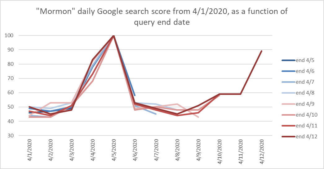
It’s not so much a pattern I find interesting here as that there are so many differences. From my (apparently simplistic) understanding of Google trends, since each of these series includes the peak day–April 5–then none of them should be different on other days. But they all are, depending on which other days are included.
On the bright side, the overall pattern is consistent, even though the daily values bounce around a little. I just show you this just to show that it’s general patterns that can be interpreted from Google Trends, but that particular values clearly aren’t set in stone.
For the comparisons I’ve done in this post, to reduce possible effects of when a series starts and ends, I got daily data from January 1, 2019 through the latest available in just two series: January 1 through August 31, 2019, and September 1, 2020 through May 13, 2020 in another series. I also used a slightly different approach to stitching the data together than I described in my first post. Rather than overlapping the daily series with each other, and using the scale differences to come up with a multiplier to make them comparable, I went back and also got the monthly values from Google Trends (by searching for an even longer series) and used the ratio of the monthly score to the average daily score for the month to scale all the daily values in the month. This method turns out to be much easier to use, and it has the added advantage of not having the possibility of compounding errors when multiple series are stitched together, because each month’s data is newly scaled against the month’s overall search score. I also found that it produces very similar results to the old method, which is comforting.
Okay, enough tedious discussion of the hows of the data. Let’s look at some results.
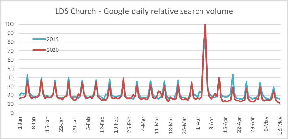
This graph is like the one I showed in my first post. It’s slightly different because I used the different method I mentioned to aggregate the data, but the pattern is the same: big General Conference peak, smaller Easter peaks offset by a week, and slight declines since church meetings were suspended in March.
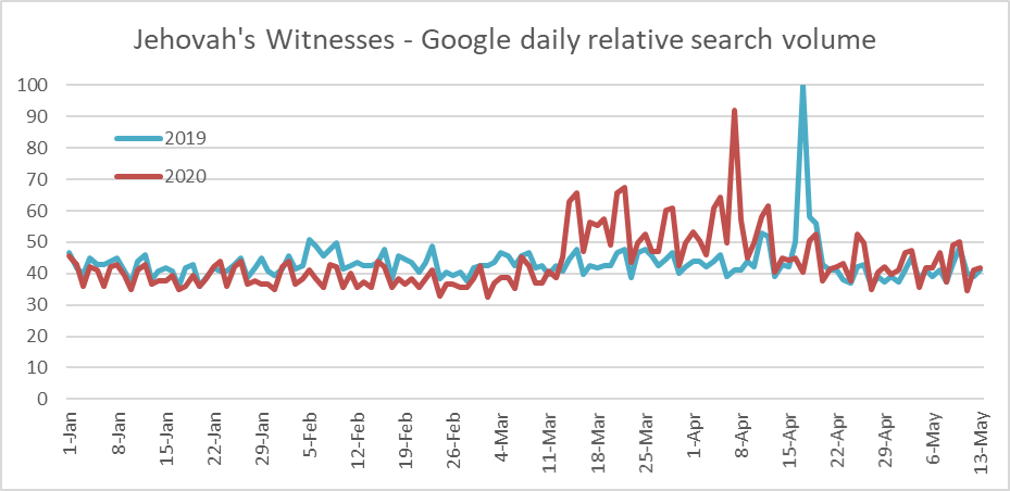
Of all the churches I looked at, the Jehovah’s Witnesses look like they have the least prominent weekly cycle of search activity. Maybe this means they’re good at actually doing religious study during the week. Also, their 2019 vs. 2020 pattern is interesting, with a bunch of 2020 activity far exceeding 2019 starting around the quarantine beginnings in March, but then dropping off to a similar pattern to 2019 since Easter.
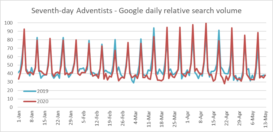
One thing these graphs hint at is how seriously different religions take Easter. We Mormons, for example, clearly think Easter is all well and good, but it’s no General Conference. From this graph, it looks like the Seventh-day Adventists might not make much of a big deal out of it at all. Also, they have probably the strongest weekly cycle of search activity, although of course it’s shifted back a day from most other Christians’.
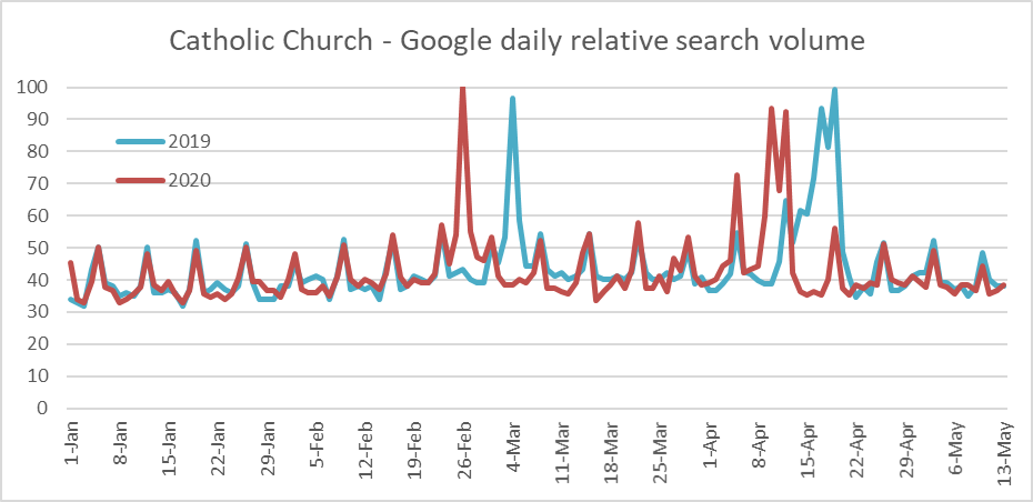
I think it’s fun how you can see part of the shape of a church’s liturgical calendar in these graphs. Those spikes in March in 2019 and February in 2020 are on Ash Wednesday. Then you can see the spikes later for Palm Sunday, Good Friday, and finally Easter. It looks like Good Friday and Easter were about as high for 2020 as for 2019, but Holy Saturday and the rest of Holy Week were quite a bit lower this year. Outside Holy Week, though, 2020 looks pretty similar to 2019.
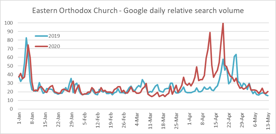
The Eastern Orthodox search scores are way up from 2019 to 2020, particularly around Holy Week. Maybe they did something new and dramatic for coronavirus time. Also, they bring a new entry to the liturgical calendar with spikes for Epiphany at the beginning of the graph.
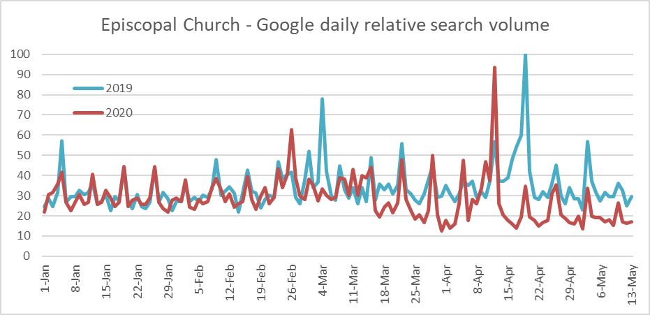
The Episcopalians have spikes like the Catholics and Eastern Orthodox, but it looks like their Good Friday search spikes aren’t anything like the Catholics’. Also, in comparing 2020 to 2019, they’ve suffered a big dropoff since quarantines began in the US in March.
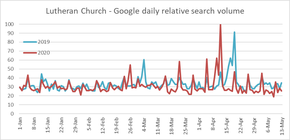
The Lutherans look similar to the Episcopalians, including having a dropoff since March 2020, although it appears only on weekdays. On Sundays, their scores are as high as last year, or even a bit higher.
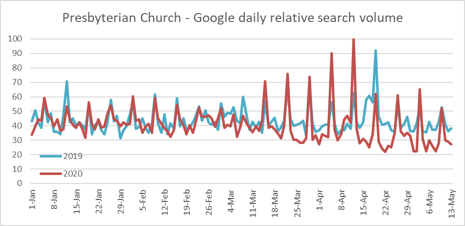
Wow! The Presbyterians have been up to something since the coronavirus hit. Their Sunday 2020 scores since mid-March are far higher than corresponding 2019 scores. This was particularly true leading up to Easter, but it remains true afterward too.
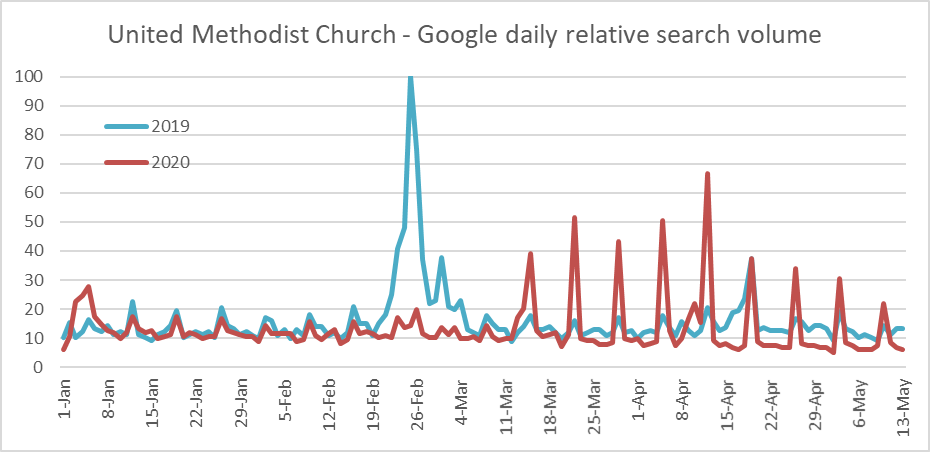
That big spike in February 2019 is of course associated with the much-discussed vote on same-sex marriage that it looks like will end up splitting the church in two. On a happier note, like the Presbyterians, while their 2020 search scores are lower during the week, their Sunday scores are far higher. I wonder if this is evidence of something like that they have a big program that embraces online church.
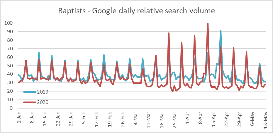
Like Presbyterians and Methodists, Baptists have higher search scores on Sundays since coronavirus quarantines began in the US in March, although at the most recent point, 2020 has fallen below 2019.
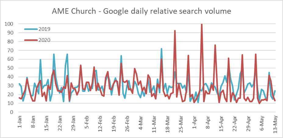
The African Methodist Episcopal Church is another that appears to be doing something online on Sundays since the coronavirus quarantines, because their Sunday search scores are higher in 2020 than in 2019. Easter 2019 doesn’t even have as high a search score as the corresponding ordinary Sunday in 2020.
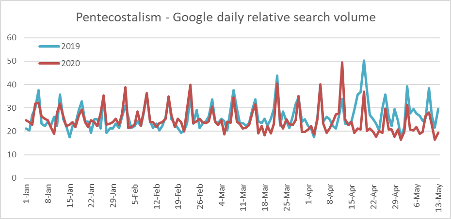
For most churches, the peak value shown in these graphs is 100, because their peak value occurs in January to May of 2019 or 2020. For Pentecostals, though, the peak value occurs at Pentecost 2019, which was too late in May to show up on the graph. Other than Easter, it looks like Pentecostals have had a decline in search score during coronavirus time.
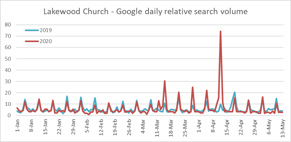
It looks like Lakewood Church really upped their game for Easter this year, or at least put it all online, because their search volume was up dramatically from Easter last year. They were up in the Sundays before Easter too, although it looks like they’ve dropped back near 2019 levels since then.
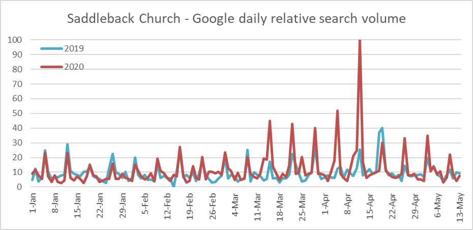
Saddleback Church also had a much higher search score for Easter this year than last. By reputation anyway, the megachurches are more open to embracing new ways of doing church than the stodgy old denominations, and at least this sample of two does seem consistent with the idea, as both of these megachurches have increased their search scores quite a bit during coronavirus lockdowns. Of course other churches like the Presbyterians, Methodists, and Baptists are also perhaps doing similar things.
Like I said earlier, these numbers are probably easy to overinterpret, and I understand if you don’t agree with my reading anything into them. I enjoyed putting them together, though, and I thought it might be fun to share them, flawed though they might be.
This is absolutely fascinating Ziff. Thank you.
Thanks, Hedgehog! I’m glad you enjoyed it.
I loved reading this! Fascinating!
Thanks, June!