Note: As Jim pointed out in the comments, I mixed up the ordering of the two most junior Q15 members, Elders Gong and Soares. I clearly need to work on my quality control. 🙂 In any case, as it was straightforward to do, I’ve corrected the yearly probabilities graph below. Because it would require more work, I haven’t fixed the remainder of the post with all the parent lifespan-adjusted probabilities. They’re still mostly correct; just ignore the lines for Elders Gong and Soares.
I’ve blogged a number of times about probabilities of Q15 members becoming Church President (see the bottom of this post for links). I’ve always used a pretty similar method to get probabilities: use a single mortality table for all members, simulate their predicted lifespans a bunch of times by drawing random numbers and comparing them to the mortality table, and then check what the implication is in each simulation for who gets to be Church President and for how long.
A suggestion that commenters have sometimes made is that I could adjust the expected lifespans of each Q15 member based on how long his parents lived, as surely longevity is at least partly heritable. In this post, I’ll show results from my attempt to make just such an adjustment. I’ve got to warn you, though: this is based on kind of seat-of-the-pants reasoning, and I’ll understand if you don’t buy the assumptions I made. See the Method section below if you want the details.
First, though, here’s an up-to-date version of the yearly probability of being President graph that I’ve also shown in a few previous posts. This doesn’t include the adjustments based on parent lifespan that I’ll talk about below. I just take the yearly mortality probabilities for each Q15 member, given their age, from the Society of Actuaries’ RP-2014 table (specifically, white collar males, employee up until age 80, and healthy annuitant after that), and for each member, his probability of being Church President in a year is his probability of surviving to that year times the probability that all the men senior to him have died by that year.
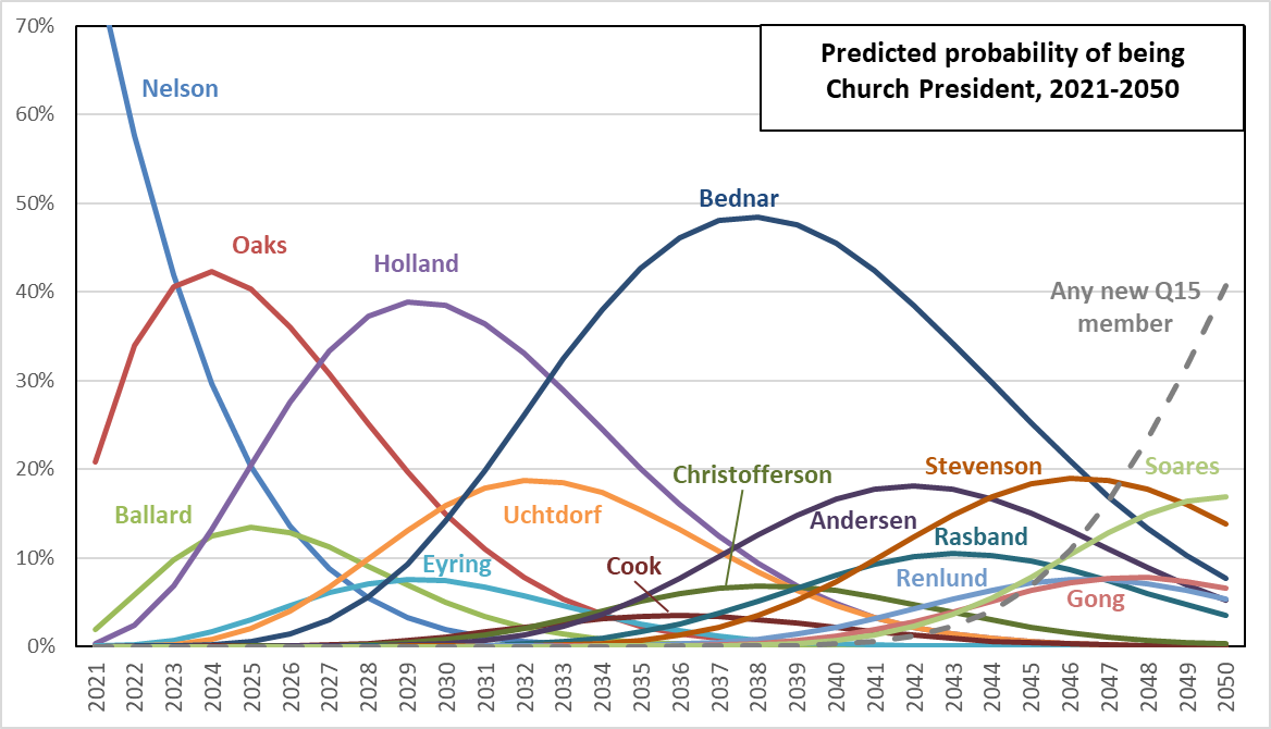
As has been the case since I first looked at this question over a decade ago, it’s President Oaks, Elder Holland, and Elder Bednar who look like the best bets to become Church President. Elders Uchtdorf, Andersen, Stevenson, and Soares might have a shot. The remainder are less likely.
However, keep in mind that the biggest weakness of this analysis is that a mortality table describes the lifespan of large groups of people, and works less well for small groups or individuals. If you’re placing bets on who in the Q15 might become Church President, sure, Elder Bednar is probably a better bet than Elder Cook. But in a tiny sample like 15 men, all kinds of things could happen. Elder Bednar might contract an incurable illness tomorrow. Elder Cook might live to be 110.
President Nelson is a great illustration of how big errors can get. In my first post on the topic, back in 2009, my custom mortality table gave him only a 23% chance of becoming Church President, and an estimated 2.4 years in the position if he did make it. He’s obviously made it to the top spot now, and he’s been in for over three years and seems to be going strong. Of course a 23% chance isn’t really that close to zero, but for sure if I had placed bets in 2009, I wouldn’t have predicted Elder Nelson would ever become President Nelson. So the method can make mistakes, big ones. But of course that doesn’t stop me from using it. I can hardly contain myself, as it’s just so darned entertaining to speculate and guess, and to cloak my guesses in at least a veneer of reasonableness.
Adjustment for Parent Lifespan
Okay, I promised that I’d show you probabilities adjusted for parent lifespan. In this table below, I show results for three simulations of probability of becoming Church President. Each simulation included one million replications (random number draws and figuring of life expectancy and who becomes Church President).
- In the columns labeled “Raw from mortality table,” I’ve used the mortality table as-is for each Q15 member.
- In the columns labeled “Adjust to 21st century avg,” I’ve adjusted the mortality table to increase life expectancy to match the average lifespan of all Q15 members who have died since 2000. (Ten Q15 members have died since 2000, with an average lifespan of 89.8 years. I adjusted the mortality table’s implied lifespan of 85.4 years up to 89.8 in the same way for all 15 current members. See the Method section below for details.)
- In the columns labeled “Adjust by parent lifespan,” I’ve adjusted the mortality table up or down from the 89.8-year life expectancy separately for each Q15 member, depending on his parents’ lifespans. Again, see the Method section below for details.
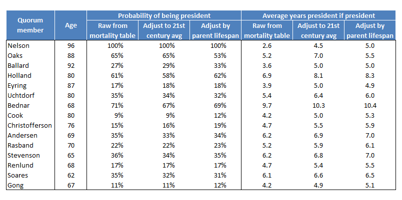
The adjustment to 21st century Q15 average life expectancy doesn’t change probabilities of becoming Church President much. It does reduce probabilities most noticeably for two of the most likely candidates, Elder Holland (falls from 61% to 58%), and Elder Bednar (falls from 71% to 67%), as well as for Elder Soares (falls from 35% to 32%), while it actually improves the chances for President Ballard (increases from 27% to 29%). The adjustment by parents’ average lifespan has some larger effects, including markedly reducing President Oaks’s chances (falls from 65% to 53%), as his father died quite young.
The years president if president increases for everyone in the adjustment to 21st century Q15 average life expectancy. I think this is probably what accounts for the general small decrease in probabilities of becoming president for the more junior Q15 members from this adjustment. If all Q15 members are expected to live longer, it’s that much more difficult to outlive everyone senior to you in the Quorum, particularly if you’re at the junior end. Overall, we would expect to have fewer different Church Presidents in any fixed period of time (e.g., a decade, a century) if lifespans are expected to be longer, so probabilities overall should go down. The second adjustment by parents’ average lifespan then doesn’t have much effect beyond the first adjustment, other than again markedly reducing the number of years president for President Oaks (falls from 7.0 to 5.5).
That’s it for the content. Continue on for the details of the method if you’re interested.
Method
For details of the simulation, see the Method section in this post. I followed the same approach here, other than here I ran one million replications rather than 10,000. In the remainder of this section, I’ll just be discussing the adjustments to the mortality tables.
For all Q15 members born since 1890 (I was going to cut off at 1900, but several were born in the 1890s so I decided to go back an extra decade), I recorded their birth date, their death date (if deceased), and their parents’ birth and death dates (if deceased–two current Q15 members each have one living parent). Dates for Q15 members themselves are obviously easy to get, as they’re public figures. I got dates for their parents from FamilySearch.org. For each of the two living parents, I was fortunately able to find news stories that gave their ages, so I was able to get their birth year at least, to within a year.
I started by looking at the deceased Q15 members’ lifespans as a function of their parents’ average lifespan (i.e., the average of the two parents for each Q15 member). I hoped this might let me estimate how to adjust living Q15 members’ predicted lifespans as a function of how long their parents lived. Here’s a scatterplot showing the relationship, for all Q15 members born since 1890 and now deceased.
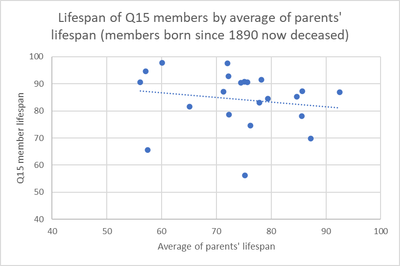
Each member is represented by a dot. The horizontal distance gives the average of his parents’ lifespans (note that the axis starts at 40 years). The vertical distance gives the Q15 member’s lifespan (also with the axis starting at 40 years). For example, the rightmost point in the graph is for Richard G. Scott, whose parents lived an average of 92.5 years, and who had a lifespan himself of 86.8 years.
The line is a least squares regression line. In this graph, it is bad news because you would expect it to increase as you go left to right across the graph. That is, the relationship between a person’s lifespan and their parents’ average lifespan is expected to be positive, so members whose parents had longer average lifespans should themselves have longer lifespans. Instead, it’s close to flat, and actually points downward a little. This is just another manifestation of the same problem as the issue with predicting who will be Church President, though. In a small sample (the graph has just 22 data points), all kinds of strange things can happen.
If a Q15 sample doesn’t give a good estimate of the relationship between parents’ lifespan and their children’s lifespan, I figured I could find an example from an academic paper that has a larger sample, even though of course it won’t be Q15 specific. I found this 2017 article from the journal SSM – Population Health, which analyzes several generations of births and deaths in a Swedish sample. Helpful to me, it has a scatterplot similar to the one I have above, but for lifespans of 620 sons as a function of their parents’ average lifespan (see the right panel of Figure 4 in the article). Of importance for my analysis, the authors even report that the coefficient for the regression line has a value of 0.11. In a one-predictor regression like this, the coefficient tells how much the predicted value changes for a one-unit increase in the predictor. The units of both the predictor and outcome variables are years, so the coefficient of 0.11 says that for a one-year increase in parents’ average lifespan, son’s predicted lifespan increases 0.11 years.
The authors of the paper don’t report the Y-intercept for the regression, but I wouldn’t have wanted to use it even if they had. The purpose of the first adjustment, to the 21st century average Q15 member lifespan, was to give a better estimate of the average lifespan anyway (i.e., taking into account any added longevity associated with, among other things, marriage and long-term tobacco abstinence). Using the Y-intercept would mean in effect borrowing the average life expectancy from the sample in the paper, when all I really wanted was to borrow the relationship between parents’ average lifespan and son’s lifespan.
In a one-predictor regression, the Y-intercept gives the predicted value of the outcome variable when the predictor variable is zero. In terms of this regression, then, it would be the predicted lifespan of a man whose parents have an average lifespan of zero years. Mathematically, of course, you can calculate it for the regression line, but it’s hard to come up with what a sensible value should be. Instead of starting with a Y-intercept, then, I started with what I wanted the average predicted value to be. I chose 89.8, which as I mentioned above is the average lifespan of Q15 members who have died since 2000. Then I adjusted from that using the regression coefficient of 0.11, and the difference between the Q15 members’ parents’ average lifespan and the average of the parents’ average lifespan, which is 82.3 years. (Note that for the two living parents of Q15 members, I didn’t want to add complexity by getting into different possibilities for how much longer they might live, so as they are both at least 95, I entered their lifespan as current age plus two years.)
Here’s an example of the calculation. Elder Cook’s parents had an average lifespan of 88.7 years. This is 6.5 years longer than the average of the parent averages (82.3). Multiplying the 6.5 years by the regression coefficient of 0.11 gives 0.7 extra years, so Elder Cook’s predicted lifespan is the 21st century average of 89.8 plus 0.7, which yields 90.5 years.
President Nelson’s expected lifespan from this calculation is 90.8 years. But in reality, he’s 96. Does this mean the adjustment says he’s already dead? No. With the adjustment, I was just getting to an adjusted life expectancy for each man, and then the last step was to convert the adjusted life expectancy into adjusted mortality table values that I could then use in the simulation.
The values in a mortality table give the probability, given how old a person is, that they’ll die in the next year. If you take a set of these values together, starting from a particular age, they imply a particular life expectancy. Let me illustrate with a little made-up example.
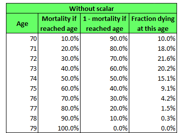
The values in the second column are usual mortality table values. For example, in the first row, 10% means that a 70-year-old has a 10% probability of dying in the next year. In the third column, I’ve just calculated the probability of survival, or one minus the probability of dying. Then, in the last column, I’ve calculated the fraction of a group of 70-year-olds who would be expected to die at each age as they progress through the table. In the first row, it’s a simple calculation: 10% die, so 10% of all the 70-year-olds died at age 70. Starting with the next row, though, it’s a little more complicated. I have to take into account that not everyone even reaches that age to begin with. In the second row, for example, 20% of those who made it to age 71 died at that age, but from the first row, third column, only 90% of 70-year-olds even survived to age 71, so 20% of that 90% is 20% × 90% or 18% of 70-year-olds die at age 71. For each row after the first, the fraction of the population of 70-year-olds reaching it is the product of the survival probabilities (in the third column) for all previous rows. For example, for age 74, the fraction surviving to age 74 is 90% × 80% × 70% × 60%, which is 30.2%. This is then multiplied by the mortality rate of 50% given having reached age 74 (in the first column) and it yields the fraction of the original group of 70-year-olds who die at age 74, which is 30.2% × 50% = 15.1% (in the last column).
Once this is done for every row in the table, the fractions add up to 100%. The life expectancy is just the average of the ages, each weighted by the fraction of 70-year-olds expected to die at that age. So here it’s calculated as 70 × 10.0% + 71 × 18.0% + . . .+ 79 × 0.0%. The result is 72.7. (Note that when calculating a weighted average, you typically need to divide by the sum of the weights after multiplying each value by its weight, but in this case, because the sum of the weights is 100%, or 1, then dividing by it has no effect.) This is the life expectancy implied by this mortality table for a 70-year-old.
As I said above, what I needed to be able to do was to modify the values in the mortality table, like those in the second column of the example table above, to make them consistent with a different life expectancy. Again, the problem is that in the adjustment for average parents’ lifespan that I did above, I ended up with a modified life expectancy. But the simulation doesn’t use a life expectancy as an input; it needs a mortality table.
So here’s what I did. I applied a scalar, or a constant multiplier, to each mortality probability in the table, and then observed its effect on the implied life expectancy. Using trial and error, I then adjusted this scalar up or down until I got the table to give the life expectancy I wanted. In the table below, I show the result when I adjusted the mortality table to get a life expectancy of 74.
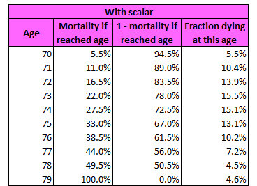
The scalar value is found by trial and error is 0.55, so each mortality probability is 0.55 times the size of the value in the previous table. For example, for age 70, 5.5% = 0.55 × 10%. The life expectancy is calculated in the same way as before, by taking the average age at death, weighting each by the fraction dying at this age in the fourth column, and it is 74. That is 70 × 5.5% + 71 × 10.4% + . . . + 79 × 4.6% = 74.
I did this same process, but using the SOA mortality table, and for ages 50 to 120, to make the adjustment of all Q15 members’ life expectancy to match the 21st century Q15 average of 89.8. Then I repeated the process separately for each Q15 member to get a scalar that would move his life expectancy to the value resulting from the average parent lifespan adjustment process described above. For example, for Elder Cook, I found a scalar that would make the life expectancy implied by the table 90.5 years, because that’s the adjusted life expectancy I previously calculated for him.
Note that I started the life expectancy calculation at age 50 because this is a recent lower bound for the age at which Q15 members are called (Dallin H. Oaks was 51 when he was called in 1984). I didn’t want to take into account mortality probabilities at earlier ages because if a man died before about age 50, he wasn’t going to be considered as a candidate for the Q15 anyway.
One question you might ask is why I used a constant scalar to make these adjustments to the mortality tables. In fact, the paper I took the regression coefficient from for relating parents’ average lifespan to son’s lifespan also reports an analysis that shows that the effect of parents’ average lifespan is not predictive for men’s longevity after age 85. This suggests that scalars later in life should be closer to one (i.e., less adjustment) than scalars earlier in life. I did try a couple of more complex scalar assignment schemes, but they turned out to be more complex than I wanted to fight with, so I am just showing this one because it is the simplest.
Of the three analyses reported in the blue-topped table above, the first analysis used no scalars, the second used a single scalar (and resulting adjusted mortality table) for all 15 Quorum members, and the third used a separate scalar (and resulting adjusted mortality table) for each Quorum member. Once I had the adjusted mortality tables in hand, the process of the simulation worked the same as it did for the unadjusted analysis: I drew a bunch of random numbers, compared them to mortality tables to find age at death for each Q15 member, and then worked out from the order in which Q15 members were expected to die, who would get to be Church President and for how long.
Ultimately, I feel like this whole line of analysis where I adjust mortality rates based on parent lifespan is probably not worth pursuing further. The biggest problem with the analysis of who is going to be Church President in the first place is that the Q15 are such a small sample that they’re unlikely to behave like the mortality table expects. With this analysis, I’m only exacerbating the problem by taking the one strength–the SOA mortality table is I’m sure based on a huge amount of data–and throwing it away by adjusting it to make custom mortality tables.
Previous posts on this topic
That’s *President* Soares to You: Probabilities of New Q12 Members Becoming Church President [April 2018]
Yearly Church President Probabilities for Current Q15 Members [January 2018]
Church President Probability Changes with President Monson’s Death [January 2018]
Estimating New Q15 Member Calls by Future Church Presidents [November 2016]
Predicting Who Will Be Church President (Updated with new Q15 members!) [October 2015]
Church President Probability Changes with Elder Scott’s Death [September 2015]
Church President Probability Changes with President Packer’s Death [July 2015]
Church President Probability Changes with Elder Perry’s Death [June 2015]
Predicting Who Will Be Church President: Fit of Actuarial Mortality Table to Historical Data [May 2015]
Could President Uchtdorf Become *President* Uchtdorf? [April 2015]
Predicting Who Will Be Church President (Now Continuously Updated!) [April 2015, no longer continuously updated]
More Church President Probabilities [November 2009, a historical view since 1950]
Predicting Who Will Be Church President [October 2009]
If something happens that was only predicted to happen 23% of the time, that does not mean that the model was wrong. It means the model was absolutely correct. So the author need not apologize for anything here.
Nonetheless, there are many, many Church members who are genuinely hoping that President Nelson outlives President Oaks. Young people especially fear that an Oaks administration would lead to backward movement, rather than progression. This could lead to an acceleration in the number of youth have leave.
You’re the coolest nerd ever.
I agree, Rudi. President Oaks could be very difficult. I’m holding out hope for Elder Uchtdorf making the top spot!
ViolaDiva, thank you! You’re very kind.
Ziff,
Posts like this put much of the rest of the bloggernacle to shame. The time and expertise it took to post this were intense. I know there haven’t been many comments, but your analyses have been referenced for many years by countless readers. Thank you for sharing your stats with us.
I pray that the church has done a similar analysis and is aware of Elder Bednar’s arch. If I were in the FP (that static feeling you might be sensing comes from standing nearby as a lightening bolt being is being aimed at me for just saying that), I would be sending Elder Bednar into intense spiritual training. Since we already know he is an apt administrator and disciple (meaning -creates discipline for religious devotion), I would send him away to do something completely different- build empathy and experience life among the humblest of saints and non-Mormons. I’d send him to serve w/o purse or script in depressed areas, incognito and without his title. I’d have him roll up his sleeves and try to help people by meeting them where they are, one on one. He would lay down much of his administrative apostolic duties and lean into apostolic ministering and service. He’d seek to align with the struggles and perspectives of ordinary people for an unspecified number of years. Until he was called back to SLC to the the president, he’d be on assignment, living an Albert Schweitzer-like life. Perhaps we can track down the three Nephites and make him their 4th companion so they can do more splits. Something like that. Do you remember when Elder Oaks was sent to the Philippines for two years to get out of the other apostles thinning hair, er, I mean build up the church there? Perhaps something like that. If I were Elder Bednar (again, it’s feeling static-y in here), I would want to volunteer to go on some sort of journey like this for as many years as I could before the inevitable long, hard haul as President.
You don’t need to work out the stats of my crazy idea ever materializing. I know. I know.
Wow, thanks, Mortimer! You’re very kind. And I love your idea of Elder Bednar being sent off for some empathy training!
Thank you for sharing this invaluable data and all the time and expertise that went into making it. Although I believe that the cause of Zion will continue to move forward in spite of whatever foibles the individuals at the helm bring to their office, it certainly gives me pause when I consider the projections you lay out in your data and the implications for progress in the 21st century church.
Ziff, this is great. You show the quorum members in order of seniority, but Elder Soares is the most junior member, not Elder Gong. This should increase Elder Gong’s chances.
Thanks for the correction, Jim. I’m not sure how I managed to get them out of order!