As the Church rushes to build ever more temples for a membership that’s now growing only slowly, the GAs must face the question of whether new temples are actually bringing in new patrons. Because that’s the goal, I would think: to make the temple accessible to members who couldn’t get to it before.
When a temple is first built in a place, a country or a region of a large country, it should draw in many new patrons who couldn’t attend (or at least couldn’t attend regularly) before. In large countries like Brazil or countries where travel may be difficult like The Philippines (I’m just guessing, with all the islands), it makes sense that building temples in different regions would make temple attendance accessible to more members. But at some point, when most members who want to go can go, a new temple is likely to just redirect temple patrons from one to another rather than actually bringing in anyone new.
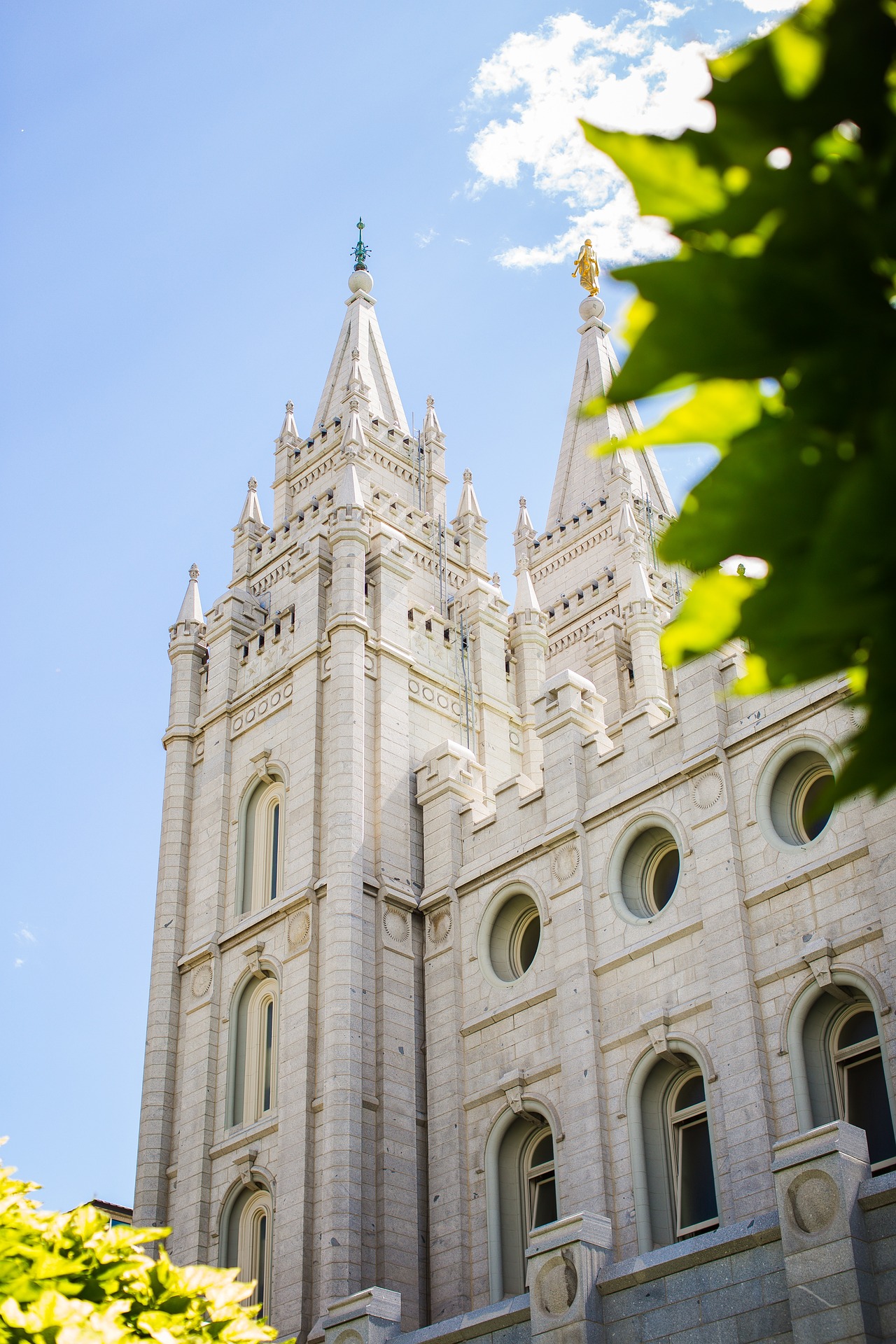
Utah is the obvious place where this point of diminishing returns for new temples is coming, if in fact it hasn’t already arrived. I thought it would be interesting to take a look at attendance there as a preview for what might happen as more and more parts of the world approach a point of temple saturation.
Between April and December of last year, on a nearly daily basis, I checked the number of available seats for endowment sessions in each temple in Utah for the next day. I also checked the number of available seats for sessions a month or two in the future to get an idea of each session’s capacity. (And to account for the fact that a few seats are scheduled even a month or two out, I took the capacity for each session as the maximum of any capacity for a session on the same day of the week and at the same time on any day within 60 days of the day of the session.) I then took the difference between capacity and seats remaining the day before as the number of endowment session patrons.
I originally planned to show graphs of daily patron counts, but there’s so much variation within weeks that it’s hard to see trends, so I’m going to show weekly counts instead. Also, to make the data easier to look at, when a temple was closed for just one day (like July 4th) or for the few days when I missed gathering data, I filled the day in with the average for the same day of the week within 30 days in the past or future.
Because the question I’m interested in is the effect of one temple on another nearby, I’ll show a few pairs of nearby temples. Here are Jordan River and Draper.
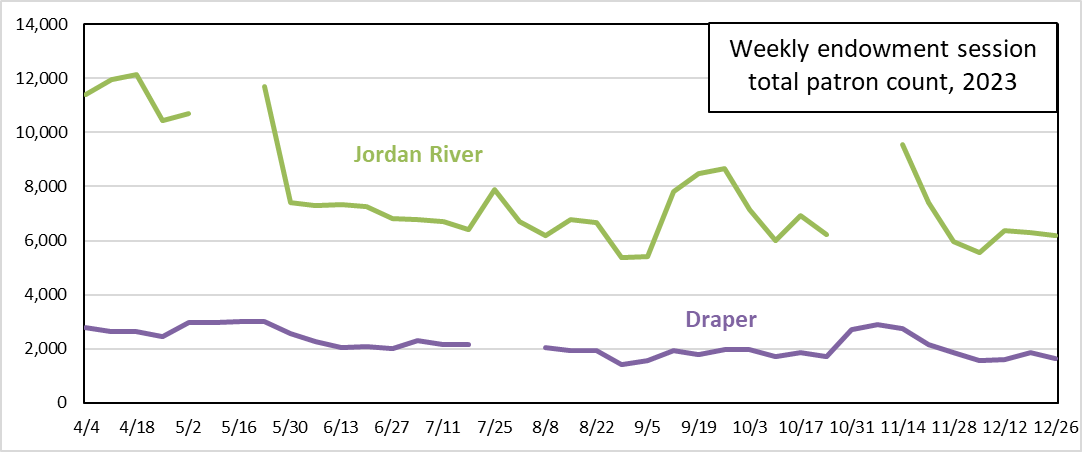
Both temples show increased attendance when the other closed. In May, when Jordan River closed, Draper’s weekly counts went from about 2600 to about 3000. And again in October, its weekly counts went from about 1800-1900 to about 2800. On the Jordan River side, when Draper closed in July, its weekly count went from the range of 6000-7000 to nearly 8000.


