How well does a mortality table predict Q15 member lifespan?

This is a question people quite reasonably often ask when I blog about which Q15 members are likely to become Church president, using a mortality table as my guide. In this post, I used the same SOA mortality table I’ve been using to forecast longevity, and applied it to Q15 members who have already died, to see how well it predicted when we already know the outcome.

Of course a big weakness of this analysis is that Q15 members aren’t a big group, so it’s hard to say with much certainty how well the table is doing. In order to expand the sample a little, I looked back to all Q15 members who were in their positions in 1950 or who have been called since then, and have since died. For each month of each Q15 member’s life, starting from the later of January 1950 and his calling date, I checked how many actual months of life he had left, as well as what the SOA table said about how much life he had left.

“What the SOA table said” isn’t one number, though, because the table just gives, at each age, the probability of dying in the next year. (It breaks these down by employees and retirees, by women and men, by white collar and blue collar, and by disabled and non-disabled. I always use the white collar non-disabled men, the employees series as long as it goes, and then the retiree series.) What I do is to use these one-year mortality probabilities to find an implied distribution of probabilities of how much more time a man of a particular age has remaining. Really, what I want is just some summary statistics from that distribution: the mean and several percentiles, namely the 5th, the 25th, the 50th (also called the median), the 75th, and the 95th. At the end of the post, if you’re interested, I give a little more detail on this process.

This graph below shows a comparison of what the mortality table predicted versus how long a few Q15 members actually lived. The horizontal axis shows age, and the vertical axis shows years of life remaining. In the lower left, Bruce R. McConkie at age 66 (the left edge of the graph) had fewer than 4 years of life left, as he would die at 69. Cutting through almost the middle of the graph, Gordon B. Hinckley at age 66 had over 30 years left.


What’s interesting, of course, is the comparison of these actual life spans to what the mortality table would have predicted. The dashed black line shows the median of the distribution of probability implied by the mortality table at each age. As you can see, it flattens out as age approaches 100, as it always predicts at least a little more life (at least until age 120, where it gives a mortality probability of 100%). I haven’t shown the mean because it’s very similar to the median, falling a bit below it for younger ages, and a bit above it for older ages.

Read More

Church President Probabilities: 10,000 Possibilities

Frequent commenter DaveW used the results of the Monte Carlo simulation from my last post on Church president probabilities to put together this fun follow-up post (and as an added bonus, he corrected an error in my post that came up from cutting off the simulation at 360 months).

I love numbers and spreadsheets and attempts to predict the future that rarely work out, so I’ve been a long time fan of Ziff’s work in projecting the future of the presidency of The Church. Longtime readers will be familiar with his Church President Probability posts going back to 2015. Ziff has done an admirable job of building a model and running 10,000 simulations to compile a view of things that are likely to occur with the presidency of the church. But I’ve always wondered, what about the improbable scenarios? What are the craziest outcomes in his 10,000 simulations that aren’t likely to happen, but still certainly could? Well, Ziff has been kind enough to let me look through his results, and now I guess he’s letting me share them here on ZD.

These uncommon outcomes come from Ziff’s work, so he deserves most of the credit here, but I did make one small improvement. His simulations only went 30 years into the future, which is generally pretty good for talking about the lifespans of senior citizens, but in some instances we needed a few more years to see how things would play out, so I extended his forecasts as much as an additional 20 years, so we can really see the outliers. One impact is that Ziff is slightly underestimating the odds that Kearon will become president some day (it’s more like 38%, not 34%), and the average time as president is a bit higher for the younger apostles (Kearon’s average should be more like 6 years, not 4).

Like all the super hero movies they seem to make now, these 10,000 simulations open us up to 10,000 possible universes. Almost anything can happen in the multiverse. So let’s explore some strange new worlds

World 2803: Some things can last forever?
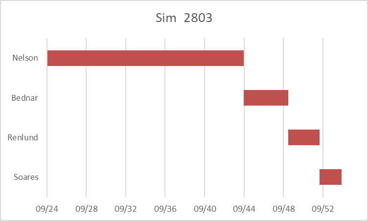
The Q15 stay very healthy, and Andersen is surprisingly the next to go in 2027. Then Oaks goes in 2031 just before his 99th birthday, followed quickly by Uchtdorf that same year. In 2033 we lose Eyring (99), and Christofferson and Gong. Cook lasts until age 96 in 2037, and Holland until age 99 in 2039. And who is still in the biggest of the red chairs through all of this? Nelson, who makes it to his 120th birthday before finally turning the keys over to Bednar in September 2044. No one else reached 120 in any of the simulations. Eyring was the only one to crack 115, with 1 scenario where he made it to 118. The chart below shows the presidential succession through all the current Q15 for the simulation. (The x-axis shows the month and year.)

Read More

Church President Probabilities, Updated for President Nelson’s Birthday!

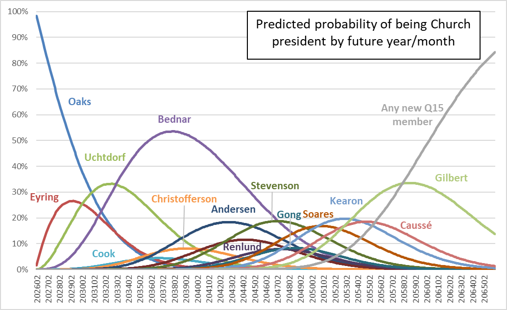
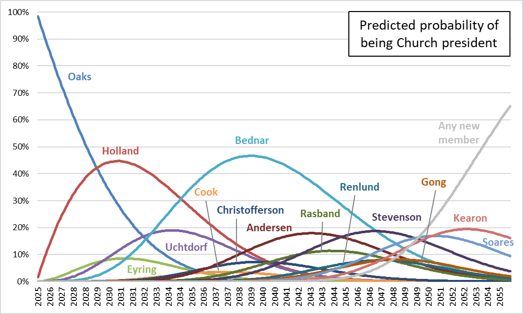
Russell M. Nelson turned 100 this week, so it seems like a good time to look at probabilities of who among the Q15 is likely to become Church president in the future. If you’ve read ZD for any length of time, you’ve probably seen me do this before. Here’s my most recent post (and here’s a follow-up post). I’m following the same method I’ve used in the past. Using this handy mortality table produced by the Society of Actuaries, I estimate the probability of each Q15 member having died for a number of times in the future. Then, using the logic of seniority and succession, I can calculate the probability of each member becoming president from the probabilities of (1) all members senior to him dying, while (2) he survives. One small change I made this time versus previous times is that I looked at monthly points in the future rather than yearly points. It’s nice to make more fine-grained graphs, but it doesn’t change the results materially. For more on the method, see the “Method” section in my 2023 post.

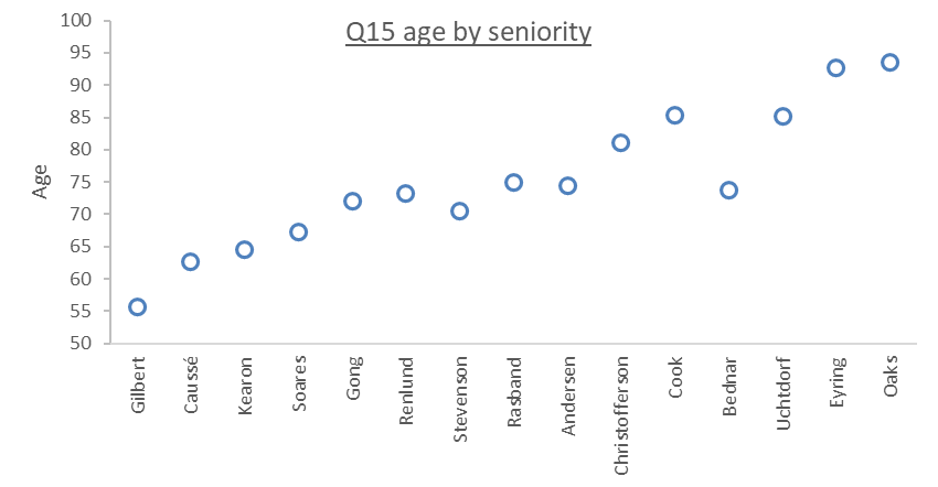
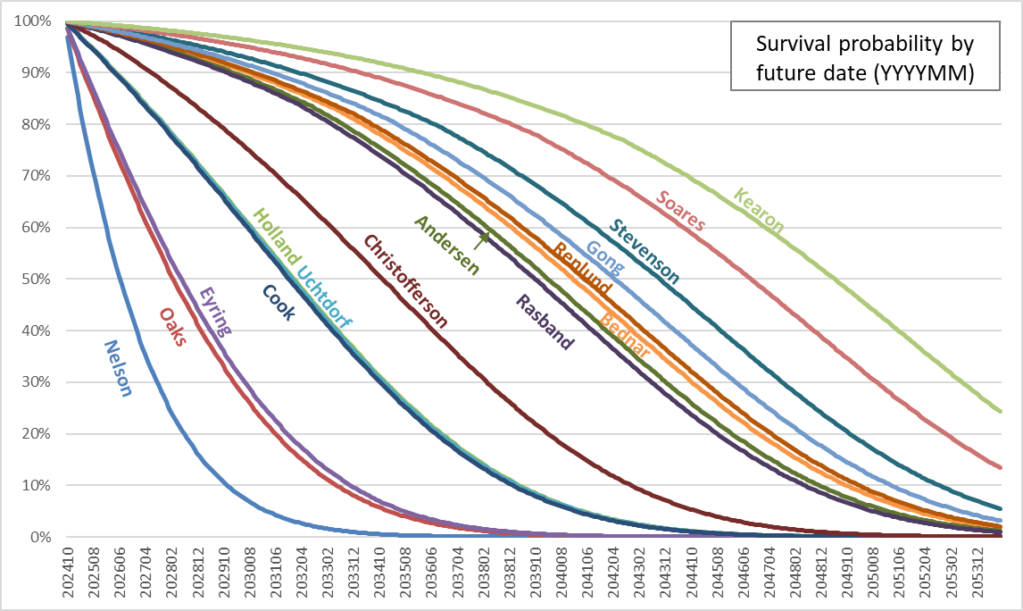
This first graph shows each Q15 member’s estimated survival probability out to 30 years (360 months) in the future. Calculating this has always been a step in the process, but I had never graphed it before and I thought it might be interesting to look at. What’s striking, I think, is where a man falls out of line with those near him in succession order. For example, Elder Bednar is between Elders Andersen and Renlund, but of course in seniority, he’s ahead of them, as well as Elders Rasband, Christofferson, and Cook, even though he is younger than they are.


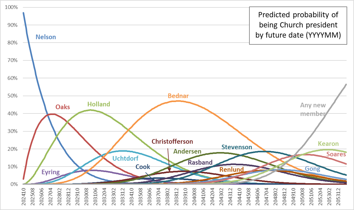
This next graph shows probabilities of becoming Church president by year.


Read More

Temples Announced and Temples Completed

Back in 2020, I wrote a post where I looked at the large number of temples President Nelson was announcing, in contrast with the slow pace at which their construction was taking place. Of course since then, the pace of announcements has only increased. In that post, I mentioned that he had announced 24 across the previous year and a half. Now, he announced 35 new temples in each of the past two years, and slowed only a bit to 15 in Conference a few weeks ago. In this post, I’m going to update the analyses I did for the 2020 post, as well as adding a couple of new ones. Nearly all my data is just taken from the Church’s list of temples, which lists announcement, groundbreaking, and dedication dates.

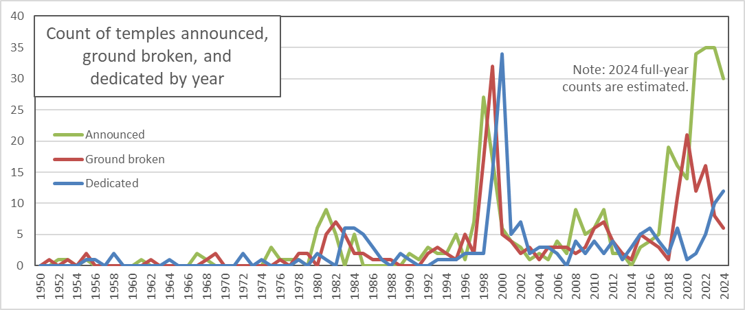
This first graph shows counts of temples announced, temples having ground broken, and temples dedicated each year since 1950. Note that for 2024, I estimated announcements as two times the number we’ve already had (as we’ve had one of two Conferences), and ground breakings and dedications as three times the number we’ve already had (as we’re about a third of the way through the year).

The biggest feature is of course the turn-of-the-millennium rush to get to 100 temples, where a bunch were announced, had ground broken, and were dedicated in pretty short order. The recent increase in announcements hasn’t been followed as reliably by groundbreakings and dedications, although dedications are clearly up since the pandemic. But they aren’t nearly up to the level of announcements.

Read More

Reading Comments on the Church’s Instagram Post

A couple of weeks ago, the Church put up an Instagram post with a quote from J. Anette Dennis of the Relief Society General Presidency from her talk in the Relief Society broadcast. The quote begins, speaking of the Church:

There is no other religious organization in the world, that I know of, that has so broadly given power and authority to women.

The quote continues for a couple of paragraphs that add some context, but it has been edited since it was first put up, and I believe it was originally just this quote. In any case, it drew thousands of comments on Instagram, many from commenters saying this is obviously false. Comments were deleted a couple of days into the discussion, which provoked further outrage and sadness from commenters, but fortunately they were eventually restored and the discussion continued. The Church social media team (and many commenters) said this was a broader platform issue, although a Meta spokesperson quoted in a New York Times story (gift article—no subscription required) denied this.

The blowup was also covered in the Salt Lake Tribune. From the more apologetic side, the Deseret News published a couple of opinion pieces from women who don’t feel unequal in the Church, and Public Square Magazine put up a response to the New York Times article. From the more critical side, the Salt Lake Tribune published an opinion piece from Rosemary Card, April Young Bennett at the Exponent traced the line of thinking to then-Elder Oaks trying to placate Ordain Women a decade ago, and Lisa Torcasso Downing at Outside the Book of Mormon Belt wrote an extensive response to an apologetic post on Facebook. Molly at Roots and Reckoning also curated and categorized a few hundred of the best quotes from the Instagram discussion at her blog.

I thought it would be interesting to read all the Instagram comments. I found a handy tool called IGCommentExporter, and it pulled 12,578 comments into a csv file for me. I read through them and tagged them with themes they brought up and noted some of my favorites, and that’s what I’ll tell you about in this post.

Before I get to that, though, let me tell you about some limitations in the data and my work:

  • Instagram currently says there are over 17,000 comments on the post, so when I scraped them on March 21st to start this project, I only got about 70% of them. This means that I didn’t include Sister Dennis’s follow-up comment, or any responses to it.
  • At least a few people appear to have deleted their comments. I say this because in what I read, there were a lot of responses tagging commenters who appeared to have few to no comments themselves.
  • The comment scraper couldn’t give me the structure of the comments, by which I mean which were replies to another commenter and which were top level. I was able to reconstruct this for about 6,000 comments by just manually loading them in my browser and using a link scraper, but for the rest, I just had to infer based on timing and who, if anyone commenters tagged.
  • You can probably guess my bias, but just to be clear, I agree with April Young Bennett. I think the whole idea of women having the priesthood in some way is clearly just a hand-wavy explanation that Dallin H. Oaks came up with in an attempt to shut Ordain Women up without actually making any changes in the Church. The only way Sister Dennis’s quote can be made sense of is to start with the idea that LDS priesthood is real and all others are fake, so of course any access to it at all—even mediated through men—is better than even the best access to the fake priesthoods of other churches. (By the same logic, you could make all kinds of other absurd arguments, like that LDS churches are the most beautiful churches in the world because they’re the only real churches, and everyone else is just “playing church” [thanks, Brad Wilcox].)
  • I’m sure my bias played into how I tagged themes in comments. As you’ll see, I used more granular theme tags for critical comments than apologetic ones.
  • I probably should have made the theme tagging more granular in general, but at some point, reading through all the comments was a long process, and I had to stop tinkering with it and go with what I had.
  • Even setting aside my biases, I probably wasn’t the most reliable tagger, meaning that if I had read through the comments more than once, I likely wouldn’t have assigned exactly the same set of tags both times. (Serious researchers do things like estimate reliability of people doing ratings by having multiple raters, but it would seem unfair to rope anyone else into reading all the comments with me.)
  • I couldn’t always figure out commenters’ meaning, especially when they commented with only an emoji. For example, it was hard to distinguish laughing at from laughing with. I was fortunate that I could ask my teenage daughter the meaning of a few slang terms.
  • I had hoped to do some analysis of likes of comments, but unfortunately my comment scraper didn’t gather them. I tried to sample some manually, but it was clear that Instagram was showing me commenters it thought I would like first, so my sample was inevitably going to be biased, so I had to give this up.

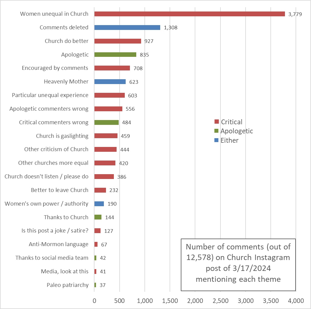
Is that enough caveats? Okay, here’s what I found. I read 12,578 comments. I assigned each comment at least one tag, a total of 16,921 tags, or about 1.3 per comment. This graph shows how often the tags were used.

Read More

Utah Temple Utilization in 2023

When I blogged last month looking at temple activity in Utah, and how patrons move between temples when their first choice is closed, several commenters asked about utilization: What fraction of endowment session seats are being filled? In this post, I’ll show some summaries from the same endowment session data I used in the last post.

But first, commenters also pointed out that I left out a huge disclaimer in that post: The data I have is only for people who schedule online. Online scheduling is still relatively new (maybe even only becoming available during Russell M. Nelson’s presidency if I remember right), and many members therefore have decades of experience just going to the temple for endowment sessions and counting on open space being available. So it wouldn’t be surprising if a substantial fraction of temple patrons don’t show up in my analysis because they didn’t schedule online. Also, to be complete, it’s also possible that people could schedule a place but then not show up for their appointment, although I’d guess that’s probably less common. In sum, the true attendance numbers are very likely higher, perhaps much higher, than what I’m showing. I’d love to hear from anyone who’s a temple worker or attender what their impression is of how many people attend without scheduling online or how many schedule online and then don’t attend. And thanks again to commenters on my last post who raised this issue and shared their experience with this.

While I’m offering that big caveat, let me tell you about two other smaller one related to data exclusion. First, in looking at utilization, I’m using only English language sessions. Utilization rates for sessions in other languages are affected by a second effect in addition to members’ general interest in attending the temple: the number of members nearby who speak the language the session is presented in. For English, there are presumably always plenty of members nearby who speak the language, so differences in utilization can be attributed more straightforwardly to differences in willingness to attend. The second exclusion of data is that I dropped all Monday sessions. Provo consistently had a few sessions on Mondays, but because it was the only temple open for endowments that day, I didn’t consistently gather the data. It’s only a small number of sessions anyway, so I just excluded all Mondays.

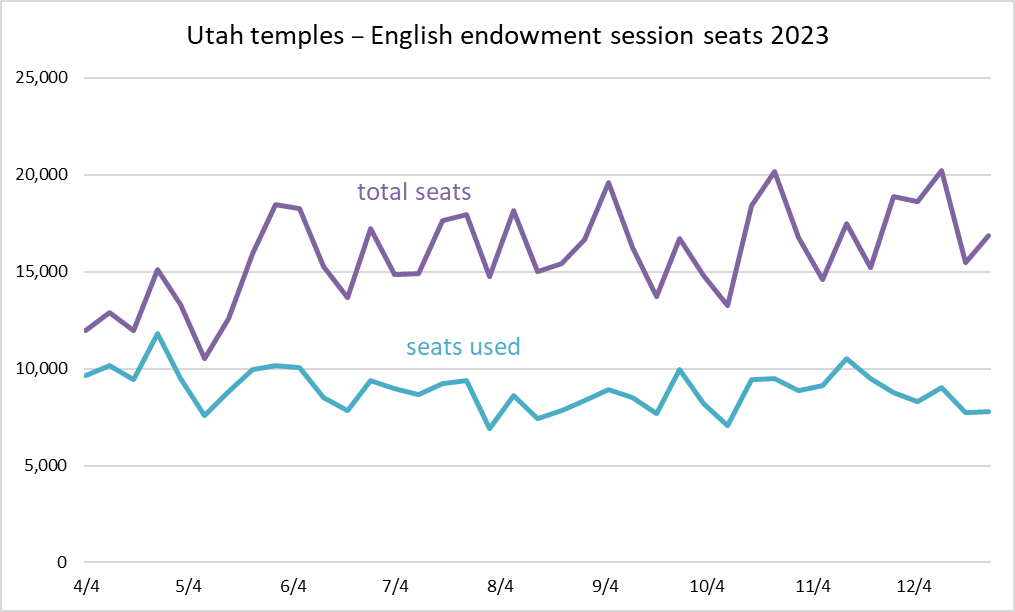
This first graph shows counts of total endowment session seats and seats used, aggregated across all Utah temples.

Read More

Do new temples bring new patrons?

As the Church rushes to build ever more temples for a membership that’s now growing only slowly, the GAs must face the question of whether new temples are actually bringing in new patrons. Because that’s the goal, I would think: to make the temple accessible to members who couldn’t get to it before.

When a temple is first built in a place, a country or a region of a large country, it should draw in many new patrons who couldn’t attend (or at least couldn’t attend regularly) before. In large countries like Brazil or countries where travel may be difficult like The Philippines (I’m just guessing, with all the islands), it makes sense that building temples in different regions would make temple attendance accessible to more members. But at some point, when most members who want to go can go, a new temple is likely to just redirect temple patrons from one to another rather than actually bringing in anyone new.

Utah is the obvious place where this point of diminishing returns for new temples is coming, if in fact it hasn’t already arrived. I thought it would be interesting to take a look at attendance there as a preview for what might happen as more and more parts of the world approach a point of temple saturation.

Between April and December of last year, on a nearly daily basis, I checked the number of available seats for endowment sessions in each temple in Utah for the next day. I also checked the number of available seats for sessions a month or two in the future to get an idea of each session’s capacity. (And to account for the fact that a few seats are scheduled even a month or two out, I took the capacity for each session as the maximum of any capacity for a session on the same day of the week and at the same time on any day within 60 days of the day of the session.) I then took the difference between capacity and seats remaining the day before as the number of endowment session patrons.

I originally planned to show graphs of daily patron counts, but there’s so much variation within weeks that it’s hard to see trends, so I’m going to show weekly counts instead. Also, to make the data easier to look at, when a temple was closed for just one day (like July 4th) or for the few days when I missed gathering data, I filled the day in with the average for the same day of the week within 30 days in the past or future.

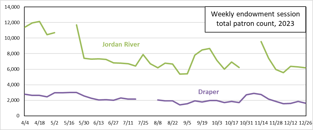
Because the question I’m interested in is the effect of one temple on another nearby, I’ll show a few pairs of nearby temples. Here are Jordan River and Draper.

Both temples show increased attendance when the other closed. In May, when Jordan River closed, Draper’s weekly counts went from about 2600 to about 3000. And again in October, its weekly counts went from about 1800-1900 to about 2800. On the Jordan River side, when Draper closed in July, its weekly count went from the range of 6000-7000 to nearly 8000.

Read More

Church President Probabilities, Changes with the Death of One Q15 Member

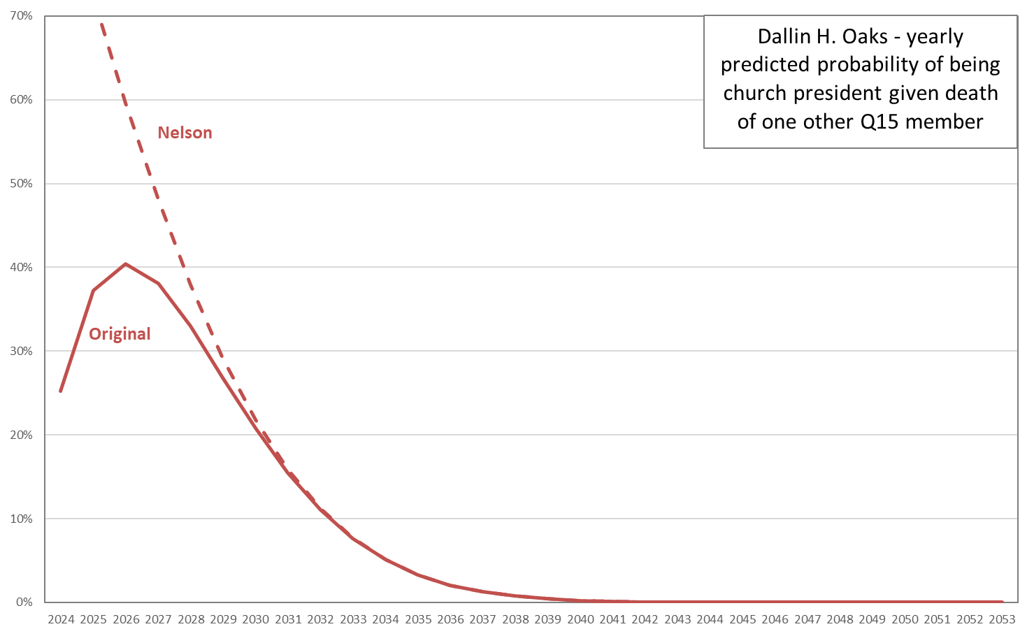
After I put up my last post, where I gave updated probabilities of each current Q15 member becoming Church president, a friend asked me if I had ever looked at sensitivity of these probabilities to the death of one Q15 member. So, for example, Russell M. Nelson is 99. If he died tomorrow, this would obviously have a big effect on the chances for Dallin H. Oaks, as he’d become Church president. But what about all the men junior to him? And you could ask the same question about each Q15 member. Like David A. Bednar seems a pretty good bet to become Church president at some point, but if out of the blue, he died tomorrow, how would that shuffle the probabilities for the men junior to him?

I recalculated all the yearly probabilities of being Church president for each of the 14 remaining members of the Quorum, with each current member being removed in turn. I used the same method and same actuarial table as in my last post. For simplicity, I didn’t do any of the health adjustments that I tried in that post; I just stuck with the base case of the unadjusted mortality table probabilities for each man (still depending on age, though).

To make the results easier to look at, I’m showing them organized by surviving member rather than by dying member. That is, I have one graph showing all the probability changes for Dallin H. Oaks if someone senior to him died (of course there’s just one man senior to him: Russell M. Nelson) and then another graph for all the probability changes for M. Russell Ballard if someone senior to him died, and so forth. Also, so you can compare the graphs to the ones in my last post, I’m keeping each man’s line color the same as in the last post and also keeping the scale of the Y-axis constant for all the graphs. In each graph, I’m making the original probability curve solid and then making dashed all the probability curves that would result if another senior member died. This might sound too messy to look at, but I think it turns out to not be too bad because the probability curves shift in regular ways, and don’t jump and cross each other all willy-nilly. Anyway, I’m hoping that even if this explanation of the graphs doesn’t make total sense, once you look at a couple of the them, it will be clearer.

There are a couple of other things to note about the graphs. One is that to avoid having the graphs for the more junior members be really cluttered, I’m only showing modified probability curves for a senior member’s death changes the member in question’s probability by at least one percentage point in at least one year. For example, Russell M. Nelson’s death would have a near zero impact on Ulisses Soares’s probabilities, as Elder Soares is already very likely to outlive President Nelson, and his chances of becoming Church president depend much more heavily on the life expectancies of men closer to him in seniority, like Gerrit W. Gong, for example. The other last thing to note is that because I only checked probabilities in yearly steps, pairs of Q15 members who are the same age as of the start date have exactly the same effects on probabilities for members junior to them if they (the members who are the same age) were to die. This means that there are two pairs of members, Jeffrey R. Holland and Dieter F. Uchtdorf (both 82) and Neil L. Andersen and Ronald A. Rasband (both 72), for whom the adjusted probability lines for men junior to both of them are identical, so I’ve just labeled them with both men’s names.

Okay, enough preamble. Here’s the graph for Dallin H. Oaks.

Read More

Church President Probabilities, 2023 update

Who among the Q15 will eventually become president of the Church? This is always an interesting question for a couple of reasons, I think. One is that the members of the Q15, even though they typically present a united front, clearly have different visions for what the Church should be. So it actually matters who makes the top spot and who doesn’t. Of course the most obvious example of this is that Russell M. Nelson was clearly fuming about use of the label “Mormon” for decades, and it was only after he finally became Church president that he could finally impose his idea on the rest of us.

The other reason I think this is such an engaging question is that it seems so tantalizingly tractable! There aren’t a million variables and unknown unknowns to account for. There’s just this very simple succession rule, and this well-defined pool of candidates, and so who gets to become president boils down to who outlives who. And it seems like we should be able to predict that, right? Right??

Of course the answer is no, but it’s fun to try anyway. I looked at this question the same way I have in previous posts (e.g., in 2015, in 2018). On the advice of an actuary friend of mine, I use a handy mortality table (specifically, the part for white collar males, employees up until the series ends at age 80, and healthy annuitant thereafter) provided by the Society of Actuaries. I’ll explain the details at the end of the post if you’re interested, but for now I’ll just say that I can use the table to work out each man’s probability of surviving to any particular future age, and from that and the probabilities of surviving for Q15 members senior to him, his probability of being church president.

When I’ve done this type of analysis before, commenters have asked the reasonable question of whether I couldn’t make an adjustment for the Q15 members’ health. I have had two concerns with trying to do this. First, it’s hard to know how to assign levels of health in any reliable way, and second, even if I did know how healthy each of them were, I’m not sure how to adjust the mortality tables in response.

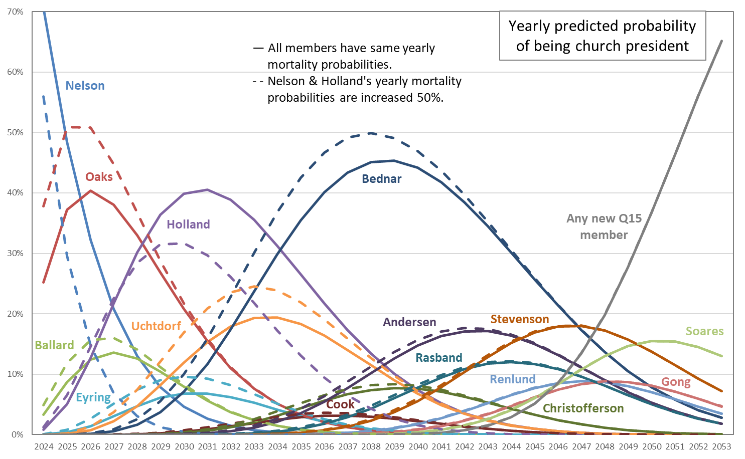
But in this post, I’m throwing caution to the wind and trying an adjustment. I’m using a very crude health categorization: I’m adjusting mortality rates only for the two Q15 members who weren’t at October Conference in person, namely Russell M. Nelson and Jeffrey R. Holland. I worked around my second concern by trying a range of possible adjustments. I adjusted the yearly mortality rates for President Nelson and Elder Holland by increasing them by 10%, 20%, 50%, and 100%. (Note that it’s really easy to mix up percentage changes and percentage point changes. These are percentage changes. So for example, if a table mortality probability is 3%, then the adjusted rates for the various increases are 3.3% [adding 10% of 3%], 3.6% [adding 20% of 3%], 4.5% [adding 50% of 3%], and 6% [adding 100% of 3%].)

The graph below shows the probability of each Q15 member being church president for each year for the next few decades. The solid lines show the unadjusted probabilities, and the dashed lines show the probabilities with a 50% adjustment.

Read More

Go to the House Mansion of the Lord

This guest post comes to ZD courtesy of Zatch. Zatch is a lapsed physicist living and working in Washington DC with his wife, son, and another kid on the way. Zatch’s Bloggernacle credentials are that one time he was in this Borderlanders article under his alter ego Zeke: https://forthosewhowonder.com/wp-content/uploads/2006/07/Adolscent-Borderlanders1.pdf

In high school, I was voted “most likely to never buy a car,” and in college my wife studied urban planning. Thus it shouldn’t be a surprise that, after recently attending a cousin’s wedding in the Draper Temple, one of the first things we talked about was how inaccessible the Draper Temple is to anyone without a car. For those who don’t know, the Draper Temple is far up on the hillside, 3+ miles (5+ km) from and 500+ feet (155+ meters) of elevation above the freeway. Unless you are into hiking or mountain biking (things we actually saw people doing on the way in), it is not easy to get there without a car.

This is actually a conversation my spouse and I have a lot. Between work, school, missions, etc. the two of us have lived in at least 8 temple districts across the US. Ignoring Utah for a moment (a place where they literally built cities around the temple), nearly every temple near which we’ve lived has been located not in the city it is named for, but rather one of the city’s wealthy suburbs:

  • Tucson -> Catalina Foothills
  • Indianapolis -> Carmel
  • Detroit -> Bloomfield Hills
  • Atlanta -> Sandy Springs
  • Oakland -> Oakland, but up a steep hill from downtown and still in a wealthy neighborhood
  • Washington D.C. -> Kensington, MD

My personal inclination is that the entire temple-going experience favors those with money. If it were up to me, clothing rental would be free, childcare would be provided, and we’d be opening more cafeterias instead of shutting them down (especially since, as I’ve claimed without evidence, many temples are in wealthy residential areas without places to eat). But that is a rant for another post.* Today I want to focus on one specific aspect of temple attendance: getting there.

Assumptions

I started from the most recent list of temples on the church website. From there, I filtered out any that have not yet had a location announced, but I did include several that are currently under construction but where the location has been announced. I cut out any temples that were named for geographic features rather than cities (e.g. Gila Valley, Mount Timpanogos). This left me with a list of 212 temples, which I grouped into regions using the same bins that Ziff used in his most recent temple-related post.

As my measure of “ease-of-access,” I used Google Maps to estimate how long it takes to travel from the city center (as defined by Google) to the temple, traveling by 1) car, 2) public transit, and 3) foot.** I set the departure time to 7am on a Saturday to avoid issues from current local traffic. The choice to use city center as a point of origin is easily the weakest point of my analysis, but I still think it’s a reasonable assumption for a couple of reasons:

  1. For members who live in the specified city, you could assume (and this is clearly an assumption) that they are randomly scattered throughout the city such that on average they live near the city center. Some will live in the northwest, some in the southeast, but hopefully those differences all cancel each other out when you include enough people.
  2. For members who do not live in the specified city and who must arrive by bus, train, or other public transit, I think it’s plausible that they would be dropped off at a terminal somewhere near the city center and then continue to the temple from there.

I thought about using the nearest (non-temple adjacent) meetinghouse as a point of origin instead of the Google-appointed city center, but that would have at least doubled the effort so I didn’t do it. This might give us a better indicator of the average member location than what I did, so please let me know if anyone gives it a try.

Results

The first question I decided to answer is “How many temples are accessible by public transit?”

I noticed that some of the Utah temples (e.g. Ogden) were showing no public transit option even though I know for a fact that’s not true. Given that the Ogden temple is two blocks from what I would consider the city center, I’m guessing Google has a hidden “why on earth would you take a bus for this?” feature. To compensate, I added a 15-minute walking distance filter; that is, if you can walk from the Google-declared city center to the temple in 15 minutes or less, it counts as having a public transit option. The following table shows the number of temples in each region, and the percentage of temples inaccessible via public transit.

Region # of temples in region # with no public transit % with no public transit
Africa 8 6 75.00%
Asia & Pacific 32 10 31.25%
Europe 14 1 7.14%
Latin America & Caribbean 53 25 47.17%
Eastern North America 27 9 33.33%
Western North America 54 17 31.48%
Utah 24 7 29.17%
Worldwide 212 75 35.38%

Read More

Do people make more temple appointments during Conference weekend?

I thought this might be an interesting question because if ever people are going to be inspired to want to go to the temple, you’d think it would be during Conference. Sister or Elder So-and-So gives an inspiring talk about temple work, and even though temples are of course closed during Conference, it’s easy while watching or listening to just whip out your phone or computer and make a temple appointment.

I looked at this question using the Church’s same handy online temple appointment scheduler that you’d use to make an appointment. Helpfully, it reports the number of seats available for a proxy ordinance session, so it was straightforward for me to check the number of seats available before Conference weekend, and then again afterward. For comparison with Conference weekend, I also checked the change in number of seats available across the four weekends around Conference weekend, two before, and two after.

Because it was still a bit laborious for me to gather the data, I reduced the sample in several ways:

  • I looked only at endowment sessions (because they’re the most time-consuming of temple ordinances).
  • I looked at only sessions for the week following the weekend I was checking. For example, for Conference weekend, which was April 1st-2nd, I looked at sessions for Tuesday April 4th through Saturday April 8th. (Most temples are closed on Mondays. The exceptions I’ve found are Aba Nigeria and Provo Utah, but I excluded the few sessions on Mondays for these temples.)
  • I looked at only a sample of open temples. I chose them by region, to try to be at least kind of representative of the areas where the Church has temples. Within each region, I chose the temple that appeared to generally offer the most endowment sessions, because I figured more sessions would give more data and more chance to find an effect.
  • For each session, I checked its available seat count just twice, once on the Friday evening before the weekend, and again on the Monday evening after the weekend. (Note that for a few temples in the Pacific and therefore many time zones ahead of me in the US, I checked their counts in mornings instead, to be sure that I wasn’t checking so late on Monday that some of their Tuesday sessions had already begun.)

In addition to the worldwide sample of temples, I was also in the middle of gathering data for another project on all temples in Utah, so I was able to include them as well. The temples outside Utah in the sample are the following: Aba Nigeria, Boise Idaho, Campinas Brazil, Chicago Illinois, Dallas Texas, Guatemala City Guatemala, Hamilton New Zealand, Lima Peru, Madrid Spain, Manila Philippines, Mesa Arizona, Mexico City Mexico, Nuku’alofa Tonga, Orlando Florida, Preston England, Seattle Washington, and Washington D.C. The open Utah temples are the following: Bountiful, Brigham City, Cedar City, Draper, Jordan River, Logan, Monticello, Mount Timpanogos, Ogden, Oquirrh Mountain, Payson, Provo City Center, Provo, and Vernal.

This graph shows results for non-Utah temples. The bars show the average change in number of available seats per endowment session between Friday and Monday (again, the actual sessions are the following Tuesday through Saturday). For each temple, the left bar shows the average change across the two weekends before Conference, the middle bar shows the average change across Conference weekend, and the right bar shows the average change across the two weekends after Conference. The lines that point up and down from the top of each bar and end in short horizontal lines are standard errors. (If you don’t want to read some statsy explanation at the link, you can just think of them as a measure of reliability: if these are small, we have more confidence that the true average change is close to the bar height, and if they’re big, we have less confidence.) Where I’ve shaded in the before-Conference or after-Conference bars, this means that they’re statistically significantly different from the Conference bar for the same temple. (The specific statistical test I used was a t-test, two tailed, meaning it looks for differences in either direction–bigger or smaller.)

Read More

Revisiting New Children of Record Data

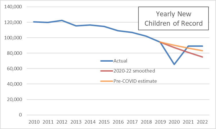
I wrote a post last year after April Conference about the new children of record counts that the Church reports every April for the previous calendar year. In that post, I pointed out that, after the marked decline in new children of record the Church reported during COVID, the bounce back the following year was far less than would be expected if it were just a matter of clearing a backlog of children who weren’t recorded during the height of the pandemic. I speculated that perhaps this was evidence of a decline in activity level that wasn’t bouncing back.

Now that we have the 2022 data from the 2023 statistical report, it looks like I was probably too hasty in my interpretation. Here’s a graph with the new data.

Read More

Mormons: To know us is to love us (or not)

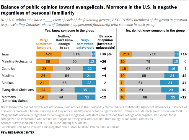
Pew released a report last week on a recent survey where they asked American respondents how they view various religious groups (and atheists). With the caveat that it only gives results for seven broad groups (e.g., all evangelical Christians are one group), Mormons fare the worst. Only 15% of respondents view us very or somewhat favorably, while 25% view us very or somewhat unfavorably. The difference of -10 percentage points is the worst for any of the groups, and is twice as large as for the second-worst-scoring group (Muslims, who get 17% and 22%, respectively, for a difference of -5). This is consistent with results of a similar YouGov survey published a few months ago, where Mormons weren’t the group seen least favorably, but we scored near the bottom, and mostly only beat out groups too small to be mentioned separately in the Pew report (e.g., FLDS, Jehovah’s Witnesses, Satanists).

One tidbit that I found most interesting in the report was that knowing a Mormon doesn’t improve respondents’ ratings of us. Here’s the complete breakdown from Pew, with the favorability ratings for respondents who do know someone from the group in the left graph, and those for respondents who don’t know someone from the group in the right graph.

Read More

Big Temples and Small Temples

Right before the turn of the millennium, President Hinckley rolled out a new temple-building campaign that reimagined what a temple could be. The Church began building temples that were far smaller than their predecessors, but were also much closer to where members lived.

It has been a couple of decades since then, and President Nelson has his own slew of newly-announced temples. I don’t think he’s made an explicit point like President Hinckley did, of saying they’ll be smaller. I think the sizes are clearly varying by location.

I got to wondering how much of the temple capacity of the Church is still in Utah, or still in the US. My impression is that even with many of the small Hinckley-era temples being built in the US, there are still often quite large temples built here, even in the Mormon corridor. Look at Payson, Utah (dedicated in 2015), for example, or Gilbert, Arizona (dedicated in 2014).

To answer my question, I looked on the Church website at how many endowment sessions there were in each open temple, and how many seats were available in those sessions, for two dates in February: the 14th and the 25th. I checked the number of available seats at least a month before the session dates so that few would be likely to be scheduled. I chose these date to have one weekday and one Saturday, and to not be right next to each other, so a temple that might be closed for cleaning on one day, for example, might open back up on the other. Also, I chose to look at endowment sessions because they’re by far the most time-intensive of vicarious ordinances, so they’re the biggest potential bottleneck.

There are 161 temples with at least one endowment session on February 14th or 25th. (I did notice that a few temples that weren’t listed as having sessions available when I started gathering data did when I checked back in the last few days, so it’s possible that a few more will open between now and then so I may be undercounting a little.) Here’s a breakdown by region.

Read More

Ratings of Mormon Books on GoodReads

I wrote a post a couple of years ago where I looked at how Mormon-related movies were rated on IMDB. I thought it would be fun to do a similar look at how Mormon-related books are rated on GoodReads.

I got ratings for 568 books, mostly Mormon-related, but with a few others for comparison. The Mormon-related ones were scriptures, Church-published materials like manuals, and books by GAs, Mormon studies people, and popular Mormon authors (e.g., Jack Weyland, Anita Stansfield). The non-Mormon ones were a few Bibles, the Left Behind series, the top 10 fiction and non-fiction books on the GoodReads lists (I’m not sure exactly of the criteria for these), and 20 fiction and 20 non-fiction books I was hoping would be more representative of average books, so I chose them off of GoodReads user-created lists that had nothing to do with the book content (one was strange titles and the other was interesting covers). I required a book to have at least 50 ratings to be included, although I made exceptions for three extra bad ones I was interested in: the ERA-era book Woman, written by a bunch of GAs, the priesthood/temple-ban-justifying Mormonism and the Negro, and the mansplained classic Woman and the Priesthood. Note that I’ve gathered this data in bits and pieces over the last month or so, so some of the numbers might be a little out of date.

I assigned the books to categories depending on how Correlation-friendly they were. Unfortunately, I’ve only read a small fraction of the books, so I didn’t have firsthand knowledge in most cases. However, most books make pretty clear what type they are. For example, Mormon studies books are typically published by university presses. More correlated books are typically published by Deseret Book or Shadow Mountain. Anyway, this table shows, for all the Mormon books, the number of books in the sample and their average rating on the 1-to-5 scale used by GoodReads.

In my post on movies, I speculated that there would be higher ratings for movies produced by the Church, or that were scripture-adjacent, and that did turn out to be the case. It looks like there’s a similar pattern here, as scriptures rate the highest, and generally categories rank lower in average rating as they move further from being correlated. Here’s a brief explanation of what falls into each category:

  • Scriptures — LDS scriptures in different forms (e.g., Book of Mormon separate vs. Triple Combination) plus some non-LDS editions of the Bible.
  • Correlated — Church manuals and books that have essentially become manuals (e.g., Jesus the Christ).
  • GA biography — Biographies of GAs.
  • Near correlated — Nearly all books by GAs, as well as books by people like John Bytheway who are striving to be correlated, and novels by writers with similar goals (Gerald Lund, Chris Heimerdinger).
  • Correlation friendly — Books that aren’t quite trying to be correlated, but are still very Church-friendly, like many of the Givens’s books, Hugh Nibley, and some of Patrick Mason’s.
  • Mormon memoir — Memoir of someone who’s still Mormon (e.g., Leonard Arrington’s Adventures of a Church Historian).
  • Mormon studies — Any look at a Mormon topic from a scholarly perspective, so for example Maxine Hanks’s Women and Authority, or John Turner’s biography of Brigham Young, or Kathleen Flake’s book about the seating of Reed Smoot in the US Senate.
  • Ex-Mormon memoir — Memoir of someone who left Mormonism, regardless of hostility level, so everything from Martha Beck’s Leaving the Saints to Katie Langston’s Sealed.
  • Not correlation friendly — This includes books with ideas that GAs would generally frown on, even if the writers aren’t hostile to the Church, so for example anything by Carol Lynn Pearson that’s too kind to gay people or too open to Heavenly Mother or rejecting polygamy.
  • Anti — The only book I got in this category is Ed Decker’s classic The God Makers.

Read More

New Children of Record and Church Activity

In this post, I just want to make a small point about the Church’s report of new children of record in the annual statistical report. Here’s a graph showing annual end-of-year counts since 2010.

The count was flat for several years, but then started falling consistently from year to year starting in 2015. And then of course it fell off a cliff in 2020, going from 94,000 all the way to 65,000, a drop of over 30%. (For the rest of this post, I’m going to abbreviate thousands as “K,” so 94K is 94,000.)

It seems clear that the 2020 decline was caused by COVID. But there are (at least) two possible mechanisms that could be driving the effect of COVID on new children of record. One is that COVID affected birth rates. I had the idea in the back of my head that economic downturns are often associated with declining birth rates, and a quick Google turns up at least one paper that suggests that that’s true. However, given the nine month length of human gestation and the fact that COVID was officially declared a pandemic on March 11, 2020, it seems pretty unlikely that couples were changing their childbearing plans and having the effects show up before the end of the year.

The other possible mechanism by which COVID could affect children of record is through church activity. The children of record count is effectively a count of children born to or adopted by LDS families where at least one parent is active enough to get them recorded on Church records. With COVID pushing church meetings to be online, or suspended entirely, it’s not surprising that families were less diligent about recording their births and adoptions with their local units than they would have been in ordinary times. So I think the big drop from 2019 to 2020 makes sense.

What is striking, though, is that the 2020 to 2021 recovery is smaller than I would expect. New children of record rebounded from 65K to 89K, which seems like a healthy gain. But if my guess that people were just lax in recording new births and adoptions is right, there should have been a big backlog from 2020 that got recorded as people largely returned to attending church in person in 2021. Really, the 2021 count should have exceeded 2019 if this was the case.

Read More

Proselytizing vs. Service Missionary Counts in the Church Statistical Report

It may not be read in general conference anymore, but needless to say, I was interested to take a look at the Church’s 2021 statistical report. One interesting thing I noticed has to do with the counts of proselytizing versus service missionaries. Here’s a graph showing the end-of-year counts of missionaries since 2010. You can see in the count of proselytizing missionaries the jump with the age change in 2012, the slow decline afterward, and then the dramatic drop with COVID and then some recovery. The count of service missionaries has had fewer dramatic movements, increasing through 2018, then declining for a couple of years, and then increasing sharply in 2021.

As I mentioned in my conference review post, several speakers reminded young men that they need to be serving missions, and that young women can go as well. For example, here’s President Nelson in the opening talk of the conference:

Today I reaffirm strongly that the Lord has asked every worthy, able young man to prepare for and serve a mission. For Latter-day Saint young men, missionary service is a priesthood responsibility. . . . For you young and able sisters, a mission is also a powerful, but optional, opportunity. . . . Your decision to serve a mission, whether a proselyting or a service mission, will bless you and many others. [italics in original]

As an aside, I find the patronizing tone directed toward young women grating, but I feel like at least it represents a step forward from President Hinckley’s 1997 talk where he pretty openly discouraged women from serving. Anecdotally, for some women I know who were missionaries at the time, the talk led many elders to sneer to them, “Why don’t you just go home?”

Looking back to the graph, President Nelson and the other GAs are clearly concerned with the upper line, the count of proselytizing missionaries. It fell from about 67,000 at the end of 2019 to about 52,000 at the end of 2020. Of course this can be attributed to the pandemic. But then through 2021, even as vaccines became more widely available, it rebounded only a little, to about 55,000. I suspect they’re concerned that all the disruption in missionary work because of COVID has made missionary service seem more optional.

Read More

Name Withheld

A few years ago while reading the Ensign, I got to wondering about the reasons an article writer’s name is withheld. For an individual article, it’s typically pretty easy to guess, but I was wondering about larger trends. Even just cataloging the list of reasons seemed possibly interesting, because it’s a list of things that are considered shameful, but not too shameful. For example, a relatively large number of name withheld articles talk about divorce, but none that I’ve ever read talk about, say, bestiality. The articles provide a kind of list of troubling issues that are on writers’ (and editors’ and perhaps GAs’) minds. Also, while I was at it, I thought it would be fun to look at any trends across time and gender differences and a couple of other things.

I initially planned to look at all magazines on the Church website since 1971, but looking at the Ensign alone turned out to be fairly time-consuming, so I didn’t go any further. Maybe I’ll go back and look at the others another time. I found 172 articles and letters to the editor, using the search “‘name withheld’ site:churchofjesuschrist.org/study/ensign”. (To be precise, a few weren’t labeled exactly “name withheld.” I manually checked all the letters to the editor from the 1970s, after I found their authorship was occasionally noted as “A regular reader” or something similar.)

For each of the 172 documents, I noted the following:

  • Publication year
  • Gender of the writer (I was able to figure this out for 121 of the 172, or 70%)
  • Is the name withheld because of something about the writer or something about another person?
  • Is the person the actor (e.g., used porn) or the victim (e.g., was abused) in the situation?
  • One or more reasons for the name to be withheld. (The max for any one document was four. Most documents had one. Three documents had zero, as I couldn’t figure out any reason at all.) I grouped these into 17 different categories, which I’ll list below with results.
  • The story end type. I classified these into three different categories: perfect (where people end up married in the temple or going on missions), good (where things end up better than they started), and learned (where things don’t get better, but the writer learns to better accept them). I also assigned some documents a not applicable here when there was no story arc. This was the case for a fair number of the letters to the editor, where writers with name withheld often say no more than “I suffer from the same problem as the person in such-and-such an article.”
  • How much the need to forgive the wrongdoer is discussed. I rated this as high, low (little discussion, or just reference to need to overcome bitterness and anger), or none.

I also tried noting down some other things, like the approximate age of the writer (typically difficult to figure out) or the location (rarely mentioned), but I wasn’t able to get enough useful data for them.

This graph shows the total number of documents in five-year periods across the history of the Ensign. Note that there’s no adjustment for possible differences in length of the magazine at different points in time.

Even with my extra combing through the 1970s issues, the prevalence of “name withheld” documents really didn’t take off until the latter half of the 1980s. It’s also interesting that it has dropped so dramatically in the latter part of the 2010s. I wonder if this is a change Russell M. Nelson has made, because even the 13 in the 2016-2020 period can be broken down into six in 2016 and seven total in the four following years.

Read More

Hymn Tempo in 1973 and 1985 Hymnals

This is what then-apostle Spencer W. Kimball had to say in a report of a 1955 mission tour (my source for the quote is Ardis Parshall):

Music: It is generally sung too fast.

If you’re like most Mormons I know, your complaints typically run in the opposite direction: Music is played and sung too slowly in church. This has certainly been my experience. I recall in the ward my wife and I lived in when we were first married a couple of decades ago, the hymns were so slow in sacrament meeting that I took to timing them and comparing to the suggested tempo in the hymnal and whispering complaints to my wife about how big the differences were. And that was before smartphones, so I had to do the math in my head! Along the same lines, you might notice that in my Conference review posts, I typically note particularly fast musical numbers for praise.

I was thinking about this issue while I’ve gathered some data from the hymnal in preparation for the release of the Church’s new hymnal. Like in my last post, I’m looking at the 1985 hymnal and the previous hymnal (the copy I have is from 1973, but it was largely unchanged from 1948). It occurred to me that, because many hymns appear virtually unchanged in both hymnals, I could line them up next to each other and see if the compilers of the 1985 hymnal generally suggested faster or slower tempos than the compilers of the previous hymnal did. This would be an indicator of whether they thought music was being played and sung too fast or too slowly.

For example, “The Spirit of God” appears in the 1973 hymnal with a tempo of 100 beats per minute (bpm), and in the 1985 hymnal with a tempo of 96-112 bpm. It is in 4/4 time in both hymnals, and the tune is the same. As you probably know, the 1985 hymnal always suggests a tempo range. The 1973 hymnal just suggests a single tempo, although I’m guessing it was with the expectation that there would be variation around it in practice.

I was able to find 250 matched pairs of hymns to compare across the two hymnals. I matched them on both title (taking into account that sometimes the titles changed for the same hymn) and composer, to be sure that I wasn’t comparing hymns set to different tunes. I used the 1985 hymnal as the starting point, and looked for a matching hymn for each in the 1973 hymnal. A few hymns appear more than once in the 1985 hymnal and therefore also more than once in the set of 250. For example, “Come, Come Ye Saints” is #30 in the 1985 hymnal, and also #326, for men’s voices.

This graph summarizes where the 1973 tempos fall in comparison to the 1985 tempos for the 250 matched pairs of hymns.

The most frequent result is that the 1973 tempo falls within the 1985 interval (the middle bar). But when it doesn’t, it’s much more common that the 1973 tempo is slower than the 1985 interval than that it’s faster. When the 1973 tempo is at the end of the interval, it’s over four times as likely (26% vs. 6%) to be at the slow end as at the fast end. When it’s entirely outside the interval, it’s over ten times as likely (22% vs. 2%) to be outside at the slow end as outside at the fast end. Another way of summarizing the same data, although it’s not shown in the graph, is that the average fraction of the 1985 tempo range that is faster than the 1973 tempo is 72%. Overall, it seems clear that the compilers of the 1985 hymnal were generally trying to speed the hymns up.

Read More

Mood of Hymns for Men vs. Hymns for Women

I’m getting ready for the Church to release the new hymnal, although I realize it will be a while still before it comes out. In preparation, I’ve been looking at some comparisons of the current 1985 hymnal with the one that preceded it. From Wikipedia, it looks like the previous hymnal was released in 1948, revised in 1950, and added to just a little in 1960. The copy I own has a copyright date of 1973, but it looks like it’s just the 1960 version (although I can tell that its preface from 1973 because it is signed by the First Presidency of Harold B. Lee, N. Eldon Tanner, and Marion G. Romney).

One difference between the two hymnals that I’ve noticed is in the hymns to be sung by men versus those to be sung by women. More particularly, the difference is in the moods used to describe how the hymns are to be sung. By “moods,” I mean the one- or two-word adverb descriptions written at the top of the hymn. For example, the current hymnbook says that hymn #1, “The Morning Breaks” is to be sung triumphantly. In the 1973 hymnal, the moods for men’s hymns aren’t too different from the moods for women’s hymns. In the 1985 hymnal, the moods for men’s versus women’s hymns are more markedly different. Because there are a lot of different mood words assigned to the hymns, I lumped them into three groups for convenience in display. Mood words like boldly I called “high energy.” Mood words like reverently I called “holy.” And mood words like peacefully I called “low energy.” Here’s a graph comparing the hymns for men and for women in the two hymnals.

The total number of hymns specifically for men or for women was much larger in the 1973 hymnal (47 for men; 41 for women) than in the 1985 hymnal (19 for men; 10 for women). As you can see, in the graph, I’m showing percentages instead of counts to make the comparisons easier to look at. (Note that six of the 41 women’s hymns in the 1973 are excluded from the comparison because they either have no mood description, or they have a tempo word in place of a mood description.)

In the 1973 hymnal, there’s some tendency for men to be assigned more high energy moods and women more holy and low energy moods. In the 1985 hymnal, this difference gets much larger, as over two thirds of men’s hymns have high energy moods, and only 10% of women’s hymns do. This isn’t at all a surprising difference to run into. I am disappointed, though, to see that the hymn selectors’ ideas of traditional gender roles, with active men and passive, worshipful women, is translated into the hymns they select and the moods they apply to them. I hope that the new hymnal doesn’t feature such a difference, but I’m guessing that it probably will.

Read More