I enjoyed Jessie Jensen’s post a couple of months ago at BCC where she reported on a number of unusual names used for babies born in Rexburg and Idaho Falls in 2015. One question that came up in the comments was whether Mormons (or at least Mormons in Utah or Idaho) actually use more unusual names than people in other places do. I was interested in this question, and my co-blogger Katya pointed out that the US Social Security Administration (SSA) actually publishes data on how often different names are used in each state each year. So I thought it might be fun to look at these data, and see if they could help me attempt to answer the question.
I’m sure you can already see the big weaknesses of this approach. I have only US data. Utah and Idaho don’t represent all Mormons, and of course also are far from being completely Mormon. But I’m not going to let a few gaping holes stop me from doing some fun tinkering with data. I’ll just trust you to keep a truckload of salt handy to take my results with.
Getting the Data
Here is where the data come from: the SSA website on popular baby names. If you want to, you can use the site to look up popular names in a particular year or a particular state. On this page, they also have the complete data available for download, both by state and for the entire country. These are the data I used in my analyses. The data go back father, but to keep the analysis more manageable, I stopped at 1960. At the other end, I took data up through 2014. The SSA has released the 2015 data since I started working on this project.
For privacy reasons, the SSA data files list only names that were used at least five times in a year in a particular state (or in the entire country for the national data). Unfortunately, it’s precisely these less common names that I was most interested in. To try to get an estimate of how many babies in each state were given less common names (names used four or fewer times in that state that year) each year, I also needed to know the total number of births so I could subtract the number of babies given more common names (names used at least five times for that sex of baby in that state that year) from the total number of births. I got yearly counts of births by state from the CDC’s Vital Statistics (for 1980 forward, from summary tables in the user’s guides to the downloadable birth data, and for years prior to 1980, from the annual Vital Statistics of the United States).
One important note is that the SSA data is all broken down by sex. In order to be able to match with the total births data, I had to get them by sex as well. For most years prior to 1980, I couldn’t find a table in the Vital Statistics of the United States that showed births broken down both by sex and by state, so I estimated the births by sex in each state by taking the percentages of births by sex for the entire country and applying them to the total number of births in each state. It’s not a perfect solution, but it’s probably not too far wrong.
One other note is that the SSA and CDC data both include Washington D.C., but I decided to exclude it. For several years, the number of births in the SSA data for D.C. actually exceeded the number of births in the CDC data. This shouldn’t be possible, as the SSA data is supposed to be a subset of the total number of births for which the baby is given a name used at least five times that year. Because of this oddity, including D.C. in the analyses had extreme effects in some analyses, so I excluded it.
Use of Less Common Names in Each State
I’m going to try a few different approaches to checking whether people in Utah and Idaho use unusual names at a greater than average rate. In this post, the approach I’ll take is to define use of unusual names as use of less common names. This makes the question of whether Utah and Idaho are outliers in this regard straightforward to answer. This graph shows the percentage of baby girls given more common names in each state each year.
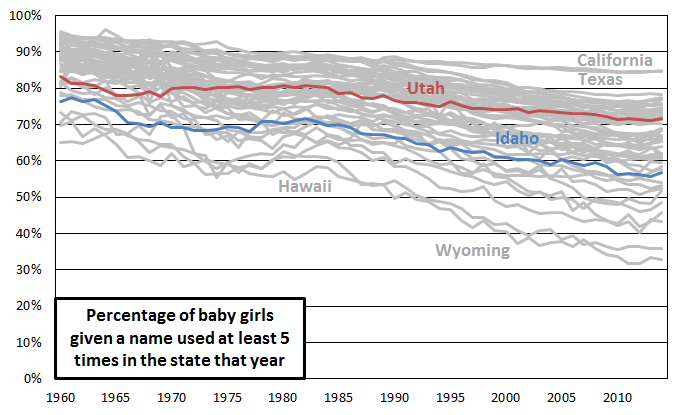 I’ve labeled Utah and Idaho and a few of the highest and lowest states. Utah and Idaho both look fairly middle of the road by this measure. Idaho definitely leans more toward being unusual, with less use of common names, but it has become less extreme with time, moving from perhaps 5th lowest in 1960 to 10th lowest in 2014.
What’s more interesting than the trend for any individual state is the general decrease with time in use of more common names. This suggests that perhaps people have become more willing in the past few decades to give their daughters unusual names. Or perhaps it reflects immigration increasing the pool of names parents are drawing from.
Here’s the corresponding graph for boys:
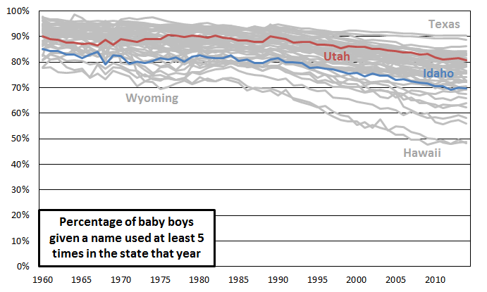 The position of Utah and Idaho are similar to their positions for the girls, and the trend across time is similar. The major difference is that all the percentages are shifted up. It looks like parents are generally more willing to give their daughters unusual names than they are their sons. For girls, the median state has declined from 89% to 67% more common names since 1960, while for boys, the median state has declined from 92% to 77% more common names in the same time period.
Adjusting for Total Number of Births in Each State
You probably noticed that the highest-percentage states I labeled are among the most populous (Texas, California) and the lowest-percentage states (Wyoming, Hawaii) are among the least populous. This is no coincidence. Remember that whether a name counts as more common or less common depends on whether it is used five or more times for babies of that sex in the year in that particular state. When you have 100,000 births, a name only has to be used for only 0.005% (5/100,000) of babies of that sex to count as more common. When you have 5,000 births, a name has to be used for 0.1% (5/5,000) of babies of that sex to count as more common.
To adjust for this association between total number of births and percentage of babies given a more common name, for each sex in each year, I ran a regression predicting the percentage from the total number1. If regression isn’t your cup of tea (and I don’t blame you if it isn’t!) you can think of it as a way of statistically controlling for the association with total births, setting it aside so we can look at what’s left over. Here’s what’s left over (the residual) for the same data as above, for girls. When states fall above zero, it means that they have higher than expected percentages of baby girls named more common names, given their total number of births of girls. When they fall below zero, it means that they have lower than expected percentages of baby girls named more common names, given their total number of births of girls.
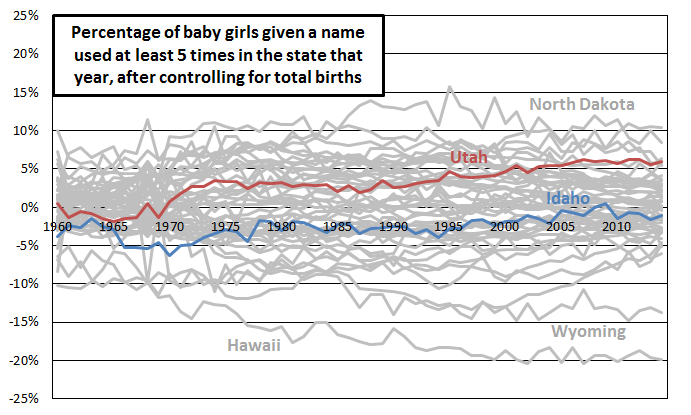 Utah is actually higher than expected, given its total number of births (i.e., its residual greater than zero) in percentage of girls given a more common name for most years since 1960. In recent years, it has even leaned toward being out of the norm on the high side, falling in the top five states in percentage of baby girls given a more common name, adjusting for number of births. Idaho, on the other hand, is slightly lower than expected given its total number of births, although it has moved more toward the middle in recent years.
Here is the corresponding graph for boys:
 The graph looks very similar to the graph for girls.
Conclusion
Well, Utah and Idaho don’t look atypical by this measure of use of unusual names. There are plenty of reasons to think that the measure I chose isn’t an ideal one, though. In the comments, please share your criticisms or your suggestions for other ways of measuring use of unusual names. If I can manage to, I will use any ideas you share to look at this question again in a future post.
__________
1. I log-transformed the total births before running each regression. They have a skewed distribution, with a few states having totals that are orders of magnitude larger than totals for other states. After log transformation, the distribution is far less skewed, and the resulting regressions have much higher R-squared values (average was 0.59).
My only criticism is that 5 girls named Brexit doesn’t make that name more conventional. I don’t know what benchmark I would use for “popular”, though, so it’s not particularly constructive criticism 😉
Try ranking names nationally from most to least popular and calculate the cumulative percentage as you go down the list. Once you hit some arbitrary cutoff (say 90%), stop and calculate the percentage of children with names below the cutoff point in each state. Both Brexit and Moroni will probably fall below the cutoff and contribute to their state’s weirdness factor. It would be interesting to see if state rankings differ much depending on the cutoff point chosen.
Any suggestions for really weird names? My daughter would appreciate them.
First, let me say Ziff that I know with every fiber of my being that your posts are truly awesome. I am with last lemming. There are probably 40 or 50 Moronis in UT. And they’re all weird. (I would just make the arbitrary cut-off lower.)
Interesting! Having lived in Baltimore and Salt Lake City, I was fascinated by the similarities of names! Never before would I have believed that inner city Baltimore and Mormon Utah could be so similar.
You could look at unique names that don’t have historical precedence. There may be some Ashleighs, Maudes or Claudias that may be unusual in some states now, but not so in past decades where Jaxxon and Trigg probably don’t have historical popularity.