Last month, I wrote a post where I used a mortality table and the current ages of the First Presidency and Quorum of the Twelve to see who among them would be most likely to become Church President. One question that was raised on the post and in some Facebook discussions was how well that mortality table matched up to historical mortality rates of Q15 members. In this post, I’ll try to answer that question.
I looked at historical data from January 1960 to April 2014. Each month1, for each current Q15 member, I noted two pieces of information: his age at the beginning of the month, and whether he was still living one year later. When I aggregated all the data together, they made an empirical mortality table. For any age that at least one Q15 member during that time period lived to, the proportion of such members who died within one year was the empirical mortality rate. Of course, there’s more data for the table at some ages than others, as few Q15 members during this time period were as young as their forties, but many have been in their sixties, seventies, and eighties.
Here’s a graph showing the mortality rate for Q15 members (in red), along with the mortality rate for the Society of Actuaries mortality table I used (in blue). I included only ages for which I had at least 120 person-month observations (or 10 person-years).
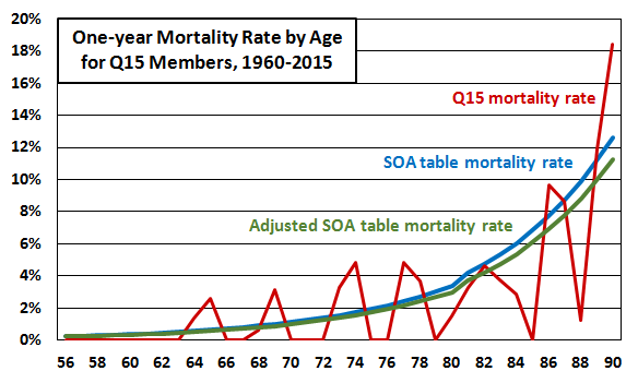
Because it’s based on so much less data, the Q15 mortality rate is lumpier than the SOA table mortality rate. Nobody in the Q15 data died within one year after being 70-72, for example. It looks like the Q15 mortality rate is higher than the table at some ages and lower at others, although generally probably lower. This would probably expected given that Q15 members are likely lifetime Word-of-Wisdom followers, and having avoided tobacco alone would probably noticeably reduce their mortality rate.
I made up an adjustment to the SOA table values to make the table fit the Q15 data better. To simplify the process, I looked for a constant multiplicative adjustment value that would make the sum of squared errors as small as possible (where an error is the difference between the points on the Q15 line and the points on the adjusted line). The adjustment value I found was 0.89, meaning the Q15 mortality rates were best fit by rates that are 11% smaller than the SOA table mortality rates. The adjusted mortality rate is shown as a green line in the graph above.
But of course you probably don’t care about whether the adjustment is 0.89 or 0.81 or 0.65 or whatever. The really interesting question is what happens to predictions about who will be Church President when we use the adjusted mortality table. Here’s what I got:
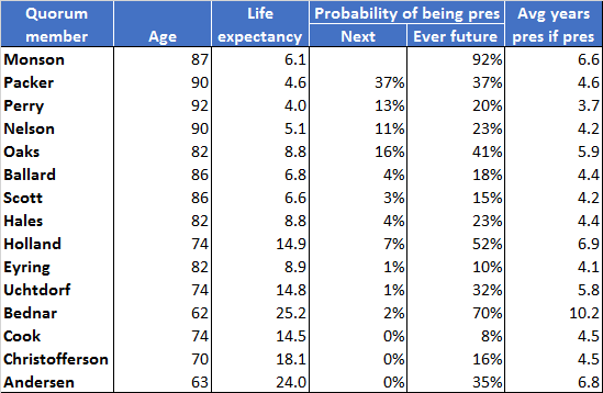 I used the same set of random numbers as in the previous post so that the only change would be using the new table. If you compare the adjusted table and the unadjusted one, they’re very similar. (Note that this table isn’t continuously updated like the other one is, so with time, they’ll diverge.) The adjusted table just predicts everyone will live a little longer, but it really doesn’t move probabilities of anyone being ever President or next President much at all. A commenter on my previous post reported that he got similar results to what I got when he used a different mortality table altogether (as well as a million simulation runs). I think what this suggests is that the really important information is just the Q15 members’ ages and seniority. As long as we’re applying the same mortality table to all of them, the outcome is probably going to be pretty much the same.
______________
1.Taking monthly observations and looking at yearly mortality rates of course means that the individual records are not independent. A Q15 member who died, for example, at age 85 years and 6 months would be counted as a death 12 times: once for each of the preceding 12 months. This doesn’t affect the resulting mortality rates, though, because a Q15 member who was still living at the same age would be counted as having survived 12 times, so the same adjustment to multiple counting is made to both the numerator and the denominator of the fraction. The reason I chose to get data monthly was to maximize how much information I got out of it, given how few Q15 members there are. If I had taken observations yearly in January, and say for example a Q15 member turned 80 in March and then died in June of a particular year, I would only get to count him once as someone who died within a year after being 79. Taking observations monthly, though, I got to split the observation of his death into nine observations as a 79-year-old and three observations as an 80-year-old. If there were thousands or millions of people to get data from, there wouldn’t be any need to do anything like this, and the result would be pretty much identical. With only a few dozen people, though, I wanted to squeeze everything I could out of the data.
Some years ago I looked at how the longevity of apostles in 1960, 1970, and 1980 compared with American males of the same age, and I did the same thing with the Supreme Court justices. A factor I had to deal with was the changing mortality across decades. For example, 25% of sixty-year-olds in 1960 died before reaching seventy (in 1970), compared with 16% in 1990. To account for changes across decades I found useful the data available from the Human Mortality Database, a joint project of the University of California, Berkeley and the Max Planck Institute for Demographic Research, available at http://www.mortality.org.
That’s a great point, John. I’ve thrown all the data for the past 50+ years together and pretended the single (current) table should apply to them. What that means is that my adjustment multiplier should probably reduce the mortality rates even more (i.e., be something like .80 instead of .89). In the end, though, I doubt even using a corrected adjustment factor like that will change the results of who’s predicted to be Church President, though.
Fascinating work, Ziff!
Most mortality analysis for small cohorts needs a little
http://4.bp.blogspot.com/_7qsq9PvZ7NI/Swbj2XbSf5I/AAAAAAAAMhY/JXH2T_1Z1kU/s1600/fudge.jpg
Keep in mind that people are living longer and longer. The sixties might as well be a part of middle age now.
Thanks, Christopher!
Spot on, gibbyg! I should’ve called this post “estimating the fudge factor.” 🙂
Seth R., exactly. That’s why I’m using this brand-new mortality table from the SOA, so I can take such things into account.
Would you mind updating this chart now that Perry is gone? https://zelophehadsdaughters.com/wp-content/uploads/2015/05/current-q15-probabilities-of-becoming-president-based-on-adjusted-soa-table.png
I’m planning on it, Brett, but I think I’ll wait until his replacement is called. Which I realize won’t be until October. But then, I’m a procrastinator, so that fits well! 🙂
Really, though, since he was the oldest member of the Q15, and thus most likely to die next according to the mortality table, his death is unlikely to move the probabilities for the other members much.