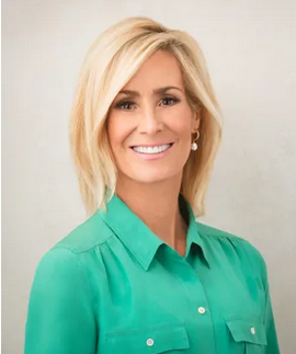
Tamara W. Runia, who’s serving as First Counselor in the YW General Presidency, gave by far my favorite talk of April’s General Conference. I also enjoyed her previous talk in 2023. She’s dueling with Patrick Kearon in my head for my current favorite speaker. And in the previous General RS Presidency, I loved Conference talks from both counselors, Sharon Eubank and Reyna I. Aburto. It occurred to me that there are more women giving strikingly good Conference talks (at least in my view) than there are men, perhaps not in absolute numbers, but certainly as a percentage of the total numbers of women and men giving talks.
Why might this be so? I’ve come up with a couple of lists of reasons. The first is a list of hows, that outline the characteristics of their talks where I feel like they outdo men. The second is a list of whys. These are my guesses about what the causes might be behind the hows that make their talks different.
How
- Women speakers are less often doctrinaire than men are, less prone to try to lay down the law of This Is The Way Things Are. They seem more often to frame the advice they give as advice, rather than as commandment.
- Women seem more often concerned with interpersonal connection, and less concerned with hierarchy, even Church hierarchy. Some men seem deeply concerned with members’ submission to Church hierarchy, and to them in particular. They are the Oracles of the Most High God, and they are darn well going to remind us of it. I find this extremely grating.
- It’s my impression that women are more likely to address people who are out of the Church’s main target demographic, which seems to be young couples who are raising young children. They’re more open to acknowledging that people might be unmarried or widowed or even gay, or that they might be lonely or depressed.
- Women are less prone to repeating their stories or even virtually entire talks, as some men do.

 Best image: I like Robert Zund’s Road to Emmaus painting that







 Best image: I really like Yongsung Kim’s painting The Hand of God that