I thought this might be a fun question to look at, and thanks to Facebook’s Graph Search, I have at least an approximate way to answer it. Graph Search will let you look for people who “like” different combinations of pages. (For the remainder of this post, I’m going to drop the quotation marks on “like” when describing Facebook likes, because they just get tiring to look at, and I figure you know what I’m talking about.) Most blogs that I wanted to look at have a Facebook page that readers can like, so I just looked up people who liked the Facebook page for each blog, and then looked at how many of each of these people liked each member of the Quorum of 15. One small difficulty I encountered is that Graph Search is more interested in showing me individual people than in giving me an exact count (which makes sense given what Facebook is for). It estimates the number of people who like a blog page and a GA page as more than 10, or fewer than 1000, or whatever, but I couldn’t get an exact count without repeatedly scrolling to the bottom of the results so that it would pull up even more results until it could find no more.
One thing I wanted to adjust for is that the general membership of the Church likes different Q15 members more or less often on Facebook (as I’ve blogged about before and plan to again). So I thought it would be most interesting to see which Q15 members are most liked by readers of different blogs, compared to how often the GAs are liked overall. For example, President Monson alone accounts for nearly 20% of all likes of Q15 members. If he gets only 15% of likes given to Q15 members by readers of a particular blog, this indicates he’s less popular among readers of the blog than among members in general (even if he still gets more likes than any other Q15 member from readers of the blog).
Here are results for ZD. The differences are in percentage points (the percentage of all likes of Q15 members going to this member among likers of the blog minus the same calculation for all Facebook users). I put the First Presidency at the left because a lot of the action is there, and then put the Q12 in order of seniority. Note that I’ve added the colors just to make it easier to see who is who at a glance. A lot of these graphs look similar, so I think it can be helpful to have the colors so you can easily look for the same person as you look across graphs.
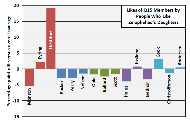 Well, that’s a pretty straightforward pattern. ZD readers like President Uchtdorf. They really, really like him. Most everyone else falls below overall norms to compensate.