Yes. Yes they do.
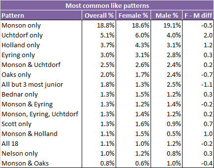
Or, at least it looks like they do more on Facebook. Here’s a list of the most common patterns of likes of Q15 members by women and men. In the second row, liking Elder Uchtdorf alone is done by 6% of women but only 4% of men. The two percentage point difference (in the last column) is the largest difference for any Q15 like pattern. (Perhaps he really does need to cover up to prevent the women of the Church from sinning in their thoughts!) The pattern men have most compared to women is liking all Q15 members but the three most junior, which 2.5% of men, but only 1.3% of women do.
The values in this table come from the same analyses that I posted about a couple of weeks ago. Briefly, I wanted to look at patterns of likes of Q15 members on Facebook (e.g., do people typically like only one member, or particular subsets of them?), so I looked at like patterns in 15 cities in countries with relatively large Mormon populations. I summarized them up to try to make them representative of the whole world of Mormon liking of GAs on Facebook by choosing weights for each city that made the summarized city results look as similar as possible to the total Facebook results.
In this post, I’m just going to share a couple of different breakdowns by city that I thought might be interesting. The table above uses the sample weights to try to make the total similar to the totals for all of Facebook, but all the tables below are broken down by city, so they don’t use the weights. They just take each city’s results as-is. The table above also looks at patterns (i.e., which subsets of members are liked), but the tables below show total likes for each member regardless of the pattern. So, for example, in the table above, “Monson only” and “Monson & Uchtdorf” are separate entries, but in the tables below, all likes of President Monson are counted together, regardless of which other Q15 members the person liked or didn’t like.
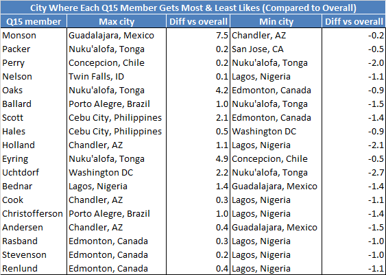
First, here are a couple of tables showing likes of Q15 members for the 15 cities I sampled. The first shows, for each Q15 member, the city where he is most liked and the city where he is least liked. The measure I am using to decide this is the percentage of likes of Q15 members from people in the city that are likes of this member minus the percentage of likes of Q15 members from all Facebook users that are likes of this member. The differences in the table are percentage point differences.
One potentially interesting pattern here is that five of the six most junior Q15 members (as of March, when I gathered the data) are least liked in Lagos, Nigeria. This suggests that the Mormons in Lagos are concentrating their likes more toward the senior end of the Q15. On the most liked side, the three most junior members all get their most positive like differences in Edmonton, Canada.
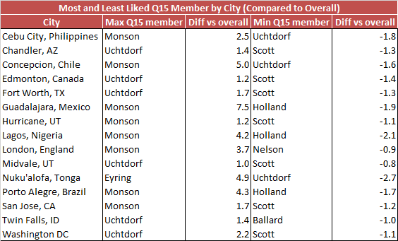
This next table flips the question around and looks at, for each city, the Q15 member who is most liked and least liked (again, compared to the overall percentage of likes the Q15 member gets).
 Not surprisingly, the three men who made up the First Presidency up until January of this year among them take the top spots in all 15 cities. President Eyring gets only one. Between President Monson and used-to-be-President Uchtdorf, it looks like Uchtdorf takes the majority of cities in North America, and Monson takes everywhere else. On the least liked side, Elder Scott gets the bottom spot for nearly half (seven of the 15) cities, a pattern that I can’t come up with an explanation for.
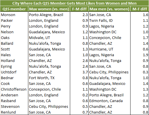
The next couple of tables are like the two above, expect that rather than showing differences between percentage of likes in the city versus percentage of likes overall, they show percentage of likes by women versus percentage of likes by men. This table shows, for each Q15 member, the city in which he is most liked by women versus men, and also the city in which he is most liked by men versus women.
 This just reinforces the point made at the beginning of the post, but even in the city where President Uchtdorf is most liked by men versus women, the difference is only 0.3 percentage points in the men’s direction. His largest like gap for women versus men–3.7 percentage points for Chandler, Arizona–is, as we might expect, the largest for any Q15 member in either direction.
Finally, this table turns the question around and looks at which Q15 member is most liked by women versus men and by men versus women in each of the 15 cities.  President Uchtdorf takes the top spot for women versus men in five cities. President Monson takes another four, and President Eyring another three. That these three men who have overall very high like counts (see the first table in my previous post) suggests that these differences might be at least partially a function of overall count. If a Q15 member has a higher like count overall, there’s more room for him to have variability between women and men and from city to city. Looking at the most preferred by men list makes this idea seem less likely, though, as nobody dominates this list like the old First Presidency dominate the list most preferred by women. Elders Hales and Andersen each take the top spot in three cities.
Please point out in the comments if there are interesting patterns in these results that I’ve missed!


Ziff, I really loved this post it really resonated with me
Thanks, Mean mama jones. I’m glad you liked it.
Having my assumptions supported by data feels great. Thanks, Ziff!
You’re welcome, Emily U!
So if the Prophet were elected by the members, Uchtdorf would be Prophet? Why is he no longer in the first presidency?