Last year I threw together a big pile of numbers, counting during the previous year the number and length of posts and comments on 11 Bloggernacle blogs, as well who wrote them. A question that came up a few times in the ensuing discussions was what the numbers would look like across several years. So for this year, I went back and collected some of those numbers.
I got post and comment counts for 18 Bloggernacle group blogs (a small improvement over last year’s 11) between 2003 (when Our Thoughts and Times and Seasons were founded) and the end of 2008. Here is an alphabetical list of the 18 blogs (with the month they were founded in parentheses):
- By Common Consent (March, 2004)
- The Exponent (January, 2006)
- Faith Promoting Rumor1 (May, 2005)
- Feast Upon the Word (December, 2006)
- Feminist Mormon Housewives (August, 2004)
- Juvenile Instructor (October, 2007)
- Millennial Star (January, 2005)
- Mormon Matters (May, 2007)
- Mormon Mentality (October, 2006)
- Mormon Mommy Wars (March, 2005)
- A Motley Vision (June, 2004)
- New Cool Thang (December, 2004)
- Nine Moons (July, 2004)
- Our Thoughts2 (July, 2003)
- Segullah (September, 2006)
- Times and Seasons (November, 2003)
- Waters of Mormon (August, 2007)
- Zelophehad’s Daughters (January, 2006)
Unfortunately, given the difficulty of gathering such broad data, I had to forego depth. I wasn’t able to note who wrote the posts or the comments or how long they were–just how many posts and how many comments were written at a particular blog in a particular month. (Actually it’s even less precise than that. I’m considering all comments on a post to have been made in the same month as the post was written. This is obviously false in some cases, but it’s not bad as an approximation.) I gathered all these numbers during December, 2008 and February, 2009, so some of the comment numbers may have increased since then if discussions continued for a long time.
Okay, on to the numbers. In this five and a half year period, the 18 blogs in the sample had a total of 18,382 posts and 557,152 comments. Here’s a figure showing how the post and comment counts have grown from month to month since Our Thoughts had its first post in July, 2003. The letters across the bottom label months (only every other month). The blue line is for posts. The red line is for comments. Since the average number of comments per post is very near 30 (30.3), I’ve set the scale for the comments (on the right vertical axis) to be 30 times as large as the scale for posts (on the left vertical axis). So when the red line is above the blue line, the number of comments per post is above its overall average; when the red line is below the blue line, the number of comments per post is below its overall average.
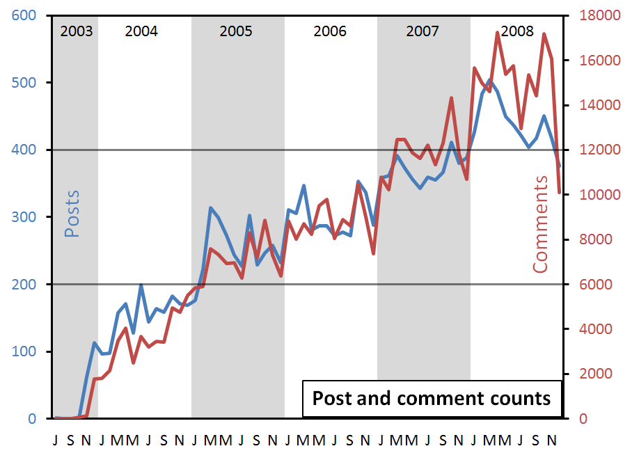
A few observations on the figure:
- The most obvious pattern is of course growth over time. Both by growth in existing blogs and in the addition of new blogs, there has been a consistent increase from month to month and year to year in number of posts and comments. (I’ll have more to say on disentangling these two sources of growth below.)
- The most consistent monthly variation is that activity has dropped off in December every year since 2005. In December, 2008, this dropoff was particularly dramatic.
- The increase in comments has been steeper than the increase in posts. Note that up until December, 2004, the number of comments per post was below its overall average of 30. More recently, though, the number of comments per post has been above its overall average. This difference probably shouldn’t be surprising, given that it’s likely easier to add a new commenter than a new blogger. A new commenter can come from another blog or from word of mouth or from Google, and has only to drop by and say something. A new blogger, on the other hand, has to make an ongoing commitment to write posts in order to join (or start) a blog.
This last point–the slightly steeper increase in comments and slightly flatter increase in posts–can also be seen in these next two figures. The first shows the percentage of all the posts that were put up in each year, and the second shows the percentage of all the comments that were put up in each year.
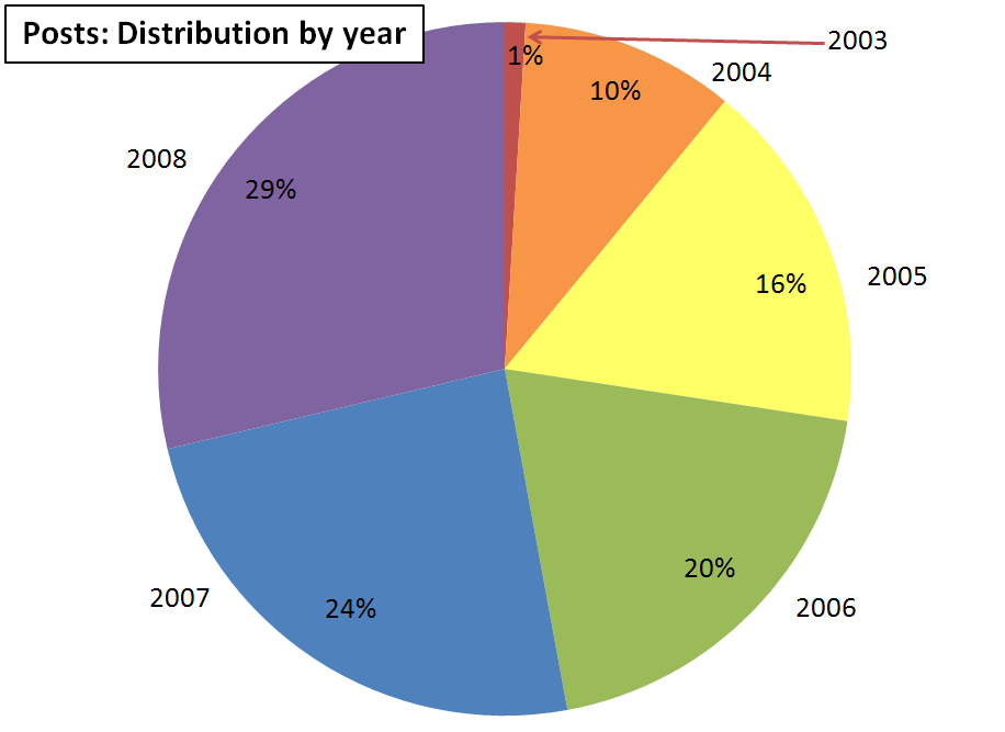
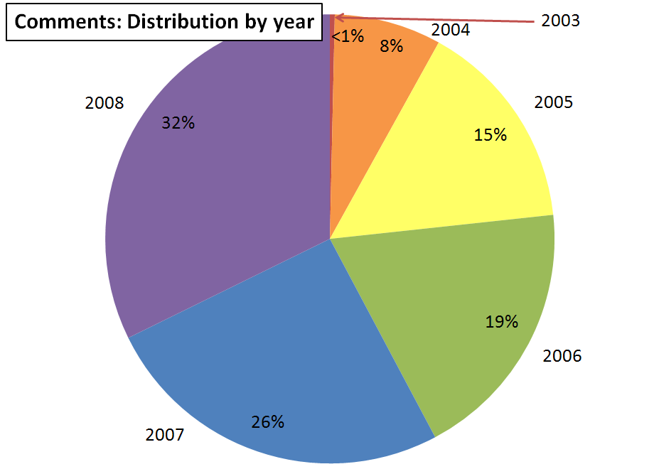
The two pie graphs show the same pattern of growth, with each year having noticeably more activity than the previous year. But the growth rate is greater for comments than for posts. 32% of the comments were written in 2008 alone. Only 29% of posts were written in 2008. Looking back to the early years, the difference is reversed. 11% of the posts were written in 2003 or 2004, but less than 9% of the comments were written in 2003 or 2004.
Next, let me show you a few fun bits of information that can be extracted from the first figure above.
Here are the first months in which the 18 blogs together had a particular number of posts:
- 1 post: July, 2003 (1)
- 10 posts: November, 2003 (62)
- 100 posts: December, 2003 (113)
- 150 posts: March, 2004 (158)
- 200 posts: February, 2005 (222)
- 250/300 posts: March, 2005 (314)
- 350 posts: October, 2006 (353)
- 400 posts: October, 2007 (411)
- 450 posts: February, 2008 (484)
- 500 posts: March, 2008 (504)
Here are the first months in which the 18 blogs together had a particular number of comments:
- 1 comment: July, 2003 (1)
- 10 comments: October, 2003 (57)
- 100 comments: November, 2003 (116)
- 1000 comments: December, 2003 (1771)
- 2000 comments: February, 2004 (2148)
- 3000 comments: March, 2004 (3472)
- 4000 comments: April, 2004 (4038)
- 5000 comments: December, 2004 (5516)
- 6000/7000 comments: March, 2005 (7587)
- 8000 comments: August, 2005 (8295)
- 9000 comments: May, 2006 (9525)
- 10,000 comments: October, 2006 (10,475)
- 11,000/12,000 comments: March, 2007 (12,452)
- 13,000/14,000 comments: October, 2007 (14,313)
- 15,000 comments: January, 2008 (15,678)
- 16,000/17,000 comments: April, 2008 (17,235)
Here are the ten busiest months in number of posts and number of comments. All of these months are from 2008, which strongly suggests consistent year-to-year growth.
| Most posts and comments in a month | |
|---|---|
| Most posts | Most comments |
|
|
Here are the ten biggest month-to-month increases in posts, both in terms of count and in terms of percentage. In this table and all others reporting percentage changes, I have excluded comparisons involving months before December, 2003 because the counts in those months are so small that even small changes result in huge percentage changes.
| Biggest one-month increases in posts | |
|---|---|
| By number of posts | By percentage change |
|
|
Here are the ten biggest month-to-month increases in comments. Three of the top five increases by count are Januarys, indicative of the consistent dropoff in activity during December.
| Biggest one-month increases in comments | |
|---|---|
| By number of comments | By percentage change |
|
|
Here are the ten biggest month-to-month decreases in posts.
| Biggest one-month decreases in posts | |
|---|---|
| By number of posts | By percentage change |
|
|
Here are the ten biggest month-to-month decreases in comments. December, 2008 is an outlier, with a decrease in comments over twice as big as the next biggest decrease. In percentage terms, it nearly matches May, 2004, when the total number of comments was only a quarter as large (about 4000 vs. about 16,000). I haven’t studied this systematically, but from my own perspective in reading a lot of what was written in October and November, I would guess that the number one reason for this dramatic decline in commenting was exhaustion after arguing about Prop 8.
| Biggest one-month decreases in comments | |
|---|---|
| By number of comments | By percentage change |
|
|
I mentioned above that there are fairly consistent patterns by month of the year (particular the December decline), so month-to-month changes might simply reflect these patterns. Perhaps more interesting are year-to-year changes for the same month.
Here are the ten biggest year-to-year increases in posts. Just to make sure I’m clear, these still use monthly data, but each month’s starting point for measuring growth is the same month in the previous year. For example, the 199 increase for June, 2004 means that there were 199 more posts in June, 2004 than in June, 2003. And of course, since none of the blogs in the sample had started by June, 2003, this means there were 199 posts in June, 2004 and zero in June, 2003.
| Biggest one-year increases in posts | |
|---|---|
| By number of posts | By percentage change |
|
|
Here are the ten biggest year-to-year increases in comments.
| Biggest one-year increases in comments | |
|---|---|
| By number of comments | By percentage change |
|
|
Here are the only three year-to-year decreases in posts. Yes, this means there have only been three months since July, 2003 when the number of posts has declined compared with the same month in the previous year.
| Biggest one-year decreases in posts | |
|---|---|
| By number of posts | By percentage change |
|
|
Here is the one year-to-year decrease in comments. Yup, it’s December, 2008. Now whether it’s a sign of the coming apocalyptic collapse of the Bloggernacle or just evidence of burnout after discussing Prop 8, you’ll have to decide. I haven’t gathered any data this year, but the Bloggernacle seems to still be in pretty good shape this year, so I would guess the latter explanation is more likely.
| Biggest one-year decreases in comments | |
|---|---|
| By number of comments | By percentage change |
|
|
Finally, let me take a shot at the question of how much of the growth in these blogs is from growth in existing blogs and how much is from adding new blogs.
This figure shows year-to-year change in number of posts at each month. The dashed black line shows the total year-to-year change. The green line shows change by adding new blogs. The purple line shows change in existing blogs. For purposes of this analysis, a new blog is one that is less than one year old, and an old blog is one year old or older.
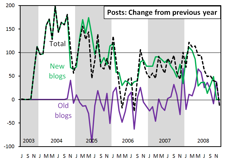 At the left end of the figure, the black and green lines are on top of each other for the first year or so because all posts came from new blogs; there were no old blogs yet. At the right end, the black and purple lines are on top of each other for the last two months because all posts came from old blogs. None of the 18 blogs in the sample were less than one year old. The green line is necessarily nonnegative at every point because it is always a comparison of some number of posts at new blogs versus how many posts those blogs had one year previously, which is by definition zero because they are new blogs.
This figure is somewhat difficult to read because the lines for new and old blogs don’t represent static groups. Moving across time, newly founded blogs are first added to the new blogs group, and then after a year, graduated to the old blogs group. Here’s a guess about what the figure is saying. From 2004 to the middle of 2007, growth in posts was mostly in new blogs. The purple line is more often negative than positive. This suggests that newly introduced blogs (in the aggregate) grew and reached a somewhat stable size in less than a year. Since the middle of 2007, though, old blogs have grown more consistently, with only 4 negative growth months in the last year and a half. So while much of the growth in posts has been attributable to the addition of new blogs, old established blogs have recently been putting up increasing numbers of posts as well.
Here’s the corresponding figure for comments.
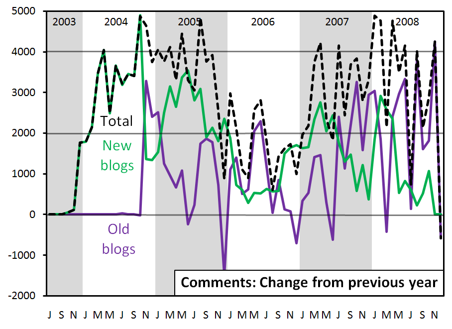 The overlap of the black and green lines at the left end and of the black and purple lines at the right end is the same as in the posts figure, and for the same reason. The overall pattern comparing new and old blogs is quite different, though. Where growth in posts at new blogs almost always exceeded growth in posts at old blogs (except for a few months in 2008), growth in comments at new blogs was frequently less than growth in comments at old blogs. Remember, this is growth and not size, so not only have old blogs been bigger (unsurprisingly), but their growth has often exceeded the growth of new blogs. With only 6 negative growth months in four and a half years, bloggers at the old blogs have been drawning steadily increasing numbers of comments. In other words, the growth in comments has been largely attributable not just to the addition of new blogs, but also to the growth in number of comments at old blogs.
Okay, that’s it for now. I’ll be back with a second post that breaks some of this data down by blog.
________
1Faith Promoting Rumor absorbed Urban Mormonism in February, 2007, so I included all post and comment counts from Urban Mormonism from its founding in October, 2006 until the merger with counts for Faith Promoting Rumor.
2Our Thoughts includes sidebar posts with main posts. Since (for consistency) I didn’t want to include them in the post counts, I simply excluded all posts on Our Thoughts that drew zero comments on the assumption that they were sidebar posts.
Ziff,
Awesome job once again. I am wondering if the limited set of only 18 blogs also limits how much can be surmised about growth due to new blogs verses growth due to these blogs growing. After all, this is almost entirely ignoring the majority of the growth in blogs due to only looking at 18 blogs, right?
“In December, 2008, this dropoff was particularly dramatic.”
Yep, the ‘naccle recession is on 😉
Jacob–you’re exactly right. I should have written a caveat making that very point in the post itself. There are hundreds–thousands–probably tens of thousands–of blogs that I’m ignoring with this analysis.
For looking at comment counts, this might matter less, because a BCC or an FMH probably draws as many comments as hundreds of smaller blogs combined.
But this all ignores the mom-oriented Mormon blogs, which rival the biggest ‘nacle blogs in traffic (if not comments?).
Ziff, I notice that every single one of your 18 blogs is a group blog. So either the solo blogs are coming in Part 2, or the solo blog is unofficially dead.
Not at all, Dave. I mean, you’re right that I’ve only looked at group blogs, but that’s just a convenient way for me to keep the sample manageable. I’m hoping to expand further by looking at individual as well blogs next year. Sorry!
Curiously, did you get all the comment totals for Dec 2008 in February? If not, part of the drop-off could simply be that some comments were made after you totaled the number of comments — since Dec 2008 is the last month in your sample, it’s more likely that more comments were made on those posts after you collected your data.
Anyway, thanks for the interesting statistics yet again!
Good question, Vada. I didn’t count comments on any posts until they were at least a month old. So I did hold off until February to count comments on December posts. There’s nothing sacred about a month, though, so you’re right that if conversations were ongoing beyond that time, then I’ve underestimated the total number of comments on those posts.
This is great. Thanks, Ziff.
And:
No wonder I no longer read every post and comment (and haven’t for awhile) on every major bloggernacle-affiliated blog.
Ziff, I think the most telling material here is in the last two graphs, which present evidence of a process of institutionalization of the “old blogs.” It seems that some of these are no longer the disposable vehicles which they all started as; instead, old blogs now seem to have enough of an established brand name that they can attract enough new writers to expand the post base.
Ziff,
Great job. I wish I could understand this better. Some of the graphs make me dizzy 🙂
The first box, that compares most posts to most comments has March of 08 on top for posts, but 9th for comments.
Any ideas why? I would have guessed they’d be more closely correlated.
Good point, JNS. I guess that conclusion is further supported by anecdotal evidence. I mean, wouldn’t you have guessed this was the case even with no data?
Jessawhy, good question. The correlation is actually quite high. Across years, it’s .97 between number of posts and number of comments in a month. Of course, a lot of that is just that they generally increased together over time. If you break it down by years to reduce this effect, the correlations are still quite high, but not so very nearly perfect:
2003: .88
2004: .80
2005: .65
2006: .43
2007: .57
2008: .53
All that said, of course I haven’t answered your actual question about what was unusual about March of last year. Unfortunately, I haven’t looked closely at that month, so I don’t have an idea about what was going on.
Ziff, the anecdotal evidence probably does point in that direction — but I like both qualitative evidence and numbers before I draw a conclusion!
.
Always fascinating.
Excellent analysis, as always, Ziff.
A couple of comments:
Not including comment-less posts skews the final results because some sidebar posts include comments and some regular posts have no comments.
I can send you an RSS feed that doesn’t include the sidebar posts.
Also, I am pretty sure BCC started in 2003.
Thanks, Th. and Kim.
Kim, regarding the comment-less posts and the sidebar, I realize my solution wasn’t perfect, but I suspect it’s not a bad approximation. I appreciate your offer, though, and will get back to you when I make another attempt at this type of analysis next year.
Also, BCC’s “Info & Contact” page claims to have been written in February of 2003, but I thought that was a joke to say they started before anyone else. Their first post appears to have been put up in March, 2004.
That could be. I remember they started shortly after T&S, I just didn’t realize it was that far away.
ziff- have you seen this ?You probably have but yowsa!
Thanks, CWC. I hadn’t seen that. I should give it a try.
Hello, Ziff!!
Will you please email me at clbruno at hotmail??
I’d like to ask you a question.
Thx.
Yup–the email is on its way, BiV!