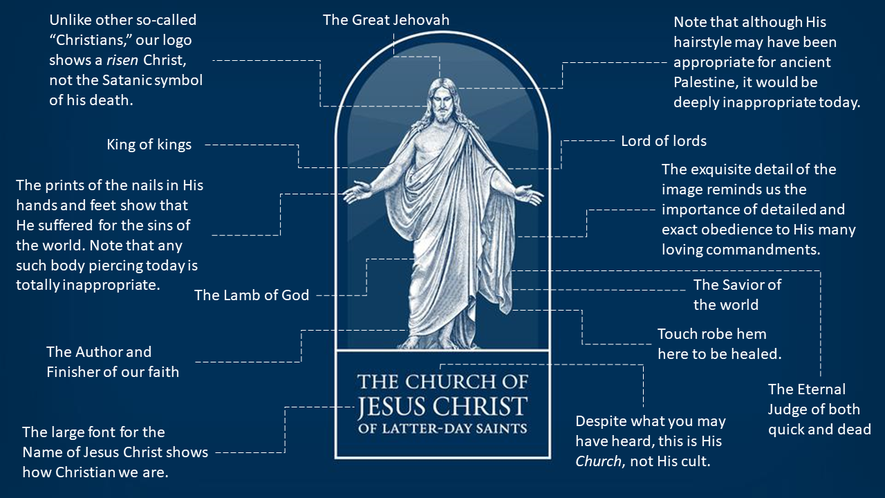
Although President Nelson discussed the Church’s new logo when he introduced it in General Conference, the Church, in consultation with McNaughton Fine Art, realized that what was also needed was a straightforward explanation of the deep symbolism of the logo, as was provided for the new Tabernacle Choir logo. We here at ZD are pleased to share this exclusive leaked draft of the document.

I need an explanation for the almost porn shoulders and bare nipple. Do you know what McNaughton Fine Art had to say (and why it wasn’t included on the draft)?
Any idea why the risen Lord isn’t wearing his garments as instructed in the temple ceremony? He’s gonna fail his next temple recommend interview.
LOL, great points, MTodd!
Thanks for sharing this Ziff. Made me smile.
As far as Jesus not following the guidelines about temple garments, he and Moroni must be of the same mind, because Moroni wasn’t wearing his garments when he visited Joseph Smith (see JS-H 1:31).
Great point, Orsonite. Those darn heavenly beings sure don’t do a good job of keeping to 21st century standards of modesty!
When my “Gospel Library” thumbnail on my phone updated it caught me by surprises. “What app has a little white ghost on it?” I wondered. It is a beautiful logo, but there are so many details that when it is shrunk down to app size, you end up with a little white ghost on a blue background. Most organizations are simplifying their visual logos rather than making them more complex.
That’s interesting, Melinda. I was similarly surprised, but I thought it looked like someone swaying, as though to music. I think you make a great point about the image being overly detailed. Especially given the places it’s going to be used, like the app, as you point out, simpler really would be better.
Along the lines, it’s interesting that while the official symbol for the Church got more complicated, the Tabernacle Choir’s symbol was simplified, which they expressly said they did with using it for digital content and with modernization in mind.
Exactly, Chad. The right hand doesn’t know what the left hand is doing. The Tabernacle Choir team needs to barge in on the Church team and straighten them out!
The arch looks really Catholic to me. And, where in the world do we have the Christus statue in front of a stained glass window? (She said, scratching her head.) Why not put stars and/or galactic objects behind him? The lines aren’t the same font, it’s too detailed, the whole image is too cluttered, and- symbols don’t need full sentences describing them (as we have done inserting our huge name in the box). I also dislike the new MoTab logo- the pipes I longer look like our iconic organ- they look like any other rank of pipes. I know they purposefully mad our symbols more mainstream. [Deleted explicative] mainstream!!!! My heart sighs with disappointment. I’m going to go outside and kick my futile “Keep Mormonism Weird” bumper sticker out of frustration.
“Keep Mormonism Weird”!! LOL! That’s my new favorite slogan! Seriously, we are not going to fit into mainstream Christianity unless we get rid of all Restoration scripture with all the unique doctrine contained therein and that’s not going to happen. Why are we trying so hard?