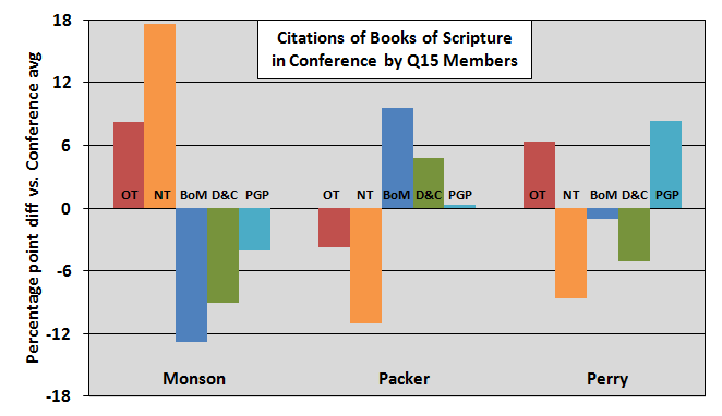
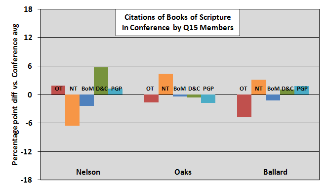
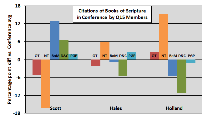
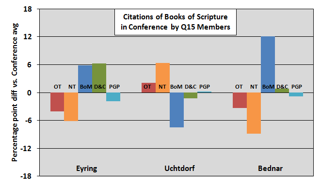
This post has some supplemental graphs for the post “Which GAs Prefer Which Books of Scripture?”
Rather than clutter the original post with more graphs, I thought I would put these in a separate post so they’re easier to ignore if they’re not of interest. 🙂
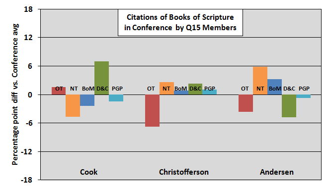
These graphs show percentage point differences by Quorum member rather than by book of scripture.
If you have comments please make them on the original post.
1 comment
Comments are closed.