Here’s a chart showing the total number of likes of Q15 members on Facebook as of late March of this year. Of course, the numbers have shifted a fair amount since then, especially for President Nelson, who’s gotten a big bump since becoming President.
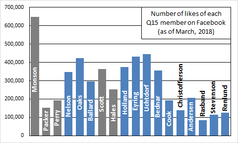
The bars are colored gray for deceased Q15 members and blue for living members. I’ve looked at these numbers regularly since the Church put up official Facebook pages for Q15 members back in 2013. What I’ve found consistently puzzling is just how variable the number of likes are between members. It’s no surprise that the Church President gets a big pile of extra likes. Liking President Monson (or now President Nelson) on Facebook is like a shortcut for indicating that you’re LDS. (I realize that you can also specify your religion as well.) But among the other 14 (or 17 in this chart because of the inclusion of deceased members), I’m surprised that the counts of likes are so variable. Certainly it’s not surprising that members who are deceased, and whose pages are therefore no longer updated, might stop getting new likes. And it might be expected that more senior members might get more likes just because they’ve been in the Quorum longer, and so they’re more familiar and perhaps more liked. But even taking these effects into account, it seems odd to me, for example, that Elder Scott would have gotten about 100,000 more likes than Elder Hales, or that Elder Andersen would get 50,000 more likes than Elder Christofferson, who is immediately senior to him.
I would have expected to see just a few patterns: people who like the Church President only, people who like the First Presidency only, and people who like all 15 members. Perhaps another pattern might be people liking all but the three most junior members. This could occur if people liked all 15 members, but then forgot to go back and update all their likes once the new members were called. But there’s just far more variability in the likes than I would expect based on these effects alone. So I was curious about what might be going on. Are there tons of people who like (what appear to me to be) random pairs of Q15 members? Holland and Bednar? Oaks and Christofferson? Cook and Scott? Or are there lots of people who like all the Q15 members except they leave only one or two least favorites (or overlooked members) out?
What I’d like to do to answer my questions about what subsets of Q15 members people are liking is to get the sets of likes of Q15 members for every Facebook user. But I’m not Cambridge Analytica, so I had to settle for a more modest solution. What I chose to do is to draw a sample of cities from all over the world and record just the Q15 likes of Facebook users in those cities. I used this handy-dandy browser plug-in that makes it easier to run the searches I wanted. Then I tried to come up with a way to aggregate the results so I could generalize to the population of all Facebook users.
I sampled from 15 cities. There’s nothing special about the number 15 for how many cities I chose; it was just the point at which I got tired of collecting data and felt like I had enough to work with. I wasn’t terribly systematic about choosing cities, but let me explain my process. Knowing that Church membership is somewhat larger outside the US than inside it, I chose more cities from outside the US (eight) than inside (seven). For cities outside the US, I started by choosing countries that have large LDS populations (using the Wikipedia page on Church membership statistics as my guide), while also trying to sample countries from different regions of the world. Then within each of the countries I chose, I chose a city that either (1) was especially large, or (2) had a temple in it or nearby, or (3) both. Within the US, I tried to pick cities that have some variability in (1) city size, (2) in what fraction of the population is LDS, and (3) in how religiously orthodox I guessed Mormons in the city to be in general.
Here is the list of cities I ended up sampling from. For the US cities, I just list the state they’re in. For the cities outside the US, I just list the country. For each city, I also list the number of Facebook users I found in the city who liked at least one Q15 member, and also the weight that I use to get the aggregated results to look as much like the population as possible. I’ll say more about how I got the weights below.
| City | People liking at least one Q15 member | Weight |
|---|---|---|
| Cebu City, Philippines | 4,410 | 2.7 |
| Chandler, AZ | 3,147 | 10.0 |
| Concepcion, Chile | 1,583 | 2.1 |
| Edmonton, Canada | 3,072 | 10.0 |
| Fort Worth, TX | 2,301 | 1.0 |
| Guadalajara, Mexico | 2,941 | 1.0 |
| Hurricane, UT | 2,814 | 1.0 |
| Lagos, Nigeria | 2,810 | 1.0 |
| London, England | 3,752 | 1.0 |
| Midvale, UT | 2,318 | 10.0 |
| Nuku’alofa, Tonga | 2,507 | 1.0 |
| Porto Alegre, Brazil | 4,344 | 2.4 |
| San Jose, CA | 1,697 | 1.0 |
| Twin Falls, ID | 3,755 | 1.0 |
| Washington, DC | 2,747 | 1.0 |
When demographers or similar researchers who actually know what they’re doing do sampling, they have a very clear idea about the size of the population they want to generalize to, and how it’s distributed in the units they sample from (states, cities, census tracts, households, or whatever). This information helps them to come up with very precise sampling weights that they can then use to weight their observations to make the results representative of the full population in their analyses.
For this project, as I just said, I was far less systematic in my sampling. However, I have an advantage that most researchers don’t have: I know exactly what the full population looks like. Facebook will tell me exactly how many people have liked President Monson’s page, for example. Because I know this, I was able to choose weights for each city in my sample that would make the sum of the sample results look as similar as possible to the population results. To do this, I set up a worksheet in Microsoft Excel in which I calculated the percentage of likes going to each Q15 member in the full population, and also the percentage of likes going to each Q15 member if the samples I had taken for each city were weighted in different ways. I calculated the root mean square error (RMSE), which is a measure of how far off the weighted city samples are from the full population, averaging across all 18 members. Then I used Excel’s solver tool and asked it to assign weights that would make the RMSE as small as possible. The solver tool’s preferred solution was to weight some of the cities at zero, so to avoid having to do that and have to throw some data out entirely, I forced the weights to fall between 1 and 10. The final weights in the table above produce an RMSE of 5%. This means that on average, the weighted sample percentages are off by 5% from the population percentages.
Here’s a little more detail on calculation of the RMSE if you’re interested. Feel free to skip this paragraph if you’re not, and the rest of the post will still make sense if you do. To calculate the RMSE, I took the percentage difference between the population percentage and the weighted sample percentage for each of the 18 members. I squared each difference (error) to make all errors positive (squared errors), took the average of these squared errors (mean square error), and then took the square root at the end to return the errors to their original metric (root mean square error). Let me show you a couple of the error calculations. For example, in the full population, President Monson got 12.61% of the likes. In the weighted sample, he got 14.07%. This represents a relatively large error of 11.58% (14.07%/12.61% = 1.1158 = 111.58%, so the weighted sample value is 11.58% larger than the population value). By contrast, the error for Elder Holland was quite small. In the full population, he got 7.31% of the likes. In the weighted sample, he got 7.34%. This represents an error of only 0.41% (7.34%/7.31% = 1.0041 = 100.41%, so the weighted sample value is 0.41% larger than the population value).
Here are the top 25 patterns of likes, along with the percentage of the population each represents. I used the weights from the table above to calculate these percentages. So, for example, a Facebook user in Chandler, Arizona counts as 10, one in Cebu City in the Philippines counts as 2.7, and one in Hurricane, Utah counts as 1.0.
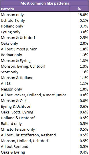 Not surprisingly given that President Monson has the most total likes by far, liking him and only him is also the most common pattern. Looking down the list, it looks like what I was missing with my guesses about what patterns of Q15 members people might like is that I underestimated how common it is for people to like one and only one Q15 member. And clearly this isn’t true only for the President of the Church. Four of the top five, and five of the top seven patterns are likes of just a single Q15 member. Further down the list are some of the other patterns I speculated about: 1.1% like all 18, 1.8% like the old Q15 but didn’t get around to liking the three newest members; 1.3% like the Monson-era First Presidency.
Some of the combinations are kind of surprising to me, though. Like what’s with the pattern where people like 10 of the 18, excluding Elders Packer, Holland, and the six most junior? Or what’s up with the one where they like everyone but Elders Christofferson and Rasband?
Looking at these patterns led me to wonder about whether it might be interesting to look at which pairs of Q15 members Facebook users agreed on the most. That is, if a person likes one Q15 member, they are likely to also like the other, and if they don’t like one member, they are likely to also not like the other. The table below shows the agreement percentages for all pairs of Q15 members (using the weights like in the previous analysis). I’ve color coded it so that larger percentages are more yellow and smaller values are more green.

The whole first column is very green for having lots of low values. All this really shows, though, is that President Monson gets lots of likes from people, pretty much regardless of which other Q15 members they like. As I noted above, liking President Monson on Facebook is like declaring that you’re a Mormon. At the other end of the table, the three newest Q15 members have some of the highest agreement percentages. Unfortunately, this isn’t all that interesting either, as it just shows that, as newer members, they have generally fewer likes than the other 15 members, so most of the agreement is just case after case of people not liking either one of them. In between, I don’t see a whole lot going on either. I checked a couple of pairs that I thought might have high agreement percentages. Elders Packer and Bednar are both kind of hard liners. I thought maybe they would get a high agreement score. But no, it’s only an unremarkable 76%. Or Elders Uchtdorf and Holland might get a high score, as more liberal-friendly Q15 members. But again, no, as it’s 68%, which is one of Elder Holland’s lowest scores. Overall, there’s less variability than I had expected, and it seems like it might just be noise.
Please let me know in the comments if there are any interesting patterns I’ve missed. Also, I’ll be back in a day or two with a follow-up post comparing the likes in the cities I sampled, and also showing breakdowns of like patterns by gender.
I love this blog.
Fascinating! Wonder how Gong and Soares will adjust numbers? Speaking from my own experience, I didn’t go in and search for the apostles on Facebook to like, but if they pop up as suggestions in my feed I like them. So my behavior (and possibly others?) has been determined by those inexplicable Facebook algorithms.
Thanks, HokieKate!
Thanks for pointing that out, acw. That totally makes sense, and that could account for all the patterns that aren’t the obvious ones I mentioned in the post (like liking all 18, or liking only the President). It also makes sense that a pattern like that could be self-reinforcing, so Facebook shows one person a suggested like of a particular set of Q15 members (not at all once, but across a period of time), and then when the person likes them, Facebook starts showing that same set of Q15 members to other users.
I wonder to what extent the likes are related to active posting on Facebook. For example, Uctdorf posts pretty regularly, so his posts may get shared more often, and more people like his page. In a brief scroll through, I see that he’s posted 17 times in 2018, but Cook, with a much lower following, only has 10 posts this year. Is there a correlation between posting rate and popularity?
That’s a great point, BeeCee. It could be as straightforward as that. I guess I was kinda sorta assuming that the pages (at least for the living members) were at least partially managed by PR people, and so they would be sure to keep posting rates pretty similar. But your check sure seems to indicate that that’s not the case at all! Thanks for weighing in.
I don’t know how it’d affect anything, but I have Nelson, Uchtdorf, Christofferson, Gong, and Soares liked on Facebook.
Thanks for weighing in, Zio. Yours is a pattern among those I didn’t consider at all! If you don’t mind my asking, did you come to that list systematically, or was it more like acw’s experience, where they liked Q15 member pages when they were presented by Facebook, but didn’t seek them out?
This is super fun, Ziff! Thanks for putting it together. It’s interesting to me that it seems to support the idea that some apostles have, one might say, fan clubs that are particularly attached to them. I mean, I’m not surprised at all to see Uchtdorf and Holland following Monson as the apostles with the most people who liked only them, just based on my experience of which apostles people are likely to get especially excited about. It will be interesting to see how long it takes Nelson to catch up.
(I don’t think I’ve liked any of the Q15, but in typical ProgMo fashion, if I were to pick just one to follow I’m sure it would be Uchtdorf.)
Thanks, Lynnette. That’s a great point about particular members having dedicated fan clubs. That totally makes sense that that would affect who gets the most likes, especially for people who like one and only one.