In this (probably last) installment of ‘Nacle Numbers, I’ll try to answer a few more questions about the 11 blogs in my sample. (If you haven’t read previous installments, Part 1 describes the sample, Part 2 discusses blogs, Part 3, bloggers, and Part 4, commenters.)
How do posts differ by gender? (ECS asked this question.)
To answer this question, I went through the sample of posts and noted for each whether it was written by a woman or man. I left out posts by administrative accounts (like BCC admin) except for the FMH Guest account, which I labeled as belonging to women. I was able to assign a gender for 3476 of the 3525 posts in the sample (99%).
Here are some descriptive numbers on the posts by gender.
| Group | Posts | Words in Posts | ||||
|---|---|---|---|---|---|---|
| Total | Mean | Median | Std dev | Max | ||
| Women | 1609 | 779,920 | 485 | 383 | 476 | 6909 |
| Men | 1867 | 985,955 | 528 | 409 | 502 | 5249 |
So it’s not just your imagination–men did write more posts. The difference isn’t as large as I expected, but of course this is strongly influenced by the blogs I chose to sample. There are four blogs in the sample–FMH, MMW, ExII, and ZD–where nearly all posts are written by women, so this means that the remainder of the blogs are really dominated by men, which probably comes as no surprise to anyone.
You can also see in the table above that in addition to writing more posts, men also wrote slightly longer posts than women (528 words vs. 485 words on average).
| Group | Comments on their Posts | ||||
|---|---|---|---|---|---|
| Total | Mean | Median | Std dev | Max | |
| Women | 52,549 | 33 | 20 | 42 | 467 |
| Men | 72,158 | 39 | 24 | 44 | 637 |
Men’s posts drew more comments, although the difference wasn’t large.
| Name | Words in Comments on their Posts | ||||
|---|---|---|---|---|---|
| Total | Mean | Median | Std dev | Max | |
| Women | 5,608,441 | 107 | 70 | 120 | 3403 |
| Men | 7,023,084 | 97 | 61 | 118 | 2769 |
Women’s posts drew longer comments on average, although again the difference wasn’t large.
ECS also asked to see a breakdown by gender of commenter, but I just didn’t get this done. There are so many more commenters, and so many more whose gender I don’t know. Sorry, ECS!
What do data for the average commenter at each blog look like?
When I made the big table of commenters in my last post, I got to wondering what the average commenter for each blog would look like. To answer this, I made weighted averages of those data for each blog. Each person’s data is weighted by how many comments they wrote at the blog. For example, Ray wrote 1710 comments at BCC and I wrote 6, so Ray’s data is weighted 285 times (1710 / 6) times as much as mine in figuring out what the average BCC commenter did.
This table has the same columns as that big table at the bottom of my post on commenters. (Here’s what I said about the Gini coefficients.)
| Total | BCC | T&S | FMH | MMnt | MMW | NCT | 9Mn | M* | ZD | FPR | ExII | Gini |
|---|---|---|---|---|---|---|---|---|---|---|---|---|
| BCC average commenter | ||||||||||||
| 707 | 407 | 128 | 32 | 42 | 12 | 32 | 14 | 15 | 10 | 11 | 3 | 0.786 |
| T&S average commenter | ||||||||||||
| 602 | 176 | 265 | 44 | 38 | 10 | 22 | 10 | 20 | 8 | 6 | 3 | 0.808 |
| FMH average commenter |
||||||||||||
| 448 | 47 | 46 | 269 | 26 | 11 | 9 | 10 | 6 | 14 | 2 | 6 | 0.837 |
| Mormon Mentality average commenter |
||||||||||||
| 627 | 119 | 77 | 51 | 273 | 6 | 22 | 25 | 34 | 8 | 9 | 2 | 0.778 |
| MMW average commenter |
||||||||||||
| 255 | 53 | 31 | 33 | 9 | 99 | 3 | 13 | 4 | 4 | 1 | 5 | 0.893 |
| New Cool Thang average commenter |
||||||||||||
| 846 | 166 | 83 | 32 | 41 | 3 | 402 | 25 | 18 | 40 | 35 | 2 | 0.803 |
| Nine Moons average commenter |
||||||||||||
| 462 | 106 | 52 | 51 | 66 | 23 | 36 | 85 | 22 | 12 | 7 | 2 | 0.788 |
| M* average commenter |
||||||||||||
| 590 | 114 | 112 | 33 | 90 | 7 | 27 | 22 | 169 | 6 | 9 | 1 | 0.806 |
| ZD average commenter |
||||||||||||
| 490 | 99 | 58 | 95 | 27 | 9 | 74 | 16 | 8 | 83 | 9 | 11 | 0.787 |
| FPR average commenter | ||||||||||||
| 413 | 118 | 47 | 16 | 34 | 2 | 72 | 9 | 13 | 11 | 87 | 3 | 0.847 |
| ExII average commenter | ||||||||||||
| 266 | 31 | 25 | 50 | 10 | 15 | 5 | 4 | 2 | 14 | 4 | 106 | 0.867 |
You can see in the first row, for example, that BCC commenters also wrote lots of comments at T&S (128 on average).
In general, BCC appears to have drawn comments from commenters everywhere. The largest numbers of comments written at any blog other than the blog being analyzed were T&S commenters at BCC (176) and New Cool Thang commenters at BCC (166). The average Nine Moons commenter actually wrote more comments at BCC than at Nine Moons (106 vs. 85). This was also true of ZD (99 vs. 83) and FPR (118 vs. 87). I think that this means that people who commented at any blog in the sample typically commented at least some at BCC, and also, to a lesser degree, at T&S and FMH. (Note, for example, that the average ZD commenter also commented more at FMH than at ZD, 95 vs. 83.)
You can also see from the Gini coefficients that commenters at Mormon Mentality (.778), BCC (.786), ZD (.787), and Nine Moons (.788) were most likely to comment across lots of blogs in the sample, while commenters at MMW (.893), ExII (.867) and FPR (.847) commented at fewer blogs. Again, of course this is influenced by my sample–if I had chosen a different set of blogs, BCC might have looked like the outlier.
What are correlations between numbers of comments at different blogs?
A more systematic way to look at whether people who comment at one blog also comment at another is to check correlations. I looked at correlations between numbers of comments commenters wrote at different blogs1.
The table below shows correlations between numbers of comments people wrote at all pairs of blogs in the sample. Of course, every blog correlates 1.00 with itself, so I left those correlations out. The upper right half of the table is also redundant with the lower left half (e.g., the correlation of M* with Nine Moons is the same as the correlation of Nine Moons with M*). Setting aside these 1’s and redundant values also allowed me to shrink the table a little bit by not listing MMW on the left or ExII on the top (but all their correlations are still in there).
I ordered the blogs in such a way that, as much as possible, blogs having high correlations are next to each other.
I’ve highlighted the largest correlations for each blog. A yellow cell indicates that the correlation is the highest for the blog on the left side of the table. A blue cell indicates that the correlation is the highest for the blog at the top of the table. A green cell indicates that the correlation is the highest. For example, the blue cell in the upper left hand corner of the table means that the .170 correlation between Nine Moons and MMW was the largest of any correlation for MMW. But of course this doesn’t mean that this was necessarily the largest correlation for Nine Moons. Its largest correlation was .255, with Mormon Mentality, which also happened to be Mormon Mentality’s highest correlation. I know this might sound like gibberish, but if you look at the table for a minute, I think it might make more sense.
| Blog | MMW | 9Mn | M* | MMnt | T&S | BCC | FPR | NCT | ZD | FMH |
|---|---|---|---|---|---|---|---|---|---|---|
| 9Mn | .170 | |||||||||
| M* | .024 | .176 | ||||||||
| MMnt | .024 | .255 | .248 | |||||||
| T&S | .080 | .125 | .213 | .183 | ||||||
| BCC | .099 | .189 | .145 | .196 | .440 | |||||
| FPR | -.009 | .077 | .080 | .101 | .093 | .175 | ||||
| NCT | .002 | .151 | .078 | .082 | .120 | .171 | .261 | |||
| ZD | .045 | .154 | .046 | .083 | .128 | .156 | .105 | .291 | ||
| FMH | .090 | .129 | .051 | .116 | .140 | .090 | .019 | .039 | .232 | |
| ExII | .071 | .020 | .003 | .017 | .033 | .026 | .025 | .008 | .118 | .087 |
By far the strongest correlation is between T&S and BCC (.440). Both of these blogs are also contenders for being the most correlated in general with the other blogs. Nine Moons is also a contender. Its largest correlation (.255, with Mormon Mentality) is only the 4th largest in the table, but 8 of its 10 correlations–more than for any other blog–are .100 or larger. (T&S and BCC each had 7 of .100 or greater.) ZD also deserves special mention, as we have the highest correlation with three blogs–New Cool Thang, FMH, and ExII.
Mormon Mommy Wars and ExII are clearly the least correlated of these blogs with the others, each only exceeding a correlation of .100 with one other blog. Again, this is strongly dependent on the sample of blogs I chose to look at.
Who comments most consistently across time?
m&m asked the opposite of this question: who commented most variably across months. Unfortunately, when I tried to answer this question, I came up with a list of people who started commenting partway through the year. It’s true that they were the most variable, but that was a trivial answer.
So I turned the question around to see who commented most consistently from month to month. Unfortunately, when I looked at which commenters had the lowest standard deviation for their monthly comment totals, the answer was a bunch of people who wrote very few comments overall, and so had little opportunity to vary from month to month. To get a more interesting answer, I converted each person’s monthly comment totals to percentages to remove differences due to overall commenting level. Then when I looked at commenters having the lowest standard deviations, I got the following top 10 list:
| Commenter | Std dev | Max month | Comments | Min month | Comments |
|---|---|---|---|---|---|
| Kevin Barney | 1.54 | April, July | 137 | February | 72 |
| Naismith | 1.61 | September | 67 | May | 34 |
| Steve Evans | 1.89 | June | 209 | February | 101 |
| Todd Wood | 1.93 | October | 30 | March | 13 |
| J. Nelson-Seawright | 2.00 | June, August, September |
95 | December | 45 |
| Ann | 2.01 | March | 47 | August | 20 |
| m&m | 2.02 | July | 141 | February | 59 |
| John Mansfield | 2.04 | July | 71 | January | 25 |
| Susan M | 2.41 | March | 79 | October | 34 |
| Caroline | 2.52 | August | 42 | December | 17 |
These are the reliable commenters of the bloggernacle, always around, regardless of the time of year. If the people on this list are any indication, discussion slows down a little in the winter (for the northern hemisphere) and picks up in the summer.
I looked at a similar pair of questions across days of the week. Again, the answer to the “most variable” question wasn’t that interesting: A whole bunch of people comment consistently from Monday through Friday, and then say little or nothing over the weekend. (In Part 1 of ‘Nacle Numbers, I found the same pattern for the set of all posters and commenters taken together.) So again I turned the question around to see who commented most consistently across days of the week. Again, I converted each person’s daily totals into percentages to remove the effect of overall comment totals. Here are the top 10 on the list.
| Commenter | Std dev | Max day | Comments | Min day | Comments |
|---|---|---|---|---|---|
| Bored in Vernal | 2.00 | Monday | 61 | Sunday, Friday | 43 |
| Paula | 2.08 | Friday | 56 | Saturday | 35 |
| Mark D. | 2.13 | Monday | 69 | Thursday | 44 |
| Eve | 2.38 | Monday | 96 | Saturday | 58 |
| Katie | 2.53 | Wednesday | 20 | Thursday | 12 |
| Proud Daughter of Eve | 2.61 | Monday | 69 | Saturday | 42 |
| Ray | 2.63 | Wednesday | 461 | Sunday | 250 |
| Ann | 2.68 | Friday | 75 | Sunday | 44 |
| Mike Parker | 2.77 | Tuesday | 44 | Saturday | 25 |
| lagirrrl | 2.84 | Friday | 19 | Sunday | 11 |
Even these consistent commenters who are unafraid of weekends generally comment more on weekdays than on weekends.
Which blogs have posts most and least spread out among bloggers? How about comments?
I’ll answer these questions with Gini coefficients. (Again here’s what I said about them in my last post.) These run from 0, indicating perfect equality (i.e., every blogger writes an equal number of posts) to 1, indicating perfect inequality (i.e., one blogger writes all the posts). In this context, of course, since I only counted bloggers who wrote at least one post as being bloggers, it wasn’t possible for a blog’s Gini coefficient for posts to quite reach 1.
For commenters, it works the same, with 0 indicating all commenters wrote an equal number of comments and 1 (although not precisely achievable) indicating one commenter wrote all comments.
Here are Gini coefficients for posts and comments for all 11 blogs in the sample. The blogs are sorted by descending Gini coefficient for posts.
| Blog | Gini coefficients | |
|---|---|---|
| Posts | Comments | |
| M* | 0.662 | 0.796 |
| MMW | 0.661 | 0.759 |
| FMH | 0.656 | 0.812 |
| BCC | 0.642 | 0.849 |
| T&S | 0.596 | 0.813 |
| 9 Moons | 0.577 | 0.744 |
| NCT | 0.571 | 0.847 |
| MMent | 0.558 | 0.837 |
| ExII | 0.553 | 0.752 |
| FPR | 0.500 | 0.776 |
| ZD | 0.400 | 0.760 |
The high values for M* and MMW are driven by the fact that both blogs were dominated by a single blogger. At M*, Geoff B wrote over twice as many posts as any other single blogger, and at MMW, Heather O. wrote more posts than all the other bloggers put together. FMH’s high coefficient might be misleading given that all posts by one-time guests were considered as coming from a single person (this excludes guest posters like JohnR and G, who posted under their own names). Of course if they had been considered separately, the Gini coefficient might have been much higher because FMH would then appear to have a really huge number of bloggers who only posted once. (The data for posts come from the first set of tables in Part 3 of ‘Nacle Numbers.) At the other end of the spectrum, ZD and FPR both have a fairly small number of bloggers who post fairly similar amounts, very few guest bloggers, and therefore low Gini coefficients.
All the Gini coefficients for comments are larger than any of the Gini coefficients for posts. I guess this shouldn’t be surprising given that commenters can and frequently do show up and make a comment or two or five but then never appear again (at least not under the same name). This really pushes the number of unique commenters up, making the comments appear to be even more dominated by the few regulars who make lots of comments. Without checking, I would guess that the difference in how many people make only a few comments largely drives the difference in Gini coefficients for comments. For example, I know that here at ZD, with one of the the lower Gini coefficient for comments (.760), not many people show up to make only one or a few comments. FMH (.812) and BCC (.849) by contrast, seem to be forever adding and losing new commenters. Aggregated over a year, I can see how this would make the discussion even more dominated by regular commenters than it was at any one time.
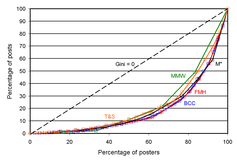
Gini coefficients can also be represented graphically, so just for fun, I tried this out. Below is a plot of Gini coefficients for posts for the five blogs having the highest values. On the horizontal axis is the percentage of bloggers, and on the vertical axis is the percentage of posts written by that percentage of bloggers.
For example, look at the orange box nearest to the “T&S” label. This is at about 43% on the horizontal axis, and 8% on the vertical axis. This means that the bottom 43% of T&S bloggers wrote only 8% of the posts. The dashed line running through the plot from lower left to upper right in the plot shows what the distribution would look like if all posters contributed an equal number of posts (i.e., the bottom 10% wrote 10% of the posts, the bottom 20% wrote 20%, etc.). In this case, the Gini coefficient would be zero. The lines for the blogs all start out more shallow than this line (indicating that the least contributing posters contribute less than proportional to their numbers) and eventually turn and become more steep (indicating that the most contributing posters contribute more than proportional to their numbers). Of course, this is a necessary shape: the line for a blog can’t fall above the Gini = 0 line because if it did, this would mean the bottom x% of posters were contributing more than x% of the posts (for some value of x), and this means that the bottom x% of bloggers wouldn’t actually be the bottom x%, rather they would be among the excessively contributing posters.
In terms of the plot, the Gini coefficient can be understood as representing the area between the Gini = 0 line and the line for the blog.
 Here’s a plot for posts for blogs having the six lowest Gini coefficients.
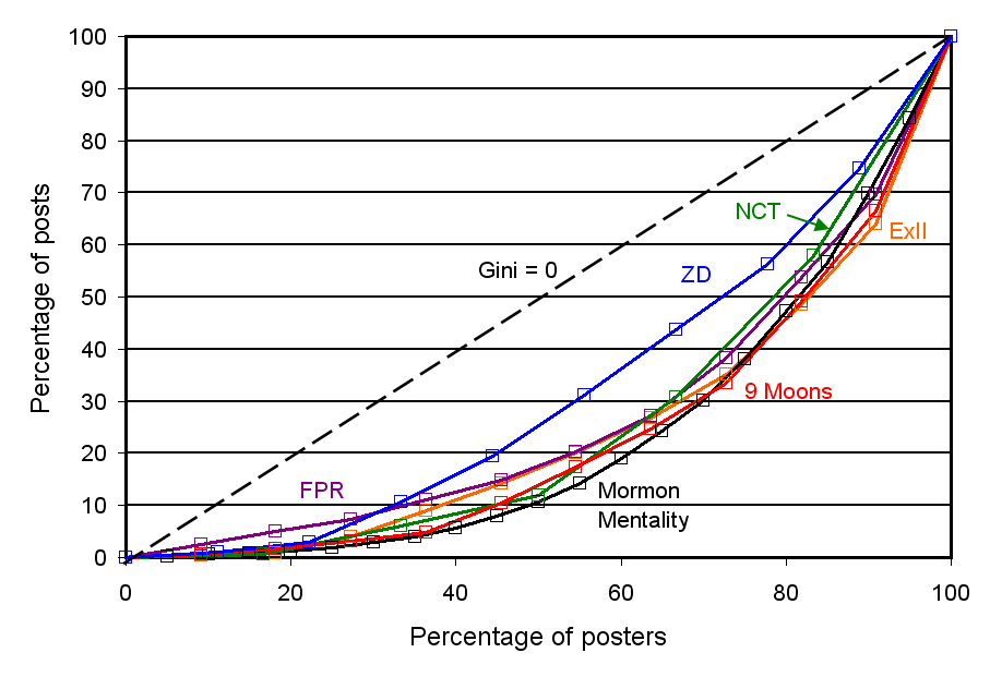 Here is a plot for the six blogs having the highest Gini coefficients for comments. Note that as the Gini coefficients are larger, the lines are farther from the Gini = 0 line.
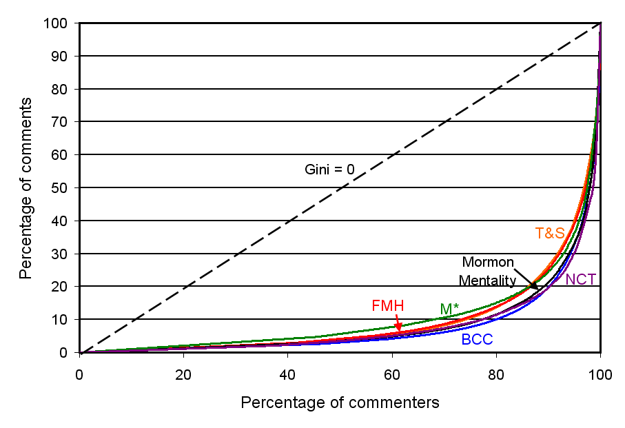 Finally, here is a plot for the blogs having the five lowest values for Gini coefficients for comments.
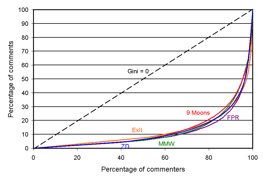 ______________________________________
1. A correlation ranges between -1 and +1. A positive correlation between blogs indicates that people who write lots of comments at one blog also write lots at the other. A correlation near zero indicates that there’s no relationship between how many comments people write at one blog and how many they write at the other. A negative correlation indicates that people who write lots of comments at one blog actually write fewer comments at the other. It looks like the correlations are all positive or near zero–the one negative value is only very slightly negative–suggesting that the dominant pattern is that people who write lots of comments write lots wherever they go. The differences in correlations just reflect what pairs of blogs people are more or less likely to comment at together.
Wow, Ziff, you’re not getting paid for this, are you? Are you doing a dissy on Bloggernacle Numbers?
Seeing my name on one of your lists sure is a rush. Even if it just proves that I have no life on weekdays or weekends.
You sure get my vote for biggest bloggernacle nerd. Let me know if you ever need a letter of recommendation for an accounting job.
This one I understood the least — but it didn’t stop me from studying your explanations and poring over the charts. How fun!
Amazing job on the entire series of posts. Thanks, Ziff!
More great stats, Ziff.
I’m going to tell Jana that ExII is the “least correlated” of the nacle — I think she’ll appreciate that. 🙂
BiV, I’m glad you enjoy being noticed as the most consistent commenter. I guess I should be writing a dissertation or something on this, but my committee would probably want me to be more focused, less rambling, and actually have a point at the end, or maybe some theory. Anyway, I’d probably enjoy it a lot less if it were for something like that–as it is I can just play.
And thanks for nominating me as biggest nerd! I’ll wear that label with pride. 🙂
Ardis, Researcher, and Kaimi, I’m glad you enjoyed this. Kaimi, I can’t believe I missed the obvious correlation joke! But I appreciate that you’re always around to find the funny points that I haven’t.
I agree that this would be way too much work, but it would be interesting to know if posts by women tend to attract more women commenters than posts by men, for the same blog. (and vice versa)
Nice job again. I would like to say the NCT / ZD correlation has to do with my love for ZD, but probably it is better explained by that gigantic argument between Geoff and the ZD sisters last year over trump cards and whatnot. Sigh.
Yeah, Jacob, I noticed that too. One big argument made NCT and ZD the second most highly correlated pair of blogs in the whole sample. I thought that was kind of funny considering that there’s not typically that much discussion back and forth between us. But I guess that’s the problem with these non-robust statistics: they’re too easily influenced by a few outliers. 🙂
Sister blah 2, that’s a good question. I’ll see if I can answer it later when I’ve got the data in front of me.
“BCC might have looked like the outlier.”
We get that a lot.
Well at least it was a really interesting massive argument…
Anyway, we dig theology at NCT and y’all dig theology at ZD so there is plenty of reason for us to be somewhat correlated right?
These have been great. Thanks for all your hard work!